BLATHER
Periodic dispatches of note. Rich with brio and humor.
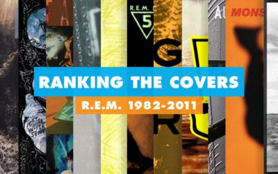
Ranking R.E.M.’s Album Covers Aesthetically 1982-2011
I was inspired by a friend’s Facebook thread about underrated late-period R.E.M. albums to create a ranking of the band’s album covers. Aesthetically. A ranking covering all their studio recordings from 1982 to their breakup in 2011. The ranking doesn’t include compilations or live albums,...
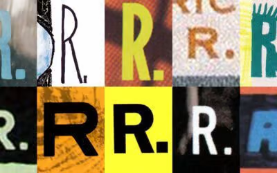
Our Band Could Be Your Typography Lesson
13. BROKE. CURIOUS. BORED. The moment is burnt indelibly into my memory. Every Sunday morning, I’d pick through the day’s edition of the Omaha World Herald (I'm a Nebraska boy. Or at least was for my first 25 years), and I was leafing through inky inserts and box store circulars to more or...