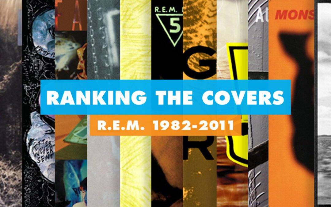
I was inspired by a friend’s Facebook thread about underrated late-period R.E.M. albums to create a ranking of the band’s album covers. Aesthetically. A ranking covering all their studio recordings from 1982 to their breakup in 2011.
The ranking doesn’t include compilations or live albums, although I am including Dead Letter Office because that one feels “of a piece” to me in spite of being assembled from various recordings for various purposes throughout the band’s first 5 years.
This ranking also does not focus on the quality of the albums themselves except where it is informed by and matched by the cover and how well those ends are served aesthetically. This is not an album ranking. This is an album cover ranking.

17. AROUND THE SUN (2004)
Admit it, you kinda knew we were going to begin with this one. The artwork for their most-maligned album suffers for sins of association to be sure, but it’s also just kind of lazy work overall. At this point Stipe was taking the reins with the band’s visuals a bit tighter than maybe he should have. The photo, a blurry multiple-exposure shot of a single person (Stipe himself?) feels like off-the-rack stock photography and the typeface gains one point for being designed by Stipe himself and is immediately docked that point by looking a bit too ’90s four years into the new century. I’m one of this album’s defenders and even still I can’t make excuses for album art that looks as disinterested as the band themselves seemed at the time.

16. REVEAL (2001)
As a designer you can often overlook failures in execution when you see good things in intention. That’s sorta how I feel about Reveal‘s art which gains in sum what it loses in parts. I like the lomography, I like the transparency effects, I like the flat 3D, and I am a huge fan of front cover track listings. And including the track times is a nice touch as well. Plus the color palette is fun saturated oranges and yellows befitting the (mostly) sunny sounds within. Still I feel like it just doesn’t gel as a whole. It feels awkward in an unintentional way that never seems to truly find its right footing. Not bad at all but suffers when I think of what might have been done with these same elements.

15. UP (1998)
As with Reveal, Up makes us look at the design’s intentions again. Some album art is meant to be taken as a whole, so that after you walk around through the inner sleeves a while you get a sense of the world the design is trying to create. Up is one of those album designs. Inner panels (and the supporting tour and merchandise) would reveal an affection for period clip art, from an era when that meant actual clipping with actual scissors. There’s lots of postal-looking packing art and cut and paste stamp art from vintage sources giving things a kind of late-1960’s office vibe. Unfortunately that deliberately cheap aesthetic stumbles a bit on the album cover proper. It seems like it needs something more to feel a bit more refined and considered than it does. Cheap was the look they were going for but this feels like it falls just a bit on the lazier end of cheap. The colors are perfect though. Up sounds like an aquarium abandoned in the woods that has since grown its own ecosystem and these blues and aquamarines nail that atmosphere perfectly.

14. CHRONIC TOWN (1982)
Oddities: Side A and B named “Chronic Town” and “Poster Torn” respectively.
Speaking of color palette informing content, whoever picked the specific blue for the overlay on the cover of their debut EP Chronic Town deserves a raise. They likely had little budget to work with here and the photo of gargoyle alone would have been fine on its own, if a bit more garage than the band deserved coming out of the gate. Add that blue overlay though and the entire thing becomes otherworldly. A perfect look for how odd and un-1982 the songs inside were. Perhaps it’s hindsight, but this cover always seemed to have the sturdy look of a band announcing itself confidently. No small feat considering how many postcards this same gargoyle likely appears on. This cover claims it as its own. Not the flashiest or most elaborate design in their catalog but iconic in a way that I’m sure must have been near-instant.

13. ACCELERATE (2008)
By 2008, R.E.M. were in comeback mode. It had only been 3 years and change since Around the Sun became their first widely-perceived mis-step in a two-decade-long run that made many wonder if the band would ever stumble. The band was re-invigorated from the not terribly enthusiastic response. They set out to regain footing, not spend as long on the recording and mixes, and come out of the gate swinging. While Accelerate fulfills that mission musically I can’t help feel looking at the cover that they were a bit rattled about just how to present it. The disconnect between the band logo, the album logo, and the art itself feels a bit scattered and schizophrenic and (for the first time) a bit more concerned with contemporary design trends than with partnering with the sounds inside. A bit too self-aware. I’m fond of a lot of what is going on here but it still feels like it exists separately from the album itself. Still, I respect the swing and for the most part this one hits where it should and perhaps the personality crisis is more of a perfect match than I realize.

12. COLLAPSE INTO NOW (2011)
This one feels like it picks up and runs with a lot of the motifs first laid down by Up. Overlays of vintage print spirals, geometric patterns and blown out posterized photos. As always there are some subtextual elements hidden in plain sight (Stipe waving goodbye, the band deliberately obscuring their own photo in a nod to their famous disinterest in pop star poses) but for the most part this one is pretty straightforward and pleasing if a degree or two below-standard, if only because the band’s own visual standard was often so high.

11. OUT OF TIME (1991)
This one hasn’t aged as well as my mind thought it would when I set out to make this list. One interesting facet: the typesetting on the ribbon. We’re so used to perfect type now that we don’t remember how accepting we used to be of imperfectly set type. In my mind’s eye, the “Out Of Time” is set more fluidly on the ribbon in spite of that not being the case in reality. That’s memory I guess: our brains tend to update detail. While its initially jarring to realize that that this is a photograph of a piece of multimedia artwork (Mike & Doug Starn’s Yellow Seascape with Film and Wood Blocks) it all works together really well, the browns and yellows and plastic gloss coming together to really nicely set the tone for the verdant springtime sounds inside. Theres a richness to it that feels simultaneously polished and handmade, just like the album itself. Frankly, I kinda prefer the crayon logo that graces the inner sleeve to the yellow one on the outer but what are ya gonna do? Still, this doesn’t look like any other album cover from anybody, let alone a multi-platinum smash hit and that’s really something.

10. AUTOMATIC FOR THE PEOPLE (1992)
The residue of early technology. Automatic for the People‘s cover is ever-so-slightly tripped up by the limitations of early photoshop filtering. Little did we know in fall of ’92 that those embossed side rails and that background digital texture would look so dated so rapidly. Who knows, maybe its charmingly retro now to younger eyes? At any rate the real star here is the brutally washed out, almost chiaroscuro photo of the vintage motel signage star and it holds up brilliantly. Framed with a tasteful sanserif (DIN 1451 I believe) that knows its place but has a soft-pedaled dignity that elevates the overall piece. The star displays a beautiful decay absolutely in line with the somber, sober, reflective songs inside. If only they hadn’t had access to an early version of Photoshop this one might have eked closer to the top 5.

9. DEAD LETTER OFFICE (1987)
Oddities: Sides A and B dubbed “Post Side” and “Script Side” respectively, the pseudo-band photos.
B-sides collections are always kind of fan-only items. Cash-ins aimed at completists. Peter Buck writes as much in the liner notes to their 1987 “oddities collared” album Dead Letter Office, but you’d never know it from the richness of the packaging. Everything here works, whether by design or not. The color blocks of green crayon, the dino chalk drawings, the band logo rendered fittingly for an “odds and sods” collection as spiky mutant beast. Even the back cover, featuring individual band member photos that were anything but, the DLE artwork has a mix of mystique and fun that was trademark in the band’s 1980’s IRS years.

8. NEW ADVENTURES IN HI-FI (1996)
If some covers haven’t aged as well as one would hope, this one has matured perfectly. I wasn’t in love with this one on its release. Having known the album title for a month before seeing it my mind had conjured something more dynamic, more colorful, more explosive. After all the word “Adventures” is part of the title. Fortunately with time this Stipe image taken out of the window during a drive through the desert (the quiet type knowing its precise place, ala Automatic) now seems perfectly suited to the band’s first real “road album”, recorded at various cities the previous year while on a massive world tour for their behemoth 1994 album Monster. A simple black and white image of a passing landscape gets at all that in a way that manages to be both suggestive and encompassing.

7. FABLES OF THE RECONSTRUCTION (OF THE) (1985)
Oddities: Owning to the alternate titles, the LP spine featured “Fables of the” one way and “Reconstruction of the” upside down on the opposite end. Liner notes featured word puzzles to match personnel to duties. Sides A and B are listed as “A Side ” and “Another Side” respectively.
Younger readers who grew up on “Everybody Hurts” (or later even) may not realize it, but at one time R.E.M. was weird. Odd, angular, arty, fussy, and completely unwilling to contort themselves to fit pop music conventions. Hell, their first video compilation was titled Succumbs, with tongue firmly in cheek. Between gauzy music videos of abstract Super 8 footage of freight trains pulling into and leaving stations, Stipe constantly toying with his public image (this tour would see him shaving a bald monk’s spot on his head) and delivering odd folk soliloquies between songs, and artsy, cryptic visuals hidden in their album and even their 7″ single covers, R.E.M. in the mid-80s were a strange creature, on purpose. Perhaps nowhere more so then on 1985’s Fables. Not only does the album feature a cyclical title (readable as Fables of the Reconstruction or Reconstruction of the Fables with an extra “of the” to bring you back round again) but it also essentially features two covers to suit this concept. Sprawled over front and back (or back and front) are weird sculptures, sponge-dab paintings of prosceniums, individual band photos projected over with ocean life…its all very psychedelic without falling into any of the tired tropes often associated with psychedelic design. There was a (to employ an oft-used cliche about this record) southern gothic flavor to this folk-psychedelia. And it only got weirder inside, with woodcuts of fractured architecture and stacks of a variety of antiquarian typefaces spelling out mysterious liner notes and song titles, some of which were for songs that wouldn’t even appear on the album.
A weird design for a weird record of a weird band in a weird period. Excellent.

6. RECKONING (1984)
Oddities: Spine features the words “File Under Water”
A left-turn from Murmur‘s more reserved cover from the previous year, the cover for 1984’s Reckoning was seen by some as a mis-step at a time that the band was fast becoming a critical darling. For them to have won Album of the Year from Rolling Stone only to follow-up with something this deliberately messy made some wonder if Reckoning‘s cover painting betrayed a sophomore slump within. Of course as left-turns build up over the longer tail of a body of work they create a tapestry of smart, knowing strategies not often visible at the time and this cover was definitely one of those. The band hired local outsider artist Rev. Howard Finster to create this primitive serpentine painting detailed with song lyrics and scratched-in figures and faces and the result is an almost religious-looking cover that declared its independence from timely packaging tropes just as the band themselves were doing the same with pop conventions at the time. It builds on the mystery they were busy forging and shooting out new paths from it.

5. MURMUR (1983)
A sophisticated piece of design from a band that seemed to appear fully-formed out of nowhere. In the internet age, a band coming from a small town in Georgia to ever-increasing notoriety doesn’t seem so strange, but in 1983 smack in the middle of the old guard music industry it wasn’t all that common. Lots of bands at the first sign of success would have packed up and moved to NY or LA (as several bands from Athens, GA did before them.) By staying put, R.E.M. demanded the world deal with them on their own terms. So when their debut arrived feeling so confident and complete it definitely garnered its share of attention. The creeping kudzu vines that star on the Murmur cover coupled with the dreamy haze of the photography and the masked ghostly type fit perfectly the strange new sounds on the record. Simultaneously fresh and timeless, smart and naive. It’s hard to look at this cover and not feel the specific humidity and atmosphere of those songs.

4. MONSTER (1994)
It’s pop-art, it’s packaging, it’s saturated (in more ways that one), it’s perfect. Not only is this packaging, but it’s an image of ephemera as ephemera. For a band coming off two albums of pastoral chamber pop and looking to (as Stipe put it at the time) make “a Banana Splits record”, Monster’s cover image of a bear face on a children’s balloon is graphically-impactful enough to be a pop smash and subtextual enough to communicate a band winking about it from the inside. For the first time ever on an album they even embrace Helvetica, in its bold oblique variation. This is them accepting superstardom on their own terms and communicating that disposability via pop art inoculation.

3. GREEN (1988)
Oddities: The R’s on the front cover were overlaid with varnish-spot printed 4’s, a motif that repeats on the back cover track listing with track “O4” listed as “OR”. Sides A and B dubbed “Air Side” and “Metal Side” respectively.
Ferns filtered to become a graphic representation of Nature itself, printed on matte recycled paper (a big deal in 1988) with a type stack that is both statuesque and civil (in the government document sense) create a pitch-perfect representation of where the band was at at the end of the 1980s. Environmental activism was topical again and it would find itself threaded into several of the songs on Green as well as in their live show that tour: in the merch, in the lobby at booths set up to educate attendees about ecological concerns. Theres even that great centered white stamp of columns and trees that anchors the composition at the bottom. There’s a weight and a gravitas to this cover that grounds the record inside yet gives it a kind of serious heft. Plus the initial run had overprinted 4’s over the R’s for reasons never fully explained, which is so mysteriously cool that I hope I never learn why they did it.

2. LIFES RICH PAGEANT (1986)
Oddities: A number of them. The spine lists the album’s title as “L Rich P”, the back cover track listing is in the wrong order while also not seeming to attempt a correct order, each song is supplemented with a bit of supporting text to either clarify or obfuscate it, all kinds of strange liner notes about local attractions and such.
My favorite era and almost my favorite cover. Many times the past 25 years I’ve pored over this one and tried to decipher it. Obviously you have Bill Berry and the buffalo and the infamous missing apostrophe, but…chains? What are these smudges and streaks? Eh, who knows. It all adds to the intrigue. Another otherworldly facet to a band working at the height of their mystique. This cover is the main reason I don’t hate Copperplate Gothic as much as most do. Here it feels like the tone of voice of whatever strange version of Americana they were up to at the time. It manages to tether things no matter how odd they get (and LRP goes some odd places indeed) to a kind of American history distorted through the specific lens of this record. Throughout there’s a wealth of quirky details and liner notes and altogether strange elements that succeed in building R.E.M.’s world apart from the mainstream.

1. DOCUMENT (1987)
Oddities: Of course the album numbering convention “REM No. 5”, the spine telling you to “File Under Fire”, the two album sides dubbed “Leaf” and “Page” respectively.
Of course. This is where I came in. I wrote a lengthy blog piece about this one igniting my love affair with typography back when I was 13 and I doubt I’ll have much to add here that I didn’t say there but man does this one stand up tall. Much like Vaughan Oliver‘s essential work on Pixies’ Doolittle, this is one that looked cool on Day One, Day One Hundred, and cool whatever day we’re on now (looked it up: this is Day 11021). Its strange, its cool, it’s fractured, it’s defined, it tells a story and it also just works as impactful cover. The numbers, the categorization, the New Deal-era stadium rock vibe comes across with clarity and a touch of their trademark mystery lest things get too dry. Just a fantastic cover and my personal favorite.