13. BROKE. CURIOUS. BORED.
The moment is burnt indelibly into my memory.
Every Sunday morning, I’d pick through the day’s edition of the Omaha World Herald (I’m a Nebraska boy. Or at least was for my first 25 years), and I was leafing through inky inserts and box store circulars to more or less fixate on the comics, entertainment section, the ads.
What I ultimately was after were the record store flyout ad circulars: colorful ad inserts hyping up new releases, sale items, and all kinds of other record store swag there was no way I’d ever afford. Cheap, tacky, and totally alluring. Rows and rows of colorful inch-high thumbnail images of exciting-looking records I had no money to buy. I was 13 and my parents didn’t believe in (nor if I’m being honest do I think they could even afford) allowances. Since I was a year or so shy of being able to get a job, I would get new music in one of two ways: If I was lucky my uncle would pick up a copy of something I wanted to hear and he’d make a crappy cassette dub off his, or I had birthdays and Christmas which were perfectly spaced 6 months apart, leaving a pretty wide valley between them. At the time, I didn’t really live within walking distance of a record store so for me, the sunday Musicland ad was more or less my version of window shopping.
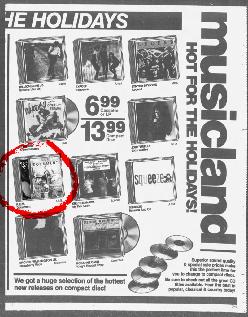
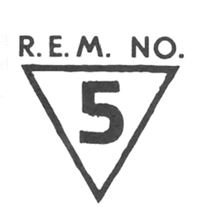
This must have been autumn of 1987 because there it was: R.E.M.’s Document, their top 10 breakthrough album after years spent toiling in the underground. The cover design was sharp and arty and completely oblique. It was an intriguing image even at 1.5 inches square: no band photo, fractured black and white abstract image, and there in the corner was it’s coup d’grace: a stamped icon that read “R.E.M. No. 5.” They had actually taken the bold step of numbering the album as one in a sequence. I cant describe how brilliant that seemed the first time I saw it. When you’re that young, every even mildly innovative idea you come across seems like a lightning bolt. Everything is new to you so when something sets itself in stark relief to other things like it its as if you discovered the genius of it all on your own. After all, for you everything is effectively happening for the very first time.
To me the cover was a bold statement that managed to straddle both art and pop culture and thus it absolutely imprinted on me. But alas, I had no money so it would be another 18 months before I’d even hear the record for the first time. (Note to younger readers that came of age during streaming: yes musical scarcity was really a thing we lived with. If you couldn’t afford the record, or none of the record stores around you had it, or you didn’t live near a cool radio station, or if you weren’t watching MTV at 2am there were lots of kinds of music you’d never even be exposed to.)
The Monkees. INXS. R.E.M.
I was fortunate to have an aunt and uncle only a couple years older than me and that opened up my world to live music. Officially my first concert was The Monkees’ 20th Anniversary Tour at the Douglas County Fair in August 1986 and I almost feel like this should count since in spite of it being a county fair it occurred during the height of MTV-stoked Monkeemania 2.0 and it was an endless sea of people as a result.
If Im being stricter about it, my first real concert experience was INXS on the Kick tour in June 1988 (opener: Steel Pulse). Having little-to-no allowance and few concert options in Omaha (let alone ones my parents would agree to let me attend, even with my aunt and uncle as de facto chaperones) the idea of attending a concert, any concert at all became more than enough the point. I was hooked. I could probably have enjoyed any show you dropped me off at around that time, regardless of band or genre. I wanted to attend more shows. Any shows. Badly.
Fast forward to the next spring. (Sigh) Bon Jovi was touring their New Jersey album and a stop in Omaha was slated. Sure. Why not. I gave my uncle the last $20 from my Christmas money and hoped for the best, reason being this was the pre-Ticketmaster era where you had to physically call record stores (on the phone) to find out which seats they had in stock from which rows and then hope you could drive over there before someone else beat you to them. I was hardly the world’s biggest Bon Jovi fan but that didn’t really matter. This was a Concert. And a big one at that. That’s what mattered.
A week or so later, my uncle calls me after school and says, “we’re thinking about doing R.E.M. instead. What do you think?”
I pretended to seriously deliberate on this for a moment long enough to make it seem like I was a wizened music snob before replying “sure, let’s do that.” I knew that I loved that cover and I knew that at my Jr. High dances “End of the World As We Know It” would blow the floor up into a rager in that crucial last half hour. And again, most importantly this was a concert. And it would also be a big one, if not quite as bombastic as what Bon Jovi had in mind. Little did I know how completely different my life would have been if we’d just settled on the Bon Jovi show instead.
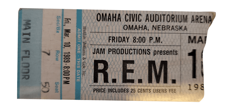
MARCH 10, 1989
R.E.M. Civic Auditorium Arena. Omaha, Nebraska. Literally everything changes. Forever.
I’m certain that everybody has that one show that sets the metrics for what every show they see forever after can and should be, and I was incredibly fortunate that this was mine.
As an awkward, dorky kid with artistic leanings, I had an inkling that I wanted something more from music but for the most part the furthest I’d been to the fringes was mildly-left-of-the-dial mid-80s Top 40 like INXS, OMD, etc. My tastes hadn’t even developed to the point that I knew there was any room to expand on them. One night in March and all that changes.
Right up front you knew that you were seeing another animal entirely. Rather than doing rote audience greetings, they used massive onstage projections to subvert those tropes, for instance minimal white text on black declaring “It’s great to be in (insert the name of your town here).” It was at once showbiz and abstract. Nowdays this isn’t such a strange thing as LED walls and computer graphics allow even the smallest acts to turn their shows into multi-media experiences, but in 1989 this was both a callback to Fillmore West-style psychedelia and a step forward into a more alternative conception of what the live experience could be. Great, blown out abstracted reels would flood the stage with light, unplanned intersections of music and image nudging and colliding sparking happy accidental moments. It was as random as a Pink Floyd show was choreographed and that made all the difference.Where the performance had a whirling careening quality (flush I suppose with the confidence of having already stacked 6 classic albums 8 years into your career) it was also the most structured thing the band had done to date. I’d hear lifers around this time complain (as they always do) that the band had lost the magically oblique sense that “anything could happen” that was a product of the mystique they’d nurtured during their IRS years and the natural result of a band becoming too big to truly belong to anyone on a personal level anymore.
The Album Cycle as Structured Visual System
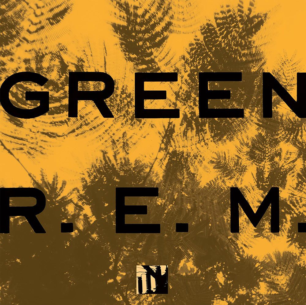
Bear with me here, cuz I realize how cynical that sentence sounds as-written. But I’m not thinking of this as “product” so much as “cohesive statement.” Sure, an album and all its resultant singles, videos, merch, swag, etc. are all undoubtedly products and products benefit from regimented brand systems, but what captivated me about what R.E.M. were doing with Green was how they used the visual to communicate core themes within the album itself. The consistency in visual representation made all the component parts that much more resonant. Everything was “of a piece” while still being individually fussy and with its own distinct flavor.
If we look at each of their four previous albums up to that point we see flashes of this, most notably on Document, but with Green for the first time things seemed to be guided by one consistent visual system.
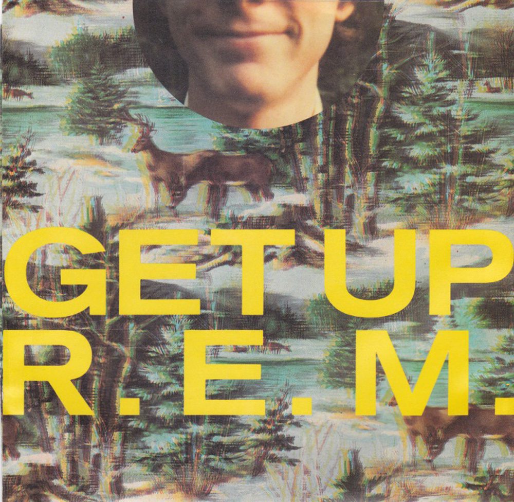
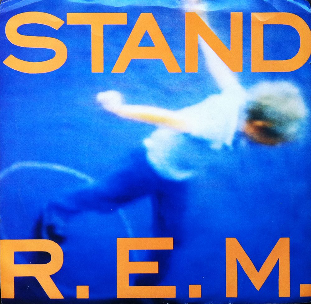
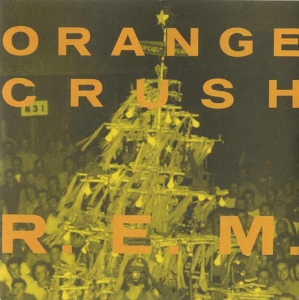
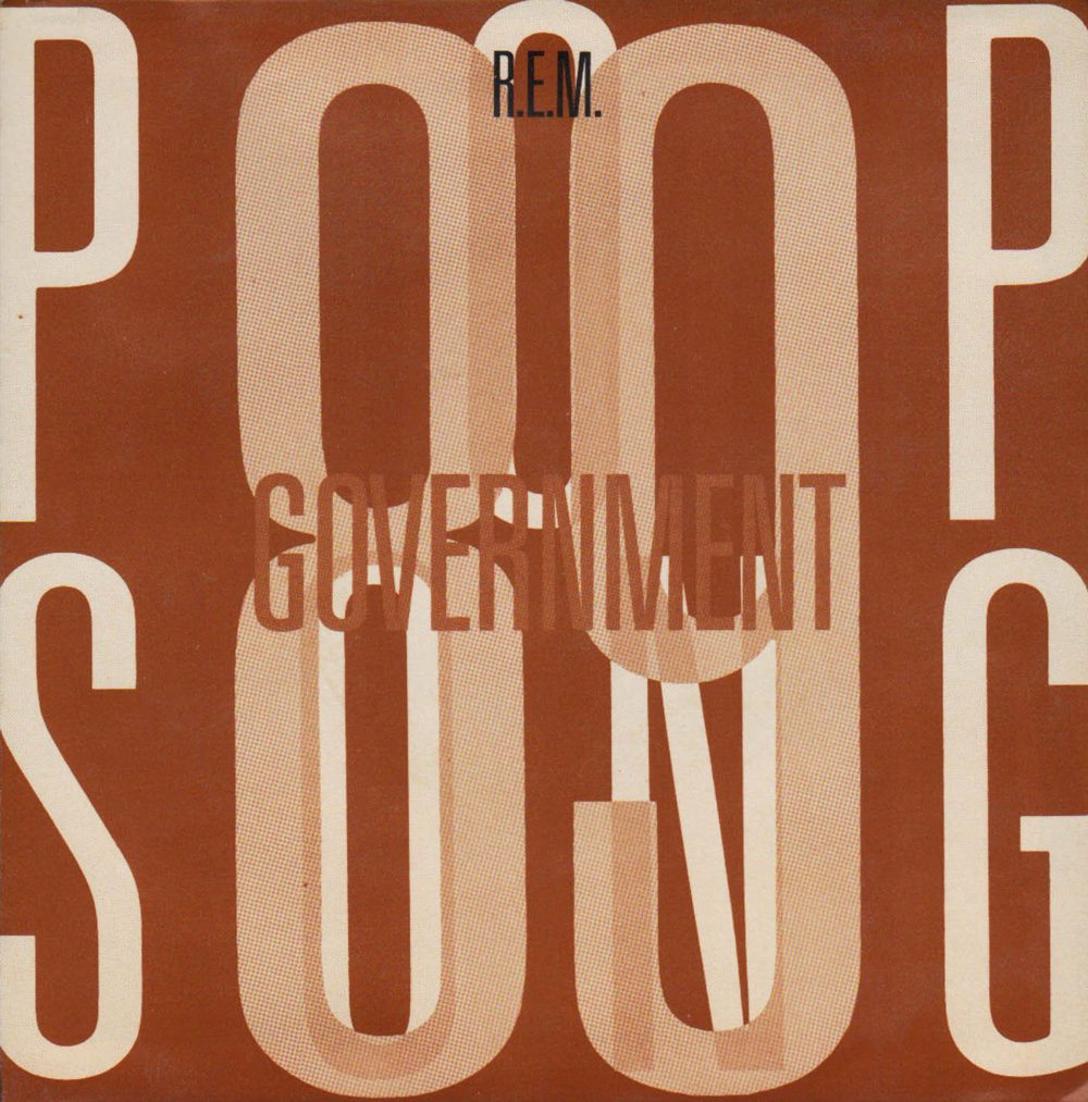
While their albums up to that time usually had established visual motifs that would cascade through their singles sleeves, merch, etc, Green was the first time there seemed to be a strict and established design system undergirding all the album’s materials. Maybe moving to Warners gave them greater resources in the packaging department, greater control, maybe they finally had a record that they felt was a cohesive enough statement to bring that uniformity of design into the fold, maybe Stipe was just really enamored of Robert Wiebking’s Venus SB Bold Extended typeface and was keen to work it in everywhere he could. It didn’t really matter. I was at the age where I was starting to understand the album as Complete Artistic Statement and seeing this carried through in their aesthetic was absolutely crucial to that end.

R.E.M.’s 1989 album Green and it’s singles. Note how all but the final single “Pop Song ’89″ adhere to a strict typographic style.
Drawing Alphabets, Illegitimate “R”S,
and Remembering Things Wrong
So with the doors to a whole new world thrown open to me I now have so much to discover and I cant wait to get started. Unfortunately I still don’t have any money, necessary in 1989 if Im going to follow this obsession to see where it goes. I would walk a half hour from home to Homer’s Records in a ShopKo-anchored strip mall and spend hours staring at (sigh, dating myself pretty hard here) CD longboxes and absorbing as much detail as I could so that it would hold in my head long enough for me to get home and try to recreate elements of the designs with my pens and markers. This of course led to a lot of things bleeding together in my mind: the trestle from the back cover of Murmur melded with the Victorian buildings which bracketed the back cover tracklist of Fables, the scratchy odds-and-sods shaggy dog look of Dead Letter Office and the outsider art scrawl of the Reverend Howard Finster’s cover painting for Reckoning.
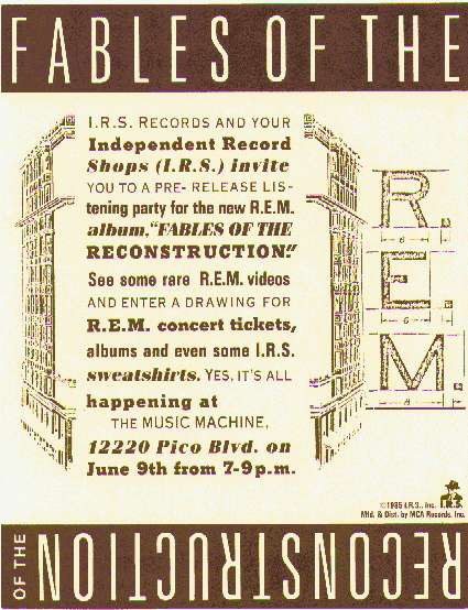
More than anything I was taken by their use of type. Every album had its own distinct fontstack ranging from strictly regimented (Lifes Rich Pageant’s signature use of Copperplate – one of the reasons I continue to cut that much-maligned typeface more slack than most) to kitchen sink (Fables’ “anything goes after midnight in the typesetters shop” stable of beautifully clashing vintage typefaces). Staring at these covers and poring over their secrets, injokes and coded hints (which IRS-era R.E.M. threaded through all their covers, even throwaway items like radio promo singles would have theme-reinforcing messages on their spines. See: “Finest Worksong”‘s “WANT” and “NEED” on opposite ends of its spine.) I spent a lot of time looking for underlying structure, of commonalities within the visuals.
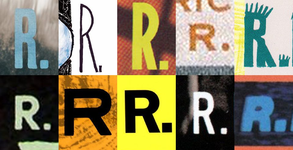
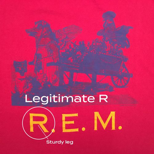
One thing that stood out to me straightway was the lack of what I would come to call “illegitimate Rs”, or capital Rs where the leg on the right hand side was straight rather than curved. With few exceptions (the R with the curved leg gracing their debut Murmur) R.E.M. steered clear of these lesser Rs. Something about this really stuck with me. It was probably nothing but to a kid under the spell of a deliberately mysterious band it had to mean something. It was more serious, artier, more structurally sound. It had to be, right? This seems like a small detail but for a 14-year-old budding typographic enthusiast, this was everything. It was easily the gateway drug into my typeface addiction and the yardstick by which I would measure other typefaces as I learned to identify them.
The Harsh Realities of the pre-Desktop Publishing age
It’s also important to remember that this was 1989. Desktop publishing was in at best its infancy and I was a working class kid. If I wanted to experiment with type I had 2 options: I could scavenge the back walls of craft stores for whatever sets of LetraSet type decals they had in stock (and those were always slim pickins) and the photocopier at the public library in my neighborhood. This worked well enough for a while but I wanted more control. To get it I was going to have to learn to draw entire alphabets. I would use my record covers to divine what a full alphabet of a certain typeface might look like. So long as I had an uppercase R and an uppercase M, I could generally extrapolate from there what the rest of the font would look like. I spent hours sitting on my couch with a ruler and a mechanical pencil making single letters 6 inches tall in my sketchbook. I had to make them large so that shrinking them down (one of the few features the library’s photocopier offered) would forgive any imperfections in my line work. I killed countless brain cells inhaling fumes from endless black markers used to ink all the characters. It was tedious work but I was obsessed: I wanted access to the same tools print designers had even if I had to fake nearly all of my way there.
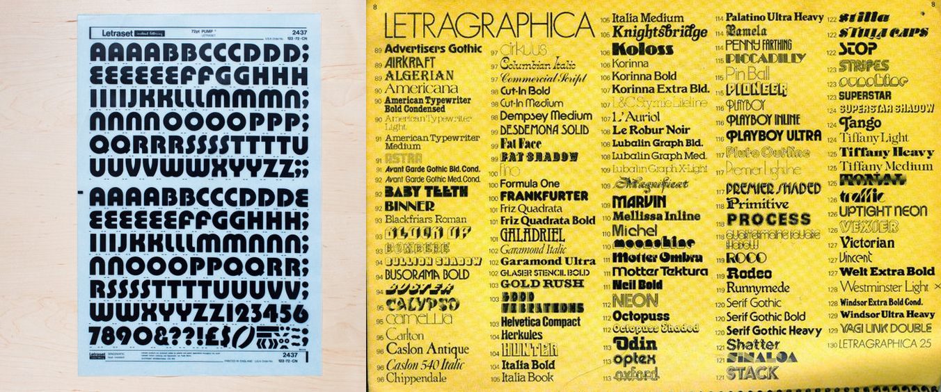
LetraSet rub-on decal type sets. Both a boon and a bane of the pre-desktop publishing era.
To make matters worse, I didn’t even have money to get the records I needed to base my fonts off of. I had to stare, study, mentally photograph, return home, and get to my sketchbook and begin work. And on top of that, if the record wasn’t in stock I would have to wait until the next time I saw my uncle and stare at the tiny thumbnail images of the band’s discography on the inner sleeve of the band’s IRS hits collection Eponymous. In a way this became more of a blessing than curse as those miniscule reproductions took things that were already mysterious and lacquered them with an extra layer of impossible mystique. I was both seeing things wrong and remembering them wrong and that caused my creativity to fill in the blanks to create something else entirely. It would be another year and a half before I would discover that the cover of Fables wasn’t an eroded abstract painting. For better or worse, my near-total lack of resources was fueling my shoestring design education.
Tiny Windows into a Larger World
The following summer, I received Tony Fletcher’s Remarks: The Story of R.E.M. as a birthday present. Aside from it being the band’s first published biography, spanning the Oconee Street church to the end of the 1989 world tour, it also featured a photo glossary of the band’s LPs and singles up to that point, and this time they were all in full color. I had more fuel for my inspiration. That summer I spent countless hours making custom cassette J-cards for mixtapes and album copies, spec tee shirt mockups and of course alternate cover art for albums and singles. I was using the band’s own art to create a kind of visual fanfiction. This was how I learned to follow stylistic cues and design to theme. And it was all happening on remaindered art room paper scraps and sketchbooks when I could afford them.
Needless to say, it was Green’s Venus that was my first foray into drawing my own type. It was at the time my favorite typeface (and one of the reasons I keep ITC’s Blair face close to my deck even today) and since there were long stretches of straight block line it was a good one to start with. After a while the curves weren’t even that much of a hassle, my hand control reaching post-chore Daniel-san heights of zen accuracy. Eventually I would loosen up a bit and drop the asceticism of the “legitimate” R’s, as even the band eventually would, kitting 1994’s Monster out in simple Helvetica Bold Oblique.
Other typefaces would follow, particularly once the Émigré-spurred custom font revolution of the early 90s kicked in. With bizarre type and grunge styles coming into vogue it became easier to hide the handmade abnormalities of my homemade type within the quirks of these faces.
Sadly, I never really kept copies of those early typefaces. You go off to art school, you move, you move again, that stuff gets scattered. But the lessons I learned over what must have been hundreds of hours hand-drawing type have stayed with me throughout my life and my career as a designer, and are almost-certainly the reason that every poster I design begins with color and type.

