Kings of Leon Poster 2017 The Gorge
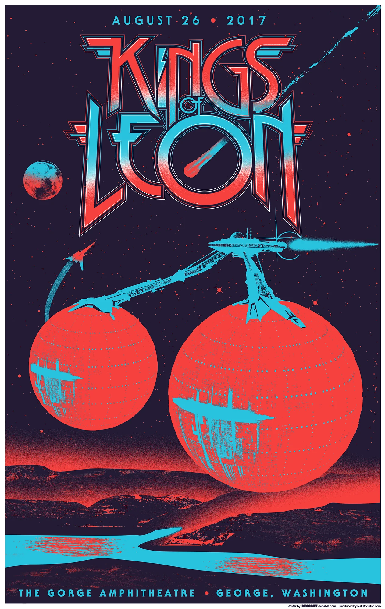
Kings of Leon Poster 2017 The Gorge, Washington
SPACE IS THE PLACE
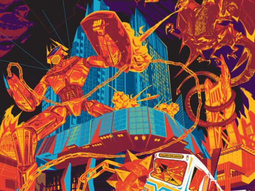
This was the final poster I created for Kings of Leon during their 2017 summer tour, produced in collaboration with Nakatomi Inc.. The print is a 12 by 18 inch, three color screenprint designed as a love letter to one of my favorite childhood visuals: the bold, waxy Topps chewing gum wrappers that sealed trading card packs in the 1970s. The palette and texture take cues from the classic 1977 Star Wars trading card wrappers, which sat at the intersection of sci-fi iconography and playground mythology.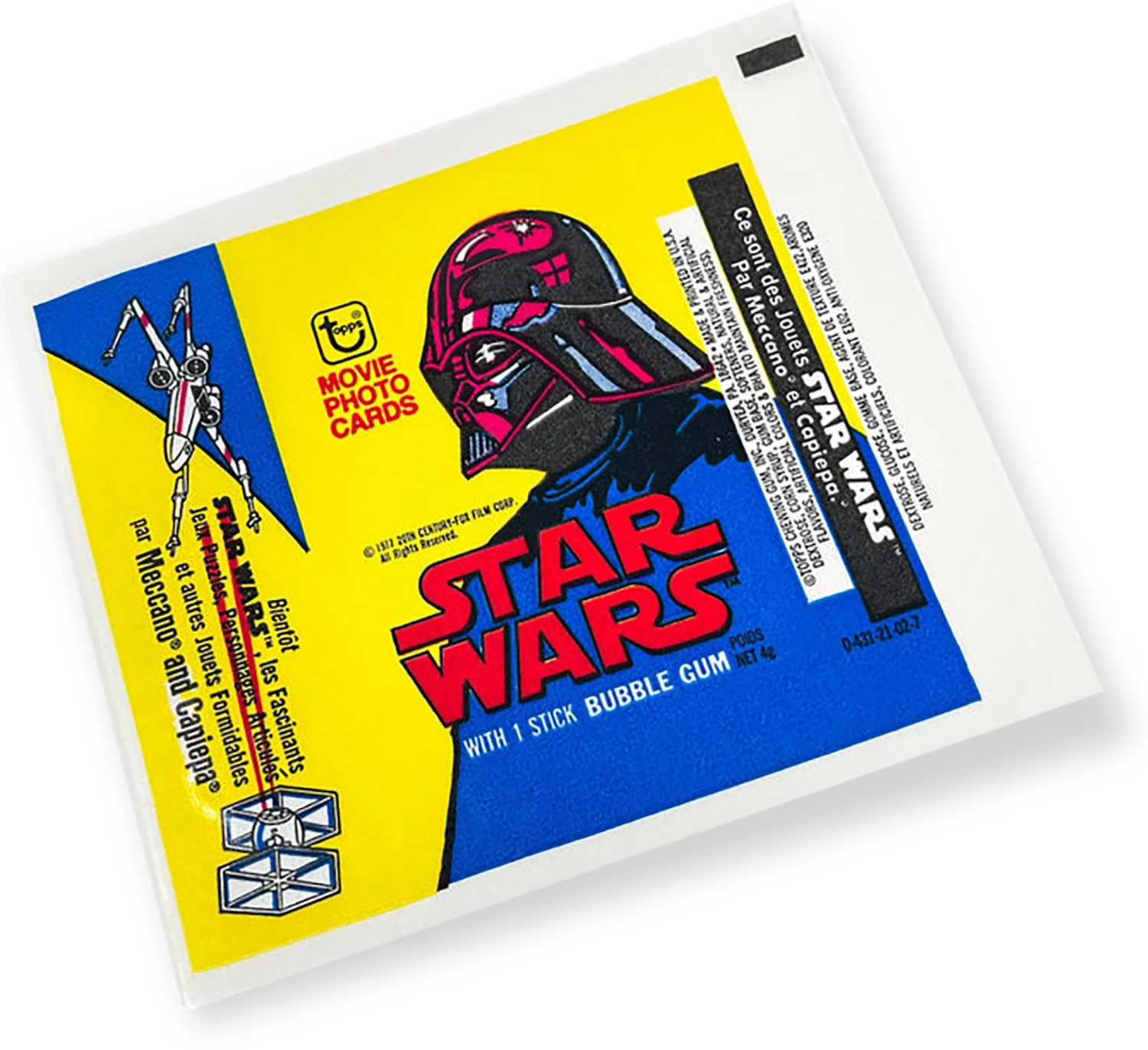
Cherries Reimagined as Starship Architecture
The band asked each artist on the tour to work cherries into their poster concepts. For the Gorge piece, I wanted the motif to feel ambitious and structural rather than decorative. That led to reimagining the cherry form as two massive spherical modules attached to a futuristic mothership. These giant cherry-like spheres are not planets. They are engineered components: glowing, gridded, and suspended above The Gorge by long mechanical arms and docking pylons. The cherry reference becomes part of the ship’s architecture, turning a simple motif into something monumental and spacefaring.A 70s Sci-Fi Dreamscape
I have a long-running affection for the 1970s airbrush sci-fi aesthetic: paperback covers, black-light posters, and the surreal cosmic art found on LP jackets. I had explored this sensibility on the album art for Life in 24 Frames and their record CTRL+Z, and it felt like a natural fit for a Kings of Leon piece. The high-contrast neon reds and cyans mimic that airbrushed glow while still working beautifully in three-color screenprint form.

The Gorge from Another Galaxy
I also wanted to anchor the concept in the actual view of The Gorge Amphitheatre in George, Washington. The iconic ridgelines, cliffs, and river appear along the bottom of the composition, reinterpreted through a cosmic lens. It places the mothership directly above a real place while letting the landscape feel illuminated by the massive cherry spheres overhead.
A Fan Favorite
Since its release, this has become one of my most requested prints. I hear from collectors almost every month hoping to track down a copy. Something about the combination of retro trading card energy, 70s sci-fi scale, and The Gorge’s natural beauty made this design resonate far beyond the tour itself.
Kings of Leon Poster 2017 Holmdel, New Jersey Specs
• 12″ x 18” THREE COLOR SCREENPRINT
• PRINTED ON ARCHIVAL QUALITY HEAVY PAPER
Recent Work










LET'S MAKE SOMETHING RAD TOGETHER!
I’ve designed posters and artwork for artists from “Weird Al” Yankovic to Foo Fighters, Metallica to Kings of Leon, Foals to Cut Copy, and many more — from small local shows to major international festivals.
Use the form below to get in touch and I’ll get back to you (usually within 24 hours) to talk about what brilliant things we might conjure into being.
Blather
Periodic dispatches of note, brimming with relatable brio.
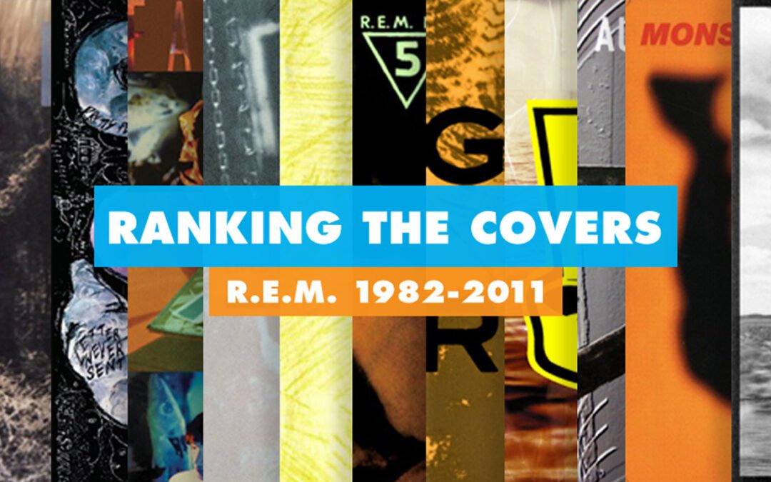
Ranking R.E.M.’s Album Covers Aesthetically 1982-2011
I was inspired by a friend’s Facebook thread about underrated late-period R.E.M. albums to create a ranking of the band’s album covers. Aesthetically. A ranking covering all their studio recordings from 1982 to their breakup in 2011. The ranking doesn’t include compilations or live albums, although I am including Dead Letter Office…
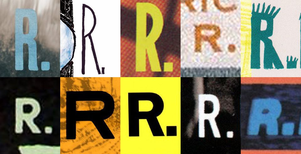
Our Band Could Be Your Typography Lesson
13. BROKE. CURIOUS. BORED. The moment is burnt indelibly into my memory. Every Sunday morning, I’d pick through the day’s edition of the Omaha World Herald (I\'m a Nebraska boy. Or at least was for my first 25 years), and I was leafing through inky inserts and box store circulars…

