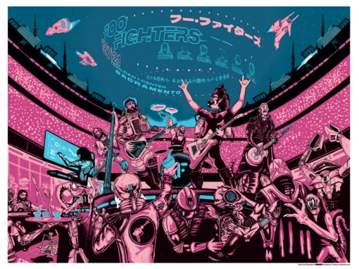
Metallica Poster Sacramento 2018

Metallica Poster Sacramento 2018
When the hometown burns brightest.
This Metallica poster Sacramento marked my second time designing for the band — and for my hometown show, no less. My first Metallica project was for their Philadelphia stop on the massive WorldWired Tour, but this one felt special. (Not counting, of course, the banner I painted back in high school that somehow won me a meet-and-greet with them during the Black Album tour.)
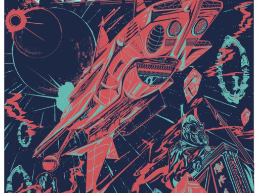
Where the Philadelphia poster challenged expectations of what a Metallica poster should be, this one leaned hard into the opposite: pure bombast. I wanted flames, robots, explosions, dragons, and total destruction — every over-the-top fantasy that fourteen-year-old me would’ve crammed into a sketchbook during study hall. Every time I thought I’d gone too far, I’d take a week away, come back, and push it even further. Having received initial approval back in April, I spent the summer refining the composition, determined to make this piece as ferocious and maximalist as the band itself.
The Concept
If there’s a concept here at all, it’s that no matter how we feel about our hometowns, we all secretly want to see them get blown up — at least on paper. For large touring acts like Metallica, artists are generally advised not to localize their designs too heavily in case of date or venue changes. But this time, I couldn’t resist.
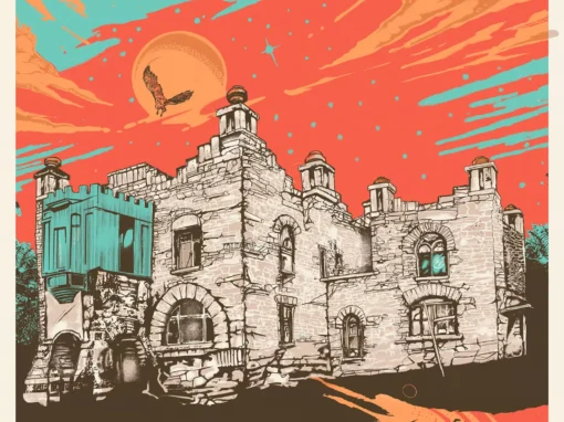
Designing for Sacramento gave me both an opportunity and a challenge: how could I make this poster unmistakably Sacramento, yet still work anywhere if needed? The solution was to make the setting feel both specific and cinematic — a futuristic city under siege. Even if you didn’t recognize the skyline, the poster’s energy would still hit.
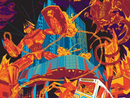
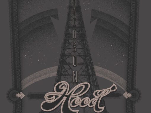
So, a massive fire-breathing dragon descends from the sky, wearing a metallic headdress, raining destruction on a gleaming city while an enormous chain-mace-wielding mech warrior defends it. The style splits the difference between Pacific Rim-era futurism and retro pulp — equal parts ROM Spaceknight, anime, and drive-in apocalypse.
Making the City a Character
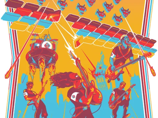
To localize the piece, I treated the city itself as a living participant in the battle. You’ll spot familiar landmarks — the Golden 1 Center, the Tower Bridge, even a few geographical fibs rearranged for dramatic effect. Golden 1’s security robots guard the controversial Jeff Koons sculpture (probably in vain), while the SacRT light rail train gets smashed — and simultaneously saved — by the mech’s swinging mace as it tears across the cracked streets.
I even worked in the Golden 1 Center’s massive outdoor video screens to suggest that while chaos rages outside, the band plays on inside. A few Easter eggs hide in plain sight, including a cameo by my friend and frequent meme subject, Chris “Wolo” Woloshansky.
Execution and Gratitude
The finished piece was printed as a limited-edition screen print through Nakatomi Inc, with color separations handled masterfully by LeAnn Jensen. It’s easily one of my most detailed works — part love letter, part fever dream, part disaster movie.
I owe a massive thanks to Metallica for letting me revisit the chaos, to Timothy Doyle and the Nakatomi team for indulging my madness, and to my city for inspiring me to quite literally blow it up.
Metallica Poster Philadelphia 2017 Specs
• 18” X 24” OFFSET LITHOGRAPH PRINT
• PRINTED ON ARCHIVAL QUALITY HEAVY PAPER
• EDITION LIMITED TO 50
Recent Work


Let’s Work Together
I’ve done work for everyone from “Weird Al” to Foo Fighters, Foals to Cut Copy, and bands and festivals ranging in scale from local to international. Contact me using the form below and I’ll be back to you (usually within 24 hours) to talk about what brilliant things we might conjure into being.
Blather
Periodic dispatches of note, brimming with relatable brio.
Our Band Could Be Your Typography Lesson
13. BROKE. CURIOUS. BORED. The moment is burnt indelibly into my memory. Every Sunday morning, I’d pick through the day’s edition of the Omaha World Herald (I\'m originally a Nebraska boy. Or at least was for my first 25 years), and I was leafing through inky inserts and box store…
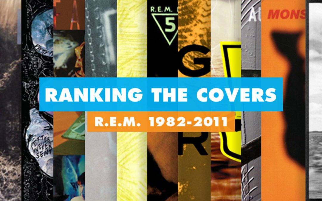
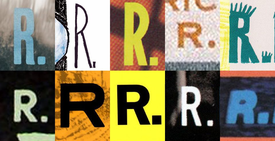
Ranking R.E.M.’s Album Covers Aesthetically 1982-2011
I was inspired by a friend’s Facebook thread about underrated late-period R.E.M. albums to create a ranking of the band’s album covers. Aesthetically. A ranking covering all their studio recordings from 1982 to their breakup in 2011. The ranking doesn’t include compilations or live albums, although I am including Dead Letter Office…