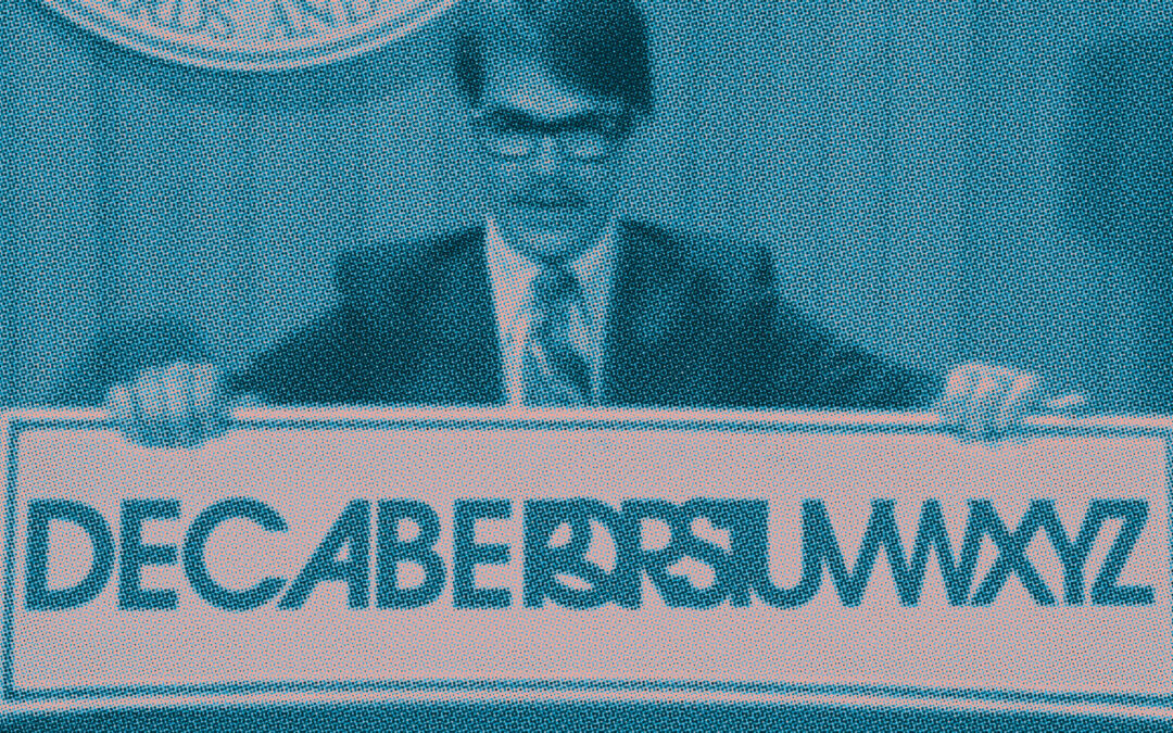
Origin
Back in 2004 when I first started designing concert posters, I wasn’t sure what to call myself. Use my given name? Come up with a studio name? Use a handle the way I did back when I was a, let’s say, spray can artist?
For the first couple of years I went by RisingSon, a nod to a track off Massive Attack’s classic album Mezzanine. I even designed a logo for it. If you have one of those early posters, you’ve seen it tucked in the lower right corner.
RisingSon business card, circa 2004. Very 2004. Yes, that’s a hotmail address.
Eventually it started to feel like it didn’t quite fit. RisingSon was a good handle but it belonged to a different era of how I thought about myself and my work. I needed something that felt more like a studio and less like a tag.
The name “Decabet” comes from a Dan Aykroyd sketch from the original and first golden age of Saturday Night Live. The kind of deep cut that only surfaces if you’re the right kind of weird. My kind of weird, at any rate.
The bit was born out of America’s brief flirtation with going metric (or “Metrication”) in the 1970s. If we were rethinking measurement, why not rethink everything? Aykroyd’s character proposed the Decabet, a condensed 10-character system to replace the bloated 26-letter alphabet.
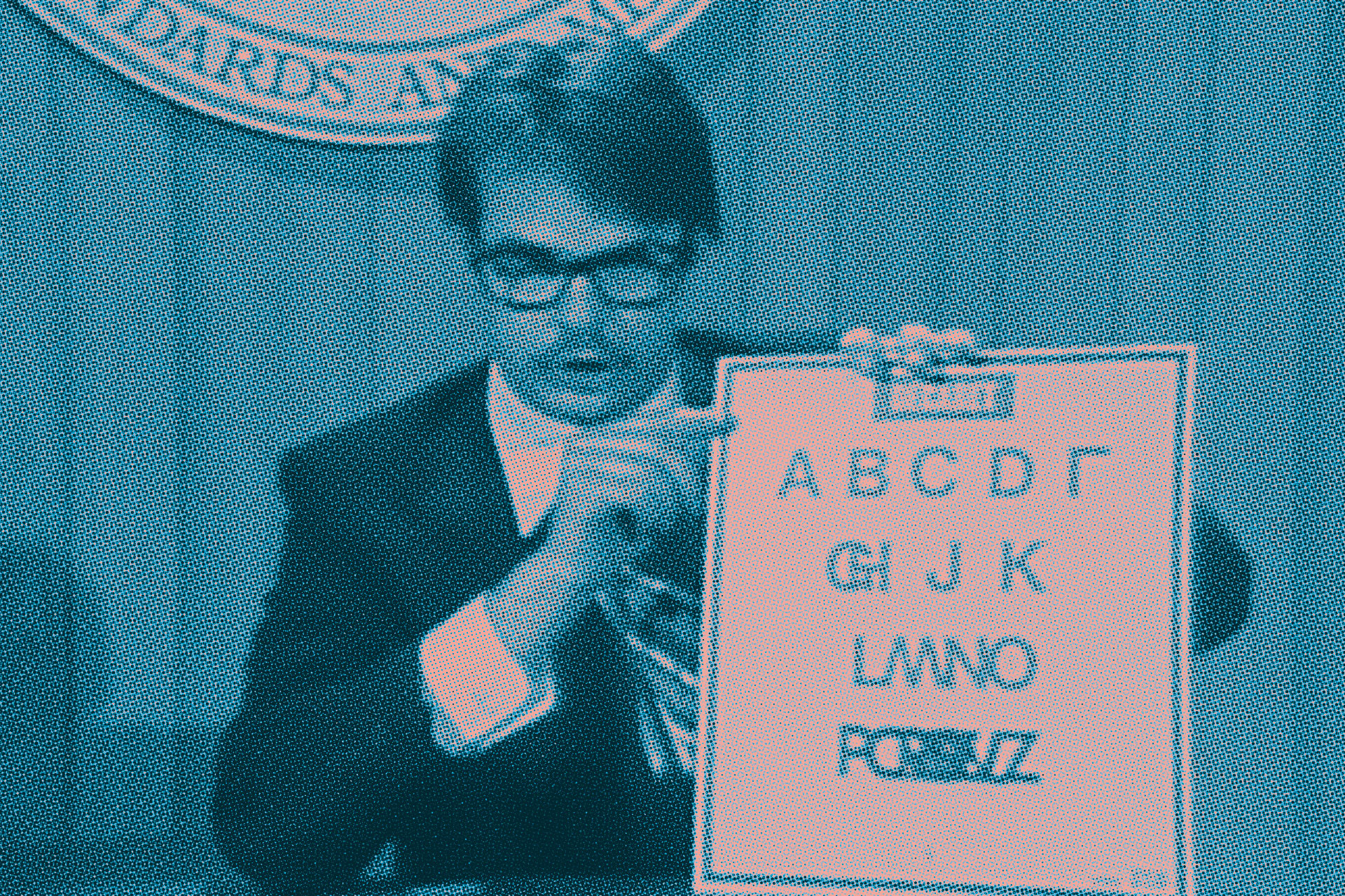
The man, the myth, the ten-letter alphabet. Dan Aykroyd on SNL, circa 1977.
Efficient. Absurd. Totally committed to the bit.
It stuck with me. There’s something in that spirit, taking something vast and distilling it down to its most essential and most striking form, that felt true to what I do with a poster. You’ve got a band, a date, a venue, and about two seconds of wall space. Make it count.
I’ve always admired designers who operate under a studio name with a certain weight to it. Vaughan Oliver’s v23 has that quality. Angular, cryptic, a little imposing. But I’m too self-effacing to adopt something like that with a straight face. Decabet gave me the best of both: it has that consonant-driven, almost statuesque presence on its own terms. The fact that it traces back to something genuinely silly is just a fun little facet. You don’t need to know. But now you do.
I’ve been designing under the Decabet name since 2004.
It’s pronounced deck-uh-bet.