Peter Murphy Poster Sacramento 2009
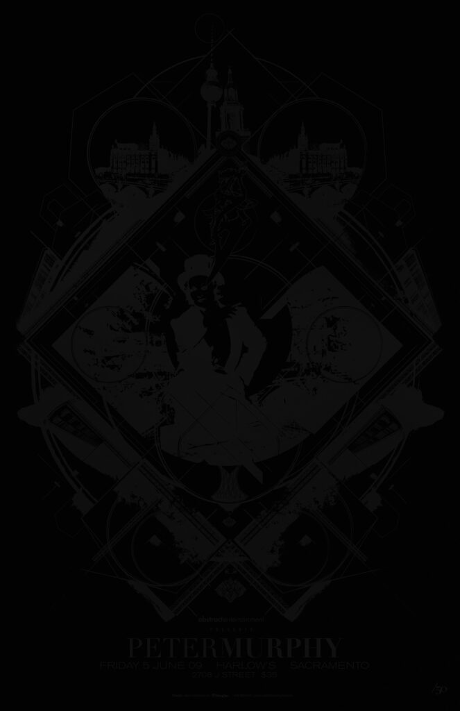
PETER MURPHY POSTER SACRAMENTO 2009
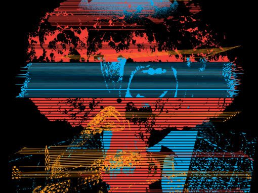
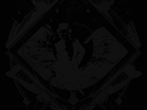
No, it’s not your brightness. It’s a black on black poster.
“NONE MORE BLACK”
For years I wanted to do a black-on-black poster. Black ink, black paper, only fully visible when the light hits the ink of the design. But you can’t just do a thing like that for anybody. For one, a poster is still a way to promote a thing. So it needs to be made for something that’s going to sell out on its own anyway. Second, it of course has to fit thematically with the artist it’s for. And at least in 2009 and as of press time, Spinal Tap weren’t doing shows.
CONCEPT AND PROCESS
Enter: Peter Murphy, king of goth from his post punk days in Bauhaus up through the decades to now. I finally had a good fit. The imagery is a mix of hard edged Eastern European line and bauhaus-inspired flourishes (including a few instances of the famous Bauhaus symbol hidden in the design itself) to more recent references to his solo career (Marlene Dietrich, smoking from an eye which is a mouth, dead center.)
SIMPLICITY BRINGS ITS OWN CHALLENGES
You actually cant simply print black on black and expect magic. I tried out a number of combinations of papers an d inks until I cracked the code for the cocktail that worked. It would be a toothsome matte black recycled stock with an inky rich black achieved with all fountains on full. This gave the optimal combination that kept the integrity of the concept without looking ineffective and inert. This poster announced itself. If you were in the room with it you could feel it. It didnt just look like a black piece of paper, it had a presence. And since the light activated the gloss of the ink, the poster appears to shimmer as you move around it in real space. This is one of my most underrated pieces, but the ones that get it really get it.
Below is a detail of the art itself….
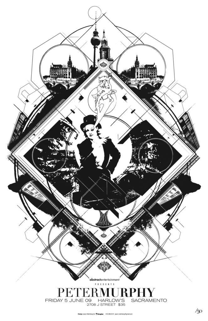
Peter Murphy Poster Sacramento 2009 Specs
• 11″ X 17” RICH BLACK ON HEAVY BLACK CONSTRUCTION PRINT
• PRINTED ON ARCHIVAL QUALITY HEAVY PAPER
• EDITION LIMITED TO 50
Recent Work









LET'S MAKE SOMETHING RAD TOGETHER!
I’ve designed posters and artwork for artists from “Weird Al” Yankovic to Foo Fighters, Metallica to Kings of Leon, Foals to Cut Copy, and many more — from small local shows to major international festivals.
Use the form below to get in touch and I’ll get back to you (usually within 24 hours) to talk about what brilliant things we might conjure into being.
Blather
Periodic dispatches of note, brimming with relatable brio.
Our Band Could Be Your Typography Lesson
13. BROKE. CURIOUS. BORED. The moment is burnt indelibly into my memory. Every Sunday morning, I’d pick through the day’s edition of the Omaha World Herald (I\'m originally a Nebraska boy. Or at least was for my first 25 years), and I was leafing through inky inserts and box store…
Ranking R.E.M.’s Album Covers Aesthetically 1982-2011
I was inspired by a friend’s Facebook thread about underrated late-period R.E.M. albums to create a ranking of the band’s album covers. Aesthetically. A ranking covering all their studio recordings from 1982 to their breakup in 2011. The ranking doesn’t include compilations or live albums, although I am including Dead Letter Office…

