TBD Fest Sacramento 2014/15 Branding Case Study

TBD FEST: FULL BRANDING CASE STUDY
or How I branded an entire music festival from scratch as a one-man design team.
INTRODUCTION
In 2015, I was asked to handle the branding and design for Sacramento’s nascent TBD Fest. This would include a full reboot of all imaging, from a new logo to branded colors, typography, rollout strategy, poster, website, and even environmental and onsite graphics, video screens, and merch. It was a mammoth undertaking to say the least, particularly for a one-man design team to take on. Its for that reason that you’ll notice I produced very few posters in 2015 as this 9-month project dominated the lion’s share of my time.
It ended up being possibly the largest single branding project I’ve ever worked on in terms of how many individual pieces I would eventually end up producing. As we lacked the budget for a design staff, I would end up designing nearly all of the print and digital collateral personally.
IMPETUS
When I had initially contacted the festival in 2013, it was in its 4th year as the Launch music festival. My interest was in curating a Sasquatch-style poster series of artist-specific posters designed by local gigposter artists. That year’s poster series went really well, with me contributing a poster for Aussie dance act Van She and a limited-edition screenprinted poster sold as merchandise. Launch had never quite developed its own consistent visual identity, changing its look from year to year and eventually its name as well.
In 2014 Launch became TBD, an open-ended moniker that could be adapted to mean a number of different things but was perhaps most-soundly tied to the event’s new location on the riverfront of West Sacramento’s burgeoning Bridge District, named for Sacramento’s nearby iconic Tower Bridge.
That year was the first time the event had a branded look and logo, though it was agreed that the look didn’t quite capture the specific vibe and feel of the event and the things that made it so unique. I came on late in the game that year to help out with some final-push design, carrying over the brand into a site map, some signage, and a digest-sized festival guidebook. I also designed a text-based poster to promote the festival’s lineup broken down by day.

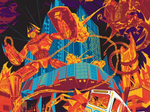
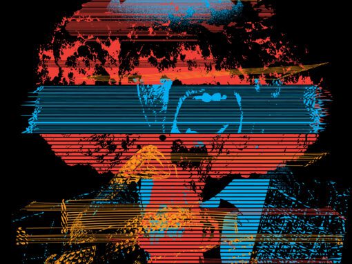
It was my work on those pieces that lead to my being asked to create a poster for TBD’s 2014/2015 New Year’s event headlined by A-Trak. Having a very tight single-week turnaround time immediately after the festival and feeling more than little mentally spent, I decided to illustrate from a bit of a self-indulgent place.
With no time to come up with something “cool” or high-concept, I opted to just make something fun and amusing to myself: a massive DJ-piloted, dome-headed robot which towered over the city, stacked with chest-mounted speakers and tractor-beam disco rays, jet pack and all. It came from a silly place but it also made the project fun to do and ended up being a huge hit. The most common praise I heard was that the design itself made the event look fun, regardless of the lineup. Quite accidentally, I was on to something.

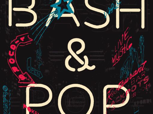
DEVELOPING THE LOGO
At the beginning of 2015 I immediately began working on logo concepts. I was given several notes to spark things off: hand drawn, dotted, low-poly/angular. For a time we were even looking into origami as an overarching usual concept. I explored several of these styles, but ultimately they felt too tied to the whims of trend with little insight or consideration into the Whys of the design.
Further, I wanted to portray the uniqueness of our location. How did it feel to be on the riverfront in Sacramento under the golden stacks of the Tower Bridge during one of our signature orange/pink/purple summer sunsets? The water, the sky, the sun. I wanted to find a way to convey all of these things within simple shapes of three letters. And I wanted to do it without featuring literal depictions of these things. This is all expressed in the layered shapes and curves that snap together to form the T, the B, and the D.
For the supporting type, I chose the Geomanist typeface, a smart sanserif whose thin weights could convey sophistication while it’s heavier weights have a character that works well at both small and large sizes without feeling too humorless or heavy. Finally we had our mark…
REBOOT: INTRODUCING THE NEW BRAND
Now that we had our flag, it was time to introduce it to the world. At this point we were still a month out from announcing a single act, but we also wanted to generate some excitement on our Facebook page and possibly stir up interest in discounted pre-lineup Early Bird tickets. So I came up with a way to stoke some chatter.
On a Friday, I switched our Facebook page’s avatar and cover photos to a black square and 3 colored dots respectively. No captions, no post, no explanation for any of it. It was such a stark change, that people would notice it and want to know what was happening. I made sure to instruct all of our people to let the public chatter grow and not respond to any of it. Let the mystery build on its own. I wanted it to feel like a system rebooting on its own.
Starting on Monday morning the following week, it all started filling in. Once a day, we’d update the avatar and the cover. Piece by piece the new logo would reveal itself. When the logo was done filling in, the cover illustration likewise began presenting itself. We still couldn’t announce any acts, but we had event artwork to build initial buzz from. Within a matrix of dots teasing out the TBD, were the Sacramento skyline, the riverfront, the iconic Tower Bridge, and striding above it all, our brand new mascot.

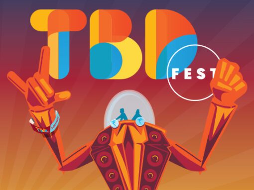
TIBBY, THE TBD ROBOT
If I had approached all of this from a single starting point I highly doubt the idea of a mascot ever would have entered my mind. It’s just not the sort of thing I would have thought of. But something about that robot from the New Year’s poster simply worked. People loved it, it was different than anything other comparable festivals were doing, and it had personality. And best of all, with our niche being divided pretty squarely between electronic music and hip hop, here was a character that felt equally tied to both. He became an ambassador, a quasi-spokesman, and (in a way) a second logo.
Over the course of the run-up to the festival, he was a great way to introduce announcement dates, ticket offers, and even celebrate historic milestones.

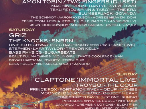
PHASE ONE LINEUP ANNOUNCEMENT
In mid-May we announced the first phase of our lineup. This was a challenge in more ways than one. Being a smaller regional festival, we didn’t have the kind of established name that would demand the world’s attention. We needed a way to make the announcement itself an event that would be exciting on its own merits. Our smaller stature gave us the freedom to have some fun with the format.
We wanted to do some kind of public event, but with a lineup reveal that was more than just a list of names either posted or spoken. I wanted this to be fun. And I wanted it to be something that you had to be at to hear first. Something that rewarded you for attending the announcement party.

My idea was twofold: first, we get DJ Greg J to spin a special set comprised only of songs by artists on the lineup. If you were there in the crowd, you’d hear a Chromeo track and that’s how you would know Chromeo was playing. But it needed something visual to accompany it. That’s where the idea of an animated poster came in. Sacramento designer and video artist Judd Hertzler dropped my poster art into After Effects and brought it all to life, but even more importantly, he devised a way for us to use a laptop to live-trigger each new name revealed in real time. As you heard a Chromeo track drop, you would also see it pop up on the motion poster as it was projected onto the wall of the club.
It went off beautifully. As the names stacked up, the crowd thickened and waited with piqued enthusiasm for each new name. It became almost like watching a football game, with cheers, applause and crowd roar greeting each new name.
THE FINAL POSTER
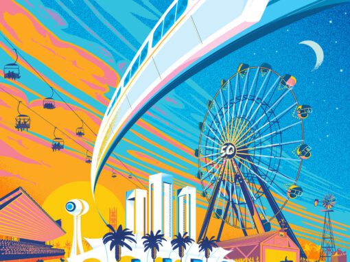
In mid-June we were finally ready to reveal the poster. Gone was the matrix of teaser dots, giving way to a panoramic illustration of one of the festival’s strongest attributes: its location. I once again wanted to capture the feel of our widescreen skies at sunset. That crisp summer air and warm energy of twilight setting in.
Since we needed to satisfy the dual needs of attracting people from SoCal and also the Bay, it was decided that we should do two colorways: a Blue Sky version for people coming in from San Francisco who might be worried that the inland summer heat in Sacramento would be too hellish, and my initial preferred version referencing our spectacular sunsets in rich sherbet tones of purple and orange.

THE WEBSITE
(Note: you can see an archived version of the site here.)
I worked with my developers to create a pure CSS transition from the two posters different backgrounds, seamlessly shifting from the orange gradient to the blue. It worked beautifully and since it was all-CSS it loaded swiftly and cleanly, even on mobile. For SEO purposes, I wanted the home page lineup to be set in dynamic text. It would have perhaps been a lot easier to make this a static graphic but I was determined to set this all in HTML with media-queries resetting the text on mobile. It wasn’t easy, but I think it made all the difference.
For the interior Lineup page I brought back the dot motif as a way to standardize what I was anticipating to be a number of band press shots of varying qualities and form factors. I wanted a way to show off the variety of acts in a “roundup” style that also gave users a simple way to immediately sample each artist. Every act was linked to representative videos and (when possible) Soundcloud pages.


THE EVENT / BRANDING THE LOCATION
Onsite branding included numerous scrims, “totems” (large 4 sided pillars which featured schedules, stage names and artwork featured in the 2015 TBD Poster Series), stage video interstitial bumpers and screen printed tee shirts and tank tops.

CONCLUSION
While this was indeed a gargantuan project, I was able to create an extremely cohesive look and feel that cascaded through countless promotional materials including many pieces of social media, print, web, video and other assorted ephemera not showcased here. The brand gave a sense of place, identity, and personality to the event that managed to really capture the public’s imagination in a way that even caused members of the public to pick up the torch and run with it. Over the course of 2015, the logo and our mascot appeared all over the region and the country. One of the greatest complements I saw to how the work was resonating was on the final night of the festival when I ran into a working Tibby costume that someone had built to wear to the event.


Recent Work
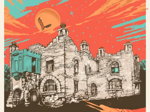
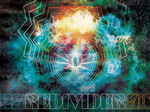
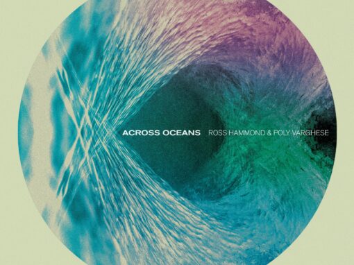
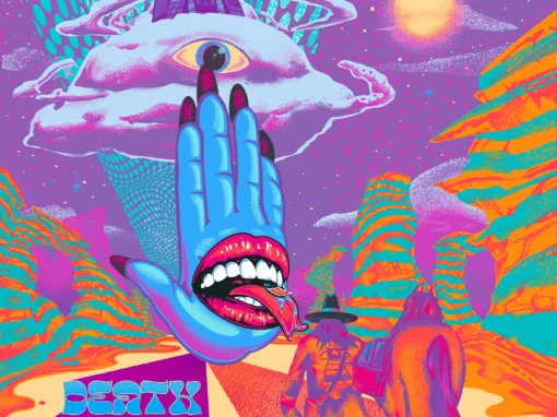
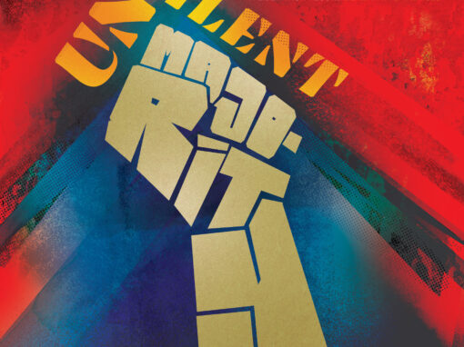
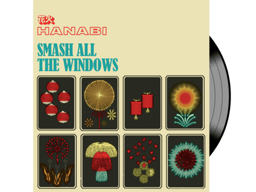
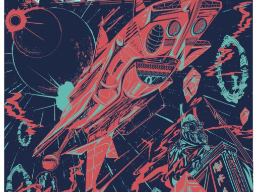


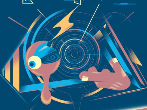
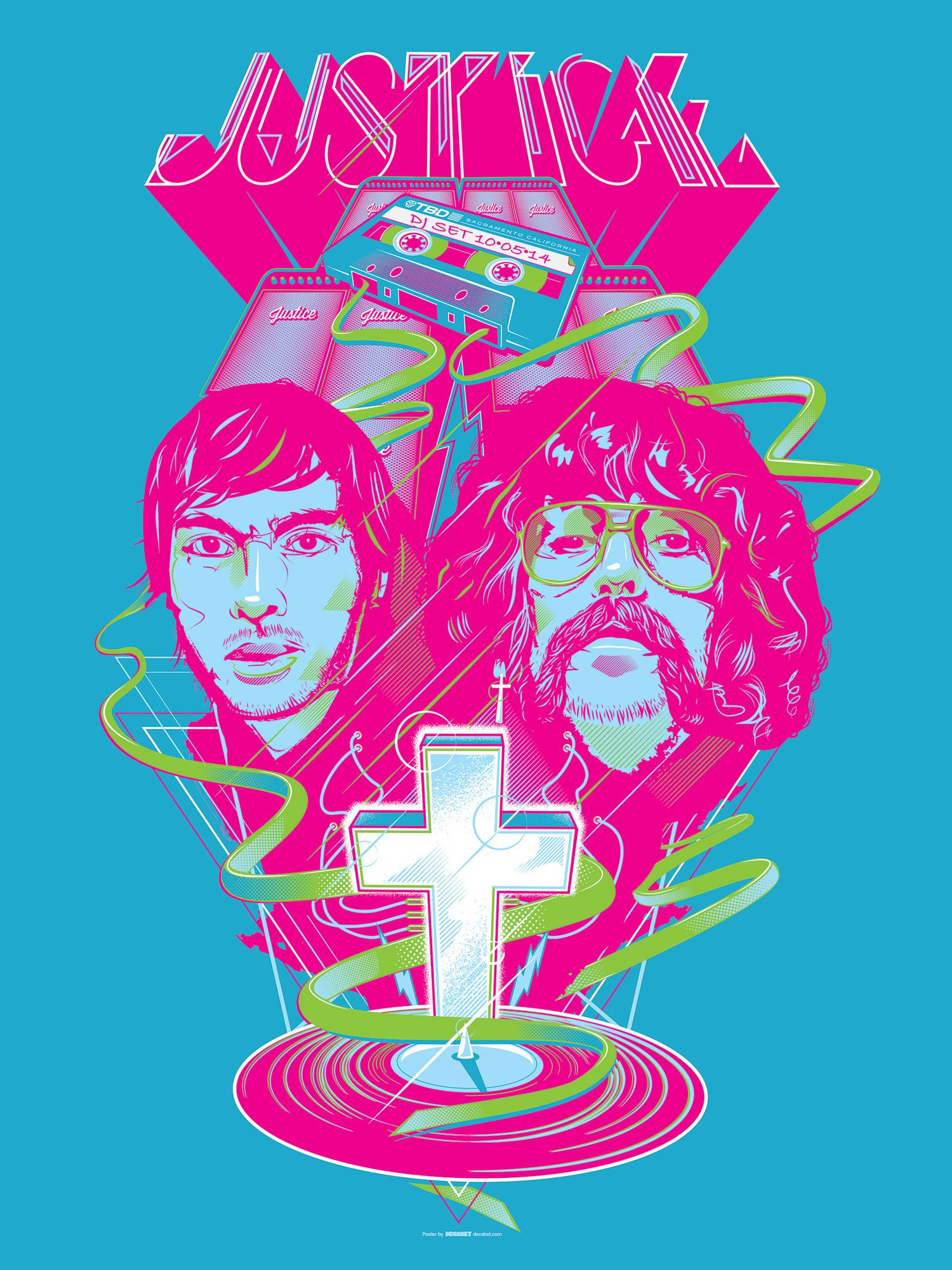
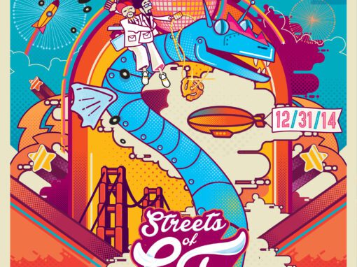
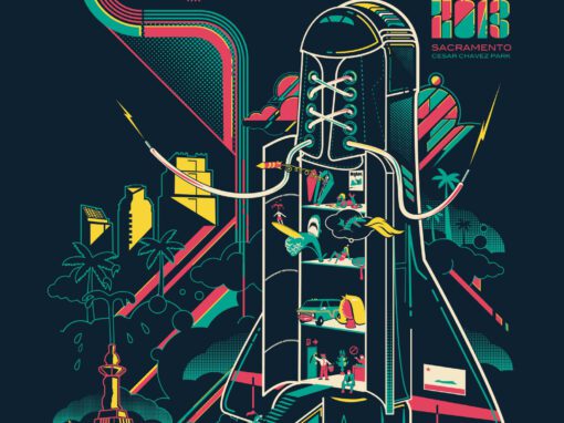


 GIGPOSTERS, FESTIVAL BRANDING, RECORD COVERS, EPHEMERA, JUVENILIA. SACRAMENTO. REPUBLIC OF CALIFORNIA.
LET'S MAKE SOMETHING RAD TOGETHER!
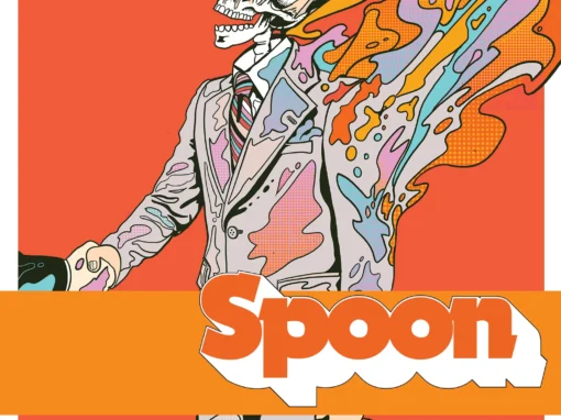
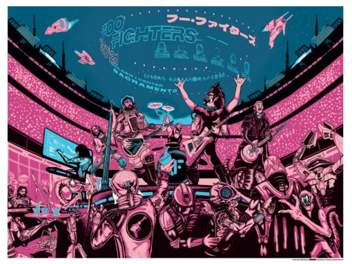
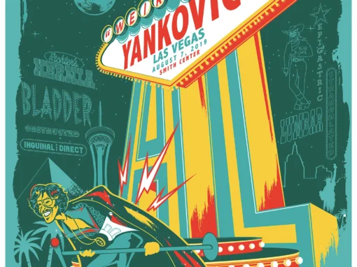
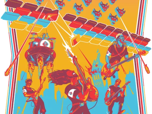
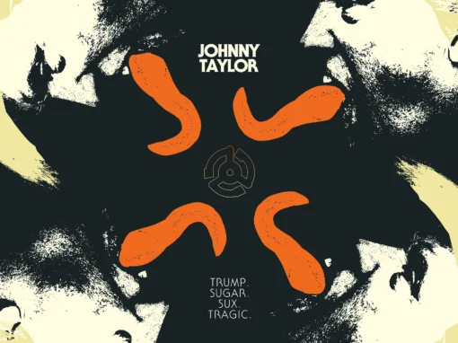
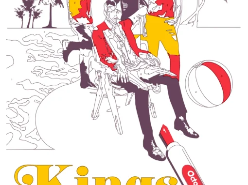
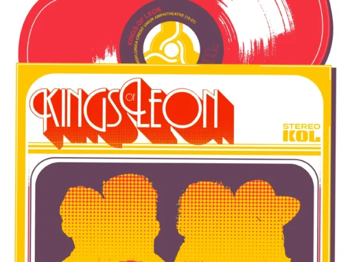
I’ve designed posters and artwork for artists from “Weird Al” Yankovic to Foo Fighters, Metallica to Kings of Leon, Foals to Cut Copy, and many more — from small local shows to major international festivals.
Use the form below to get in touch and I’ll get back to you (usually within 24 hours) to talk about what brilliant things we might conjure into being.