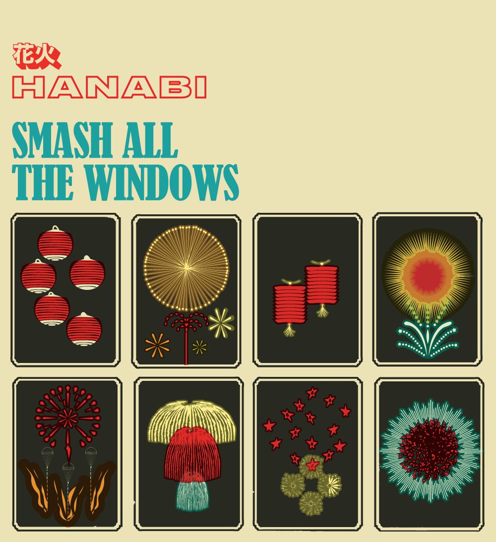
Hanabi – Smash All the Windows Album Cover
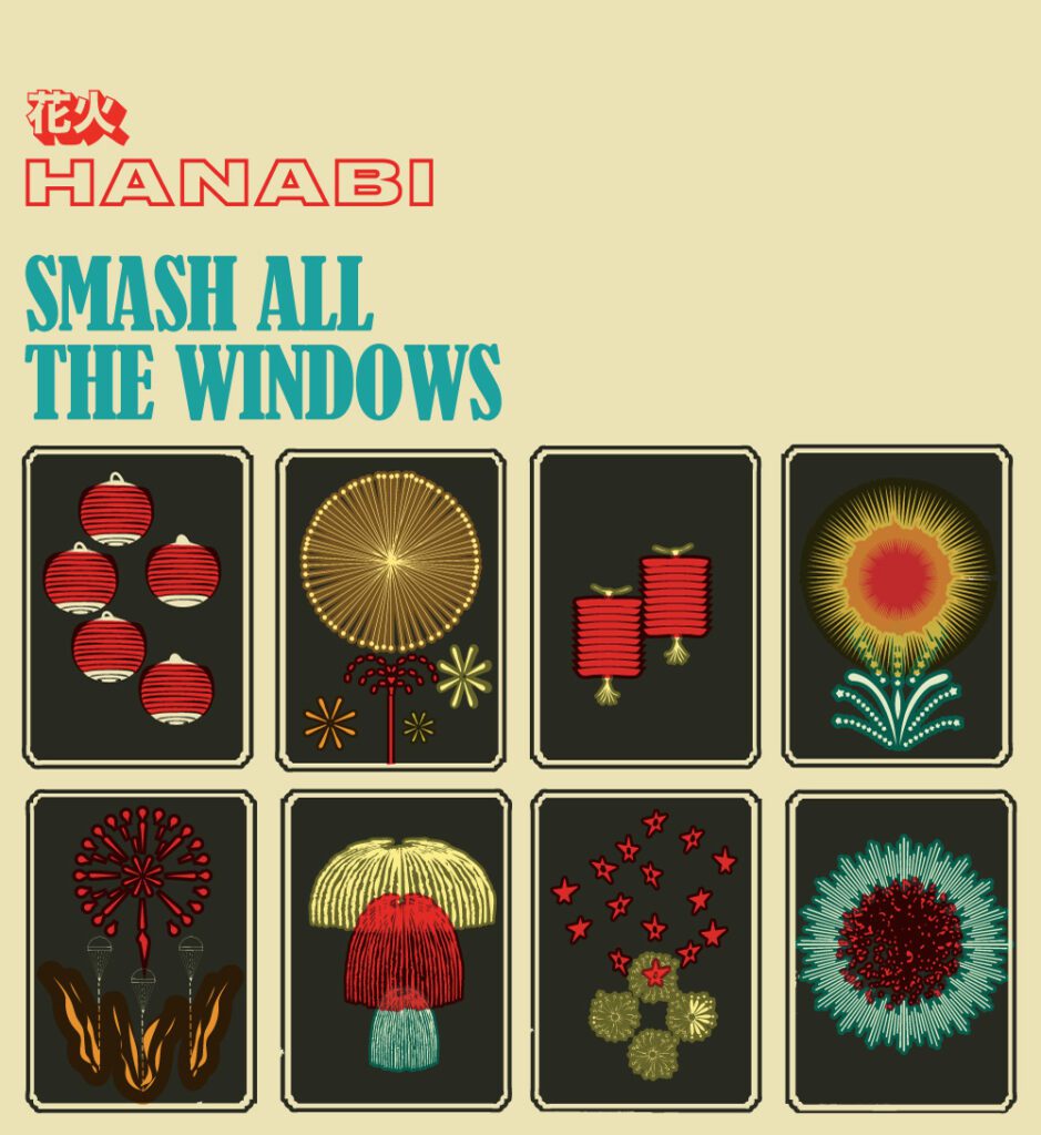
HANABI
SMASH ALL THE WINDOWS
A sad side effect of this here digital paradise we all inhabit in this The Year of our Lord 2020 AD is that some cultural forms we once thought were safe an expected to be around forever have either fallen away entirely to the march of progress or have been forced to compromise and retool themselves to the demands of the digital space. So it is with the album cover. What worked on 14 square inches of cardstock just might not scan at 300 x 300 pixels. Ya cant fight time’s inexorable march and really ya shouldn’t want to, so the challenge becomes making art that can kick up a presence for itself in either space. Which is not to say there cant still be room for a little nuance and wit, but it becomes a more secondary challenge to immediacy.
INTERPRETING THE BAND
When Hanabi leader Chris Marron contacted me in late 2018 to think about something for his band’s forthcoming debut Smash All The Windows, it was a great chance to interpret a band from the atoms out. I had known Chris casually for several years through our frequenting the Coachella message board and as such had an impression of the man formed, but had no idea what to expect from his band. In fact I may not have been aware that he was a musician at all before that. But this was gonna be great. I could listen to the rough mixes of their tracks (mostly) blind, without any inborn perceptions or biases and see where the songs took me. Immediately I found the band sharp, catchy and literate in a way that ticked off several of my boxes. It had a wiry (and at times Wire-y) post-post-post-punk energy that lined up my Venn circles quite nicely.
THEN, YOU GET A BREAK…
In most cases I don’t know that I would have entertained going down the “title-driven concept” path, but this one was kind of too perfect. Hanabi, in its most direct translation, is Japanese for “flowers of fire” which of course is a more lyrical way of describing fireworks. That plus the sound and album’s overall vibe put me in a very Blur – The Magic Whip headspace, comme ça….

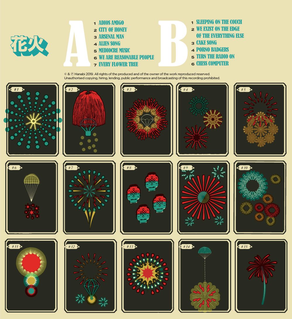
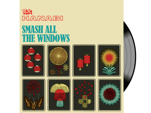
This Blur cover had the acorn of the vibe I wanted to get across: bold, clean, colorful, smart, and urban in a way that was more city and less street. But clearly I wasnt just going to bite the Blur cover and besides that there was kind of a glut of neon album covers in the later part of the 2010’s that I have a feeling arent going to age all that well overall as a visual trope. For a time it was risking becoming a cliche. Plus that was a couple slots over from the band’s vibe anyway. But then I happened upon a gorgeous catalog of Japanese fireworks illustrated in the late 1800s by an artist named Jinta Hirayama. Jinta made gorgeous rudimentary illustrations of hundreds of fireworks in bloom using basic shapes and a simple color palette likely ruled by budget more than aesthetic. These were perfect. Something about this particular look resonated with me immediately and felt like a glove-perfect fit for the band. Of course I didnt want to simply co-opt them as a “found art” piece for juxtaposition’s sake ala someone like Peter Saville. That wasnt really me and it wasn’t quite Hanabi either. Using the original 1890’s catalog as inspiration I would design us our own illustrations, approximating the kind of low-fi aesthetic and printing processes they must have used at the time to create those original illustrations. I’d create a variety of lanterns, rockets, sky dancing blossoms, etc…
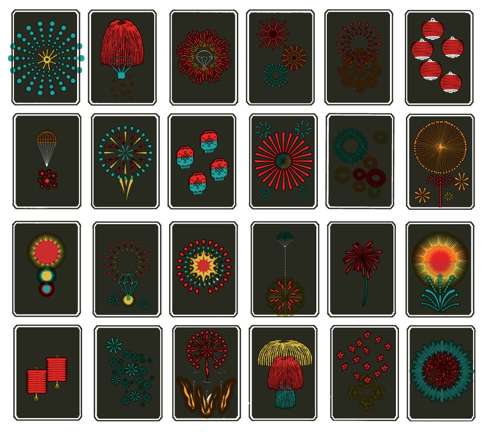
I took great pains to approximate the kind of pigments that would have been in wide use in the late 1800s, with the inks having a kind of leaden, toxic shine to them. I also had a lot of fun with overprint and knockout effects, a must when trying to stretch a few colors out to look like a couple more than you can afford.
Now that we had our aesthetic we needed to find a way to house it all.
BRANDING THE BAND
Chris was good enough to send me a jpeg of the chracters that spelled out the band name in kanji and I couldn’t resist stylizing them and using them here. For the accompanying English translation I wanted something that felt dynamic enough to announce that this was a vital new band but was also confident enough to know when to hang back and let all the other elements play the star. There were going to be a lot of small spot illustrations on this cover and the band name needed to confidently assert its place quietly.

AN HOMAGE VIA TYPE
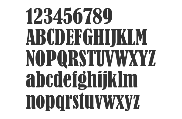
Blur wasn’t the only legendary britpop act I’d pull inspiration from. I would also find type inspiration in Designer’s Republic’s iconic work on Pulp’s Different Class cover by bringing in Bernard MT Condensed, a font that couldn’t be more British if it tried. It felt like a touch of referential wit on my part and it provided a warmth that I think counterbalanced the rest of the sharper, brighter elements of the cover out nicely.
ALLTOGETHERNOW
As the album was cheekily titled Smash All the Windows there was something that felt perfectly insistent about composing it all as a mosaic of windows housing the different illustrations. In fact the arrangement almost seems to be daring you to smash them, pop them, or scratch away at them like you would a lottery ticket. The album’s energy was at once composed yet anxious and at times boils over into explosive, and I think the visual package I put together with the band captures this all nicely. The colors are restrained but raise their tone when necessary and the grid is restrained enough to make a little noise in the couple areas where I break from it.
Overall I am really proud of what we did here and I am grateful to have been fortunate enough to work with the band on this project and cant wait to hear what they do next.
Hanabi’s Smash All the Windows (2019)
Recent Work










LET'S MAKE SOMETHING RAD TOGETHER!
I’ve designed posters and artwork for artists from “Weird Al” Yankovic to Foo Fighters, Metallica to Kings of Leon, Foals to Cut Copy, and many more — from small local shows to major international festivals.
Use the form below to get in touch and I’ll get back to you (usually within 24 hours) to talk about what brilliant things we might conjure into being.

