Failure Poster Sacramento 2019
FAILURE POSTER SACRAMENTO 2019
There’s something really special about getting to design a poster for a band that you genuinely love and whose music had a part in making you who(ever) you are now. As is kind of a common thing with me, I came to Failure a bit late and via a somewhat roundabout route, but once they hit with me they hit hard and resonated deeply for a long time. When I first moved to California in late 99, music in general was in a pretty sorry state. The Alternative Nation had long since fizzled, the TRL bubblegum pop acts and angry wallet chain rap rock mooks had taken over the mainstream, and even our most reliable elder statesmen were turning in under par music. We were 11 months out from Kid A and just a few past the inaugural Coachella, which had made mild if any ripples. American indie had retreated into a kind of anodyne milquetoast inoffensive sweatervest sound (itself feeling like a reaction to the Nü-whatever revolution and the turgid, 15th-generation Vedder vocal Xeroxes hijacking the airwaves of the moment) and it was going to be a lonely few years waiting and wondering if anything exciting was ever going to happen in music again. That’s where we were at. It was a dark time and I being brand new in town was in a place that was—if not dark—at least very, very dim. One record connected with me unlike any other at that time: Failure (on a hiatus at the time) lead singer Ken Andrews’ solo project On and its (his?) debut Shifting Skin. I’m sure I had heard Andrews’ voice before and thus I had likely heard Failure before then, at least in passing, but at the time it was the On record that felt like a lifeline out of the blue back to a more forward thinking kind of alt rock. It had touches of sci-fi (which I’d later learn was a Failure hallmark), great melodies, a crunchy production, and a looseness to it that suggested a larger world beyond it. I was sold. From there I tracked down Failure’s Fantastic Planet and worked my way back through the catalog from there. Sadly, that was all there was at that point (as they again were on hiatus) but at the time it was more than enough. This band and I seemed to get each other, with lots of similar pet enthusiasms emerging in the songs, themes, and lyrics. There seemed to be nods to Blade Runner, space as a concept and aesthetic, retro-futurism, and it was all tightly wound in a clean alt guitar sound with occasional left turns into synth and soundscapes. It also didn’t feel like a schtick so much as a natural mode for this band. It’s absolutely fitting that an early model for what would become Failure was called the Replicants.
THE CONCEPT
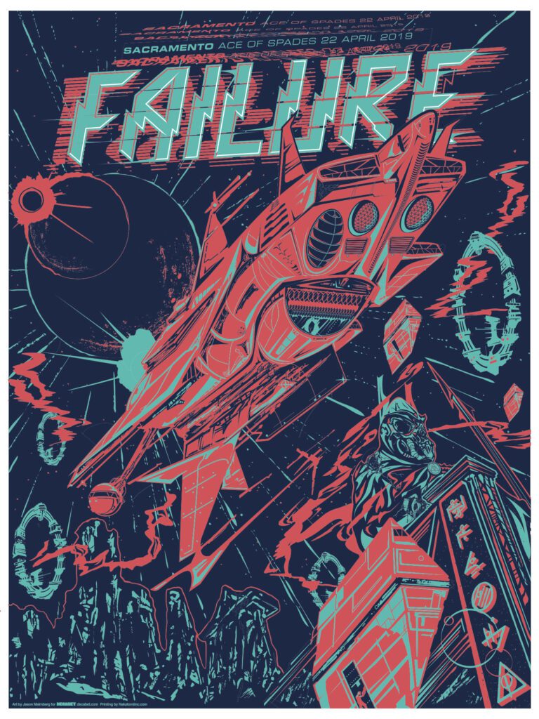
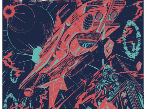
Getting the chance to design a poster for a band so close to my own influences was a huge opportunity (thanks once again to Timothy Paul Doyle and the lads at Nakatomi, Inc for indulging me, and especially LeAnn Jensen for taking my crappy color seps and making them sing with her color sep and trapping skills) and I wanted to use that opportunity to create something very much in their mode, but that added onto it as well. I wanted the starship to feel like a design that is simultaneously wrong but also right, in that Captain Harlock but also Jodorowsky’s Dune kind of way: asymmetrical, alien, strange, and balanced by being off-balance. I decided it should be drifting up and away from a cold landscape, looming over the massive, crumbling monument of some important alien figure. Maybe a warlord, maybe a leader. Meanwhile, angular loading ships leave the planet’s surface filled with something undetermined and cruising up to the ship’s bay. In the background overhead, stars explode, the galaxy unravels, and planets align and eclipse one another. All my kitchen sink sci-fi enthusiasms on display in one place. And of course, I was able to snag the date for our hometown show, and that was huge. And it was a mind-blowing show as well, with a controlled heavy power, perfect sound, deliberate energy, and a lighting rig that made the place seem a thousand times more vast. We, ladies and gentlemen, were floating in space.
Failure Poster Sacramento 2019 Specs
• 18” X 24” THREE COLOR SCREENPRINT
• PRINTED ON ARCHIVAL QUALITY HEAVY PAPER
• EDITION LIMITED TO 50
Recent Work










Let’s Work Together
I’ve done work for everyone from “Weird Al” to Foo Fighters, Foals to Cut Copy, and bands and festivals ranging in scale from local to international.
Contact me using the form below and I’ll be back to you (usually within 24 hours) to talk about what brilliant things we might conjure into being.

