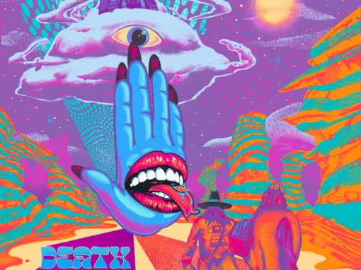
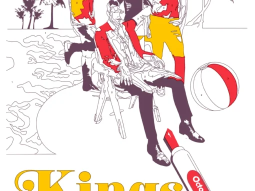
Kings of Leon Poster West Palm Beach 2017

Kings of Leon Poster 2017 West Palm Beach, Florida
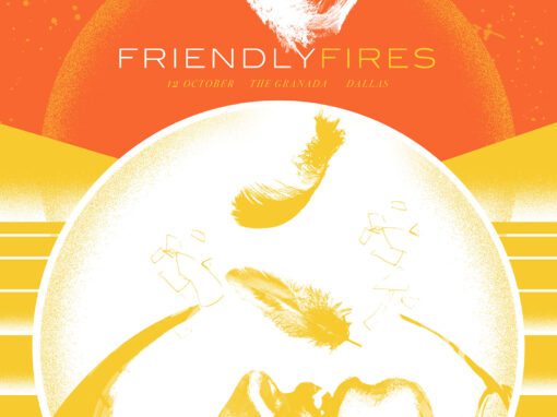
Color by Numbers
After completing three posters for Kings of Leon during their 2017 summer tour, the band reached out again and asked if I could take on a couple of their fall dates. By that point I felt like I had used up every clever angle to incorporate cherries, a recurring motif the band wanted to thread through the entire tour series. Dropping a cherry somewhere in the artwork just to check a box never sits right with me, so I went looking for a concept that could fold the motif into the core idea.
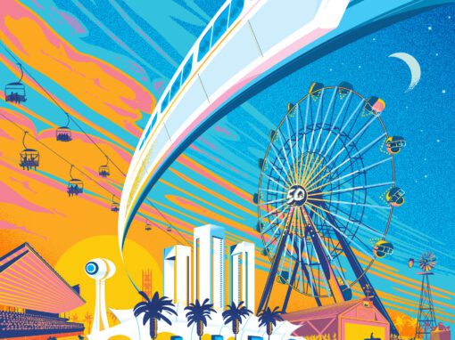
A Paint-by-Numbers Scene in West Palm Beach
This poster imagines the band inside a half-finished paint-by-numbers illustration set poolside in West Palm Beach. The sun, palms, beach ball, and minimal outlines let the viewer feel like they have stepped into an unfinished art kit. I kept most of the coloring incomplete, leaving it loose and airy. The goal was to make the entire piece feel active, energetic, and slightly interactive, as if the viewer could grab a marker and finish the coloring themselves.
Cherry Red as the Final Clue
The cherry motif appears here through a single open marker labeled Cherry Red. It anchors the direction of the piece and gives the viewer a narrative clue about what is meant to be filled in next. Rather than placing cherries as a literal object in the composition, the Cherry Red marker becomes the conceptual bridge, keeping the motif alive without repeating it in a literal or ornamental way.
Fall Tour Momentum
This poster, produced in collaboration with Nakatomi Inc., was one of two fall-tour designs that grew out of this late-season creative burst. The band responded strongly to this direction, which let the series shift into a more playful and illustrative mode while still maintaining continuity with the earlier summer-tour prints.
Kings of Leon Poster 2017 West Palm Beach Specs
• 12″ x 18” THREE COLOR SCREENPRINT
• PRINTED ON ARCHIVAL QUALITY HEAVY PAPER
Recent Work


LET'S MAKE SOMETHING RAD TOGETHER!
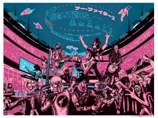
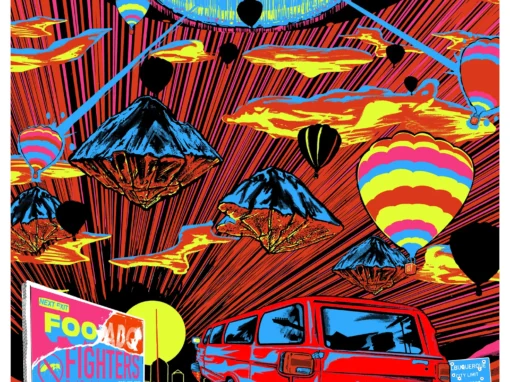
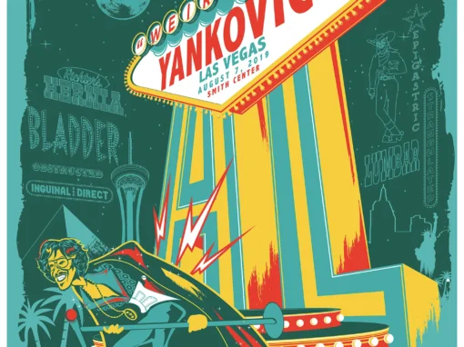
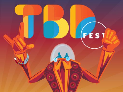
I’ve designed posters and artwork for artists from “Weird Al” Yankovic to Foo Fighters, Metallica to Kings of Leon, Foals to Cut Copy, and many more — from small local shows to major international festivals.
Use the form below to get in touch and I’ll get back to you (usually within 24 hours) to talk about what brilliant things we might conjure into being.
Blather
Periodic dispatches of note, brimming with relatable brio.
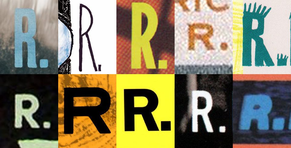
Our Band Could Be Your Typography Lesson
13. BROKE. CURIOUS. BORED. The moment is burnt indelibly into my memory. Every Sunday morning, I’d pick through the day’s edition of the Omaha World Herald (I\'m originally a Nebraska boy. Or at least was for my first 25 years), and I was leafing through inky inserts and box store…
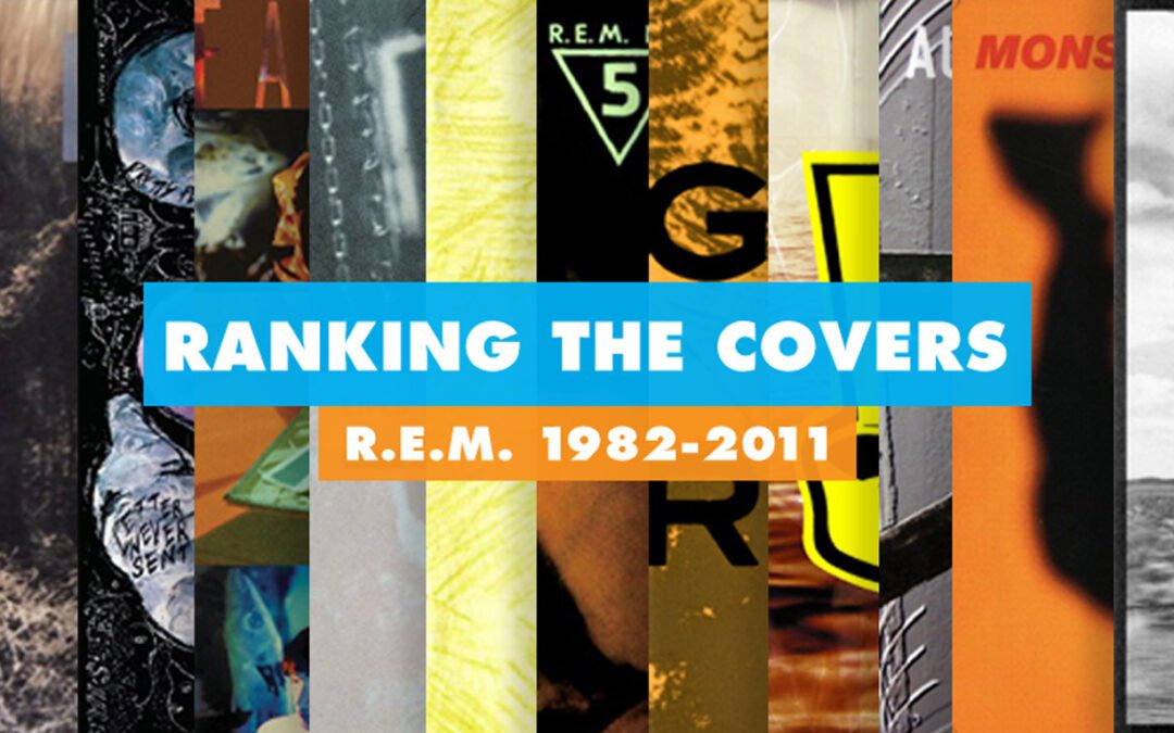
Ranking R.E.M.’s Album Covers Aesthetically 1982-2011
I was inspired by a friend’s Facebook thread about underrated late-period R.E.M. albums to create a ranking of the band’s album covers. Aesthetically. A ranking covering all their studio recordings from 1982 to their breakup in 2011. The ranking doesn’t include compilations or live albums, although I am including Dead Letter Office…