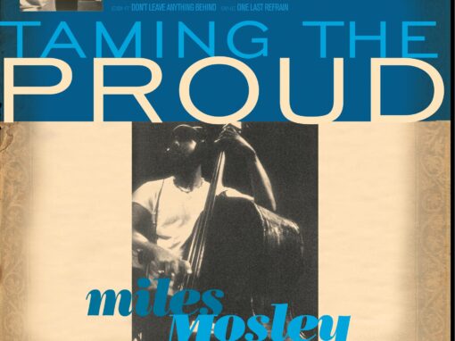
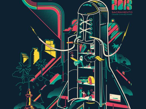
Miles Mosley / Taming the Proud

Miles Mosley album art was never going to be a straightforward assignment. Mosley arrived on the scene with a sound that defied easy categorization. His self-described “brothel jazz” pulled from bebop, funk, rock, and R&B, held together by a virtuosic command of the upright bass and an instinct for raw, lived-in atmosphere. Mosley was a founding member of the West Coast Get Down, the Los Angeles collective that also counted Kamasi Washington, Ryan Porter, and Thundercat among its ranks. Before Washington’s The Epic announced the WCGD to the world in 2015 and before Kendrick Lamar brought the whole scene into the mainstream conversation with To Pimp a Butterfly, these musicians were building something serious and largely under the radar. Taming the Proud sits in that pre-breakthrough window, which makes it a document of something genuinely very unguarded.
The album featured Kamasi Washington on tenor alongside Ryan Porter on trombone, Mike Bolger on trumpet, and Aaron McLendon on drums. Looking back at the personnel list now, it reads like a who’s who of a movement that hadn’t yet been named. This project gave me an early and roundabout connection to some of the most important figures in contemporary jazz before any of us knew quite how the story would unfold.
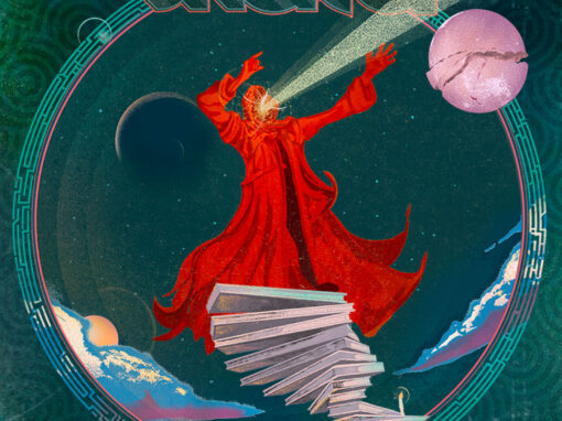
The design brief called for artwork that matched the actual contours of that sound. The easy move would have been a Reid Miles Blue Note pastiche, clean geometry, stark type, mid-century cool. That wasn’t the right answer here. Mosley’s music carried more grit and more history than that. I wanted the package to feel like it had been in a crate for sixty years. The palette pulled from worn paper, teal, deep crimson, and gold damask textures that suggested something older than postwar jazz. The typography mixed bold condensed display lettering with flowing script, and the tracklist leaned into the wordplay I built into the numbering system, 1NE, 2WO, THR3E, and so on, which I treated as a design element in its own right.
The logo incorporated a brushstroke arrow and layered letterforms, with “brothel jazz” set in teal as a badge underneath. The inside gatefold featured a vintage 78 rpm record label graphic alongside bold color blocking, a nod to an era even further back than Blue Note. The full package, front cover, back cover, gatefold, and logo, was designed to feel like an artifact from a parallel timeline where Mosley had always been a classic.


Miles Mosley / Taming the Proud
Recent Work


LET'S MAKE SOMETHING RAD TOGETHER!
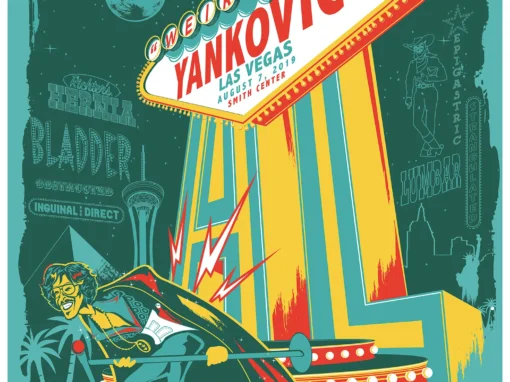
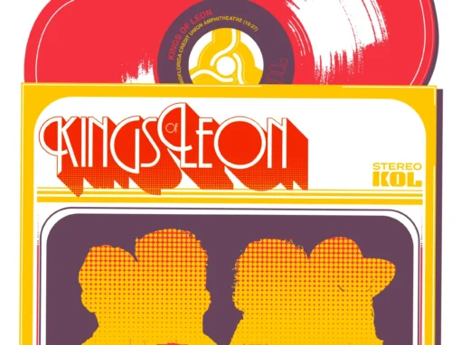
I’ve designed posters and artwork for artists from “Weird Al” Yankovic to Foo Fighters, Metallica to Kings of Leon, Foals to Cut Copy, and many more — from small local shows to major international festivals.
Use the form below to get in touch and I’ll get back to you (usually within 24 hours) to talk about what brilliant things we might conjure into being.
Blather
Periodic dispatches of note, brimming with relatable brio.
Our Band Could Be Your Typography Lesson
13. BROKE. CURIOUS. BORED. The moment is burnt indelibly into my memory. Every Sunday morning, I’d pick through the day’s edition of the Omaha World Herald (I\'m originally a Nebraska boy. Or at least was for my first 25 years), and I was leafing through inky inserts and box store…
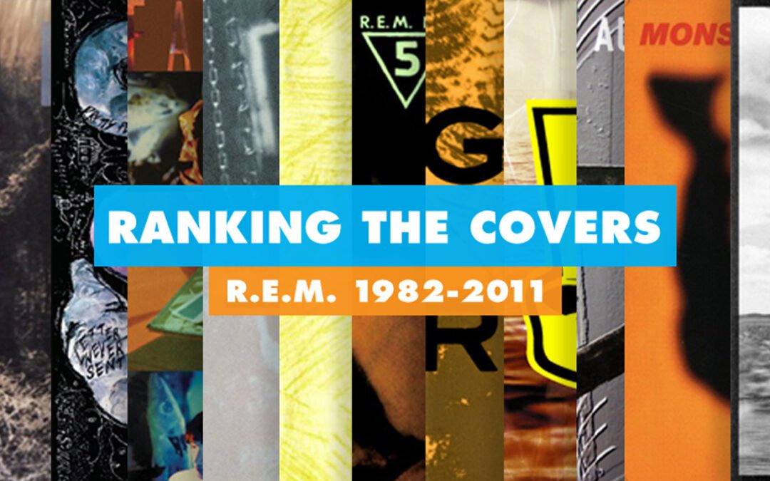
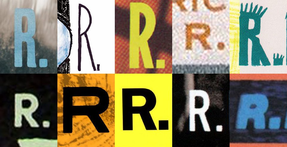
Ranking R.E.M.’s Album Covers Aesthetically 1982-2011
I was inspired by a friend’s Facebook thread about underrated late-period R.E.M. albums to create a ranking of the band’s album covers. Aesthetically. A ranking covering all their studio recordings from 1982 to their breakup in 2011. The ranking doesn’t include compilations or live albums, although I am including Dead Letter Office…