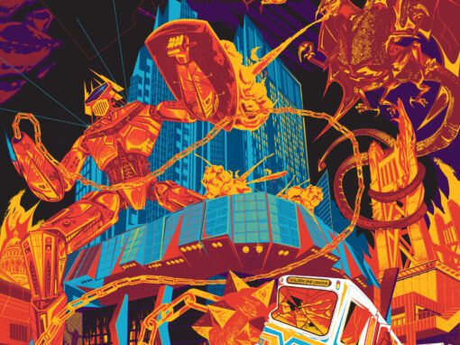
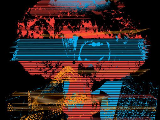
Cut Copy Poster / Foals / The Naked and Famous / Holy Ghost! Dallas 2011

CUT COPY / FOALS / HOLY GHOST! / THE NAKED AND FAMOUS POSTER 2011 DALLAS
CONCEPT AND PROCESS
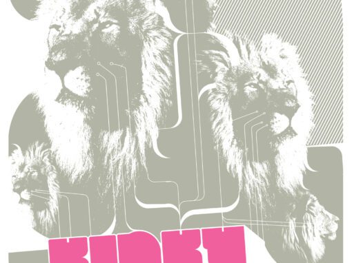
This Cut Copy / Foals Poster 2011 has the unique honor of being the first poster I ever designed for the Granada Theater in Dallas was for the “dream bill” (to me anyway) of Cut Copy, Foals, The Naked and Famous, and Holy Ghost!. Seriously, can you even imagine that embarrassment of riches? Thats a “call in sick the next day” lineup.
My initial concept was to riff on the famous Polish poster for Andrei Tarkovsky’s Solaris, long one of my favorite pieces of bold, minimal, tech (at least in the analogue method of its day) graphic design. It was a rare case of a poster making me want to see a film straight off. I remember seeing it in a collection of 70s movie posters in the late 90s and thinking “I have to see whatever this is” and frankly I think loving that poster design so much helped me to have more patience with the (very deliberately paced, to say the least) film. Looking back, this poster manages to perfectly capture the feeling of the film: its cold and can feel sterile but theres also a humanity to its precision. A real and very human hand behind it all that you can feel at work.
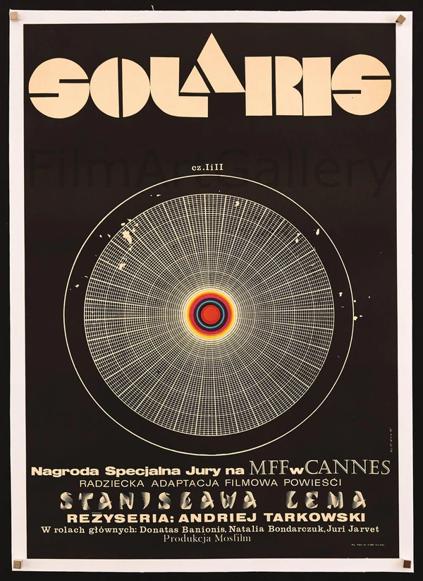
Plus its just funky as hell. Imagine seeing that in a cinema lobby in 1973 next to like Benji Come Home or whatever.
So the original plan was to make this one a very minimal homage to that design, but things never really quite end up the same as they start. In the end you have no choice but to make things yours and often its in-process that that happens. A few years later I would tap into a similar vibe for Foals’ appearance at Ace of Spades in Sacramento.
Cut Copy / Foals 2011 Poster Dallas Specs
• 11″ X 17″ MATTE OFFSET PRINT
• PRINTED ON ARCHIVAL QUALITY HEAVY PAPER
• EDITION LIMITED TO 50
Recent Work

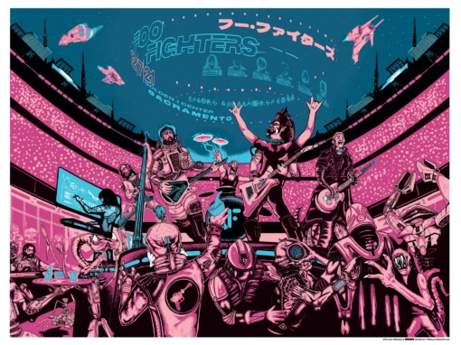
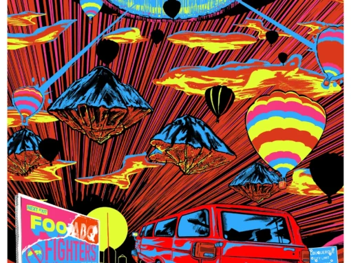
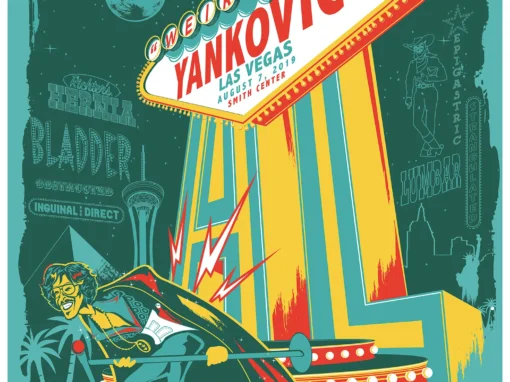
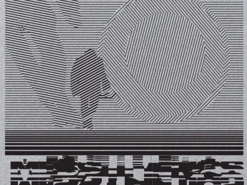









Let’s Work Together
I’ve done work for everyone from “Weird Al” to Foo Fighters, Foals to Cut Copy, and bands and festivals ranging in scale from local to international.
Contact me using the form below and I’ll be back to you (usually within 24 hours) to talk about what brilliant things we might conjure into being.
Blather
Periodic dispatches of note, brimming with relatable brio.
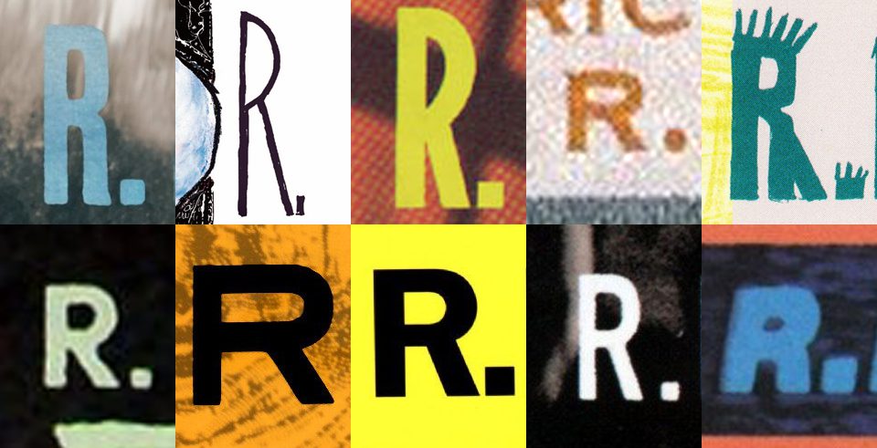
Our Band Could Be Your Typography Lesson
13. BROKE. CURIOUS. BORED. The moment is burnt indelibly into my memory. Every Sunday morning, I’d pick through the day’s edition of the Omaha World Herald (I\'m originally a Nebraska boy. Or at least was for my first 25 years), and I was leafing through inky inserts and box store…
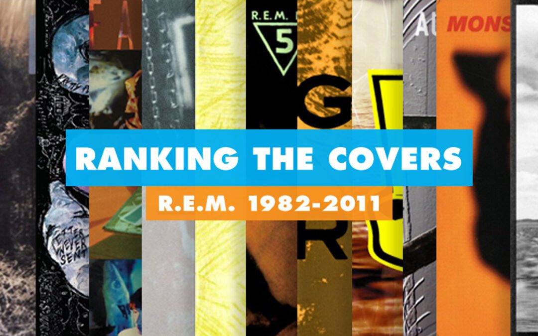
Ranking R.E.M.’s Album Covers Aesthetically 1982-2011
I was inspired by a friend’s Facebook thread about underrated late-period R.E.M. albums to create a ranking of the band’s album covers. Aesthetically. A ranking covering all their studio recordings from 1982 to their breakup in 2011. The ranking doesn’t include compilations or live albums, although I am including Dead Letter Office…

