Foals Poster Sacramento 2013
FOALS POSTER SACRAMENTO 2013
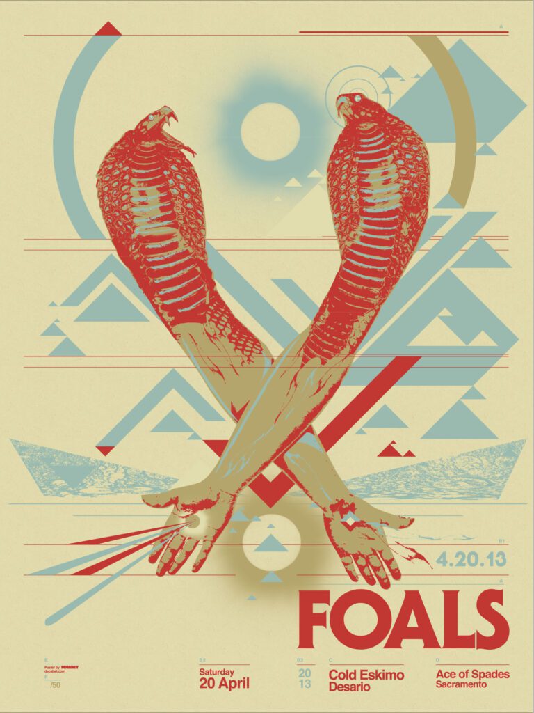
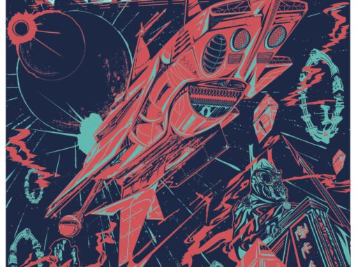
With Oxford band Foals finally playing my hometown of Sacramento in the spring of 2003, it was crucially important to me that I get this one right. As a major fan from their first record Antidotes back in 2007, I wanted to create a striking design that would fit into the grain of their overall aesthetic. Something that would snap into place alongside their arch and abstract videos and album covers. I felt pretty distinctly keyed into the band’s vibe, but how to portray it?
In a way this was my second poster for the band, having designed an extremely popular print for their 2010 show with Cut Copy at the Granada in Dallas. That one referenced Tarkovsky’s classic 1972 sci-fi film Solaris (among any number of other retro affectations of mine) and I didn’t want to mine that same ground again. The album they were touring at the time, 2013’s Holy Fire was another step forward for the band’s widescreen aspirations. There were touches of the surreal and the macabre mixed with something more reaching and spiritual. To that end, I sought to come up with something mystic and unnerving.
Foals Poster Sacramento 2013 Specs
• 18” X 24” THREE COLOR SCREENPRINT
• PRINTED ON ARCHIVAL QUALITY HEAVY PAPER
• EDITION LIMITED TO 50
Recent Work


















Let’s Work Together
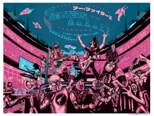
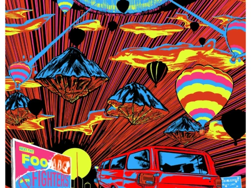
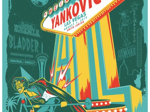
I’ve done work for everyone from “Weird Al” to Foo Fighters, Foals to Cut Copy, and bands and festivals ranging in scale from local to international.
Contact me using the form below and I’ll be back to you (usually within 24 hours) to talk about what brilliant things we might conjure into being.
Blather
Periodic dispatches of note, brimming with relatable brio.
Our Band Could Be Your Typography Lesson
13. BROKE. CURIOUS. BORED. The moment is burnt indelibly into my memory. Every Sunday morning, I’d pick through the day’s edition of the Omaha World Herald (I\'m originally a Nebraska boy. Or at least was for my first 25 years), and I was leafing through inky inserts and box store…
Ranking R.E.M.’s Album Covers Aesthetically 1982-2011
I was inspired by a friend’s Facebook thread about underrated late-period R.E.M. albums to create a ranking of the band’s album covers. Aesthetically. A ranking covering all their studio recordings from 1982 to their breakup in 2011. The ranking doesn’t include compilations or live albums, although I am including Dead Letter Office…

