Foo Fighters Gilford 2023 Gig Poster
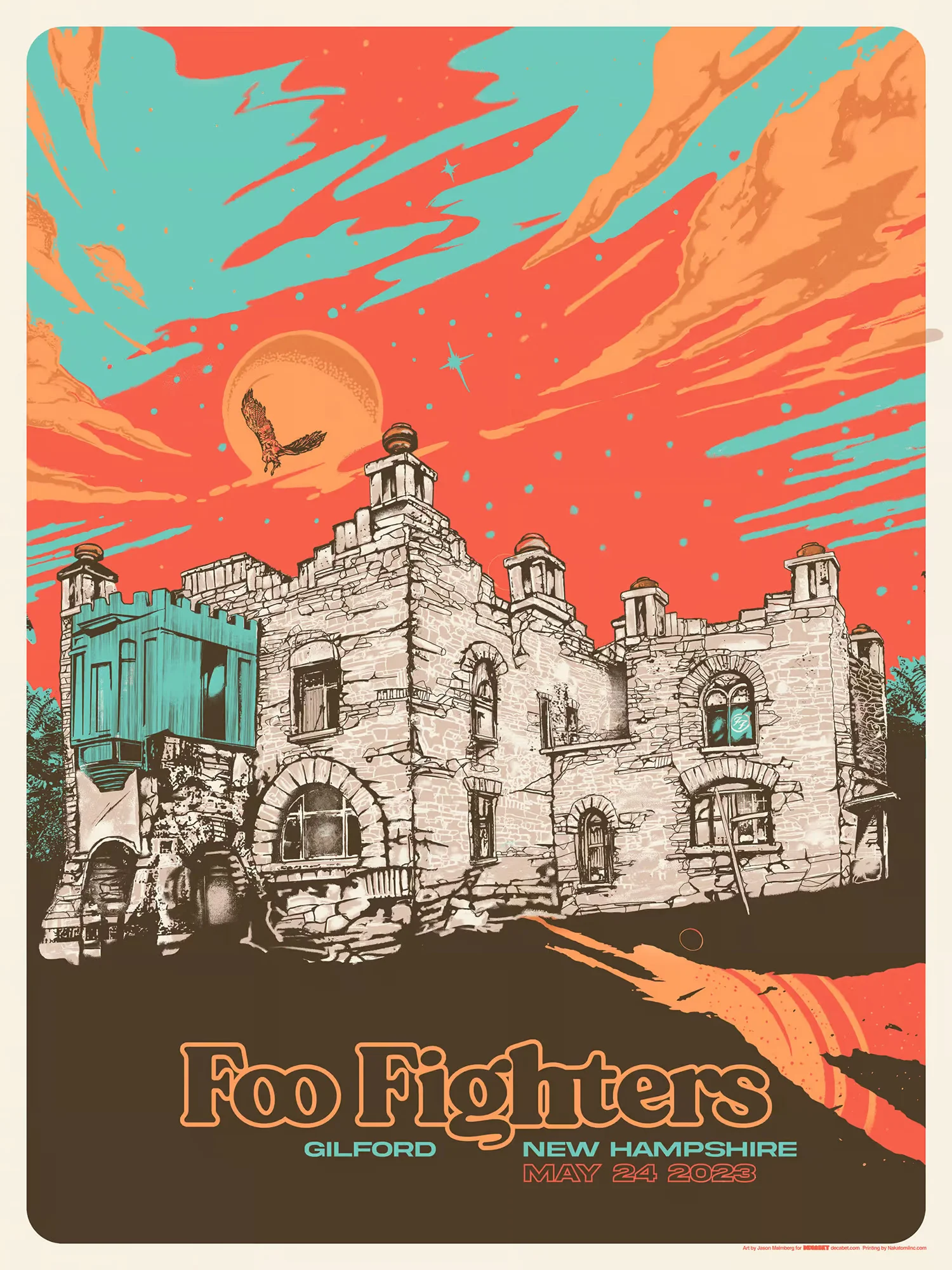
Foo Fighters Gilford 2023 Gig Poster by Jason Malmberg
Kimball Castle and the First Show Back
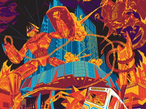
The Foo Fighters Gilford 2023 gig poster by Jason Malmberg was created under his Decabet studio for the band’s long-awaited return to the stage.
Since 2018, I’ve been fortunate to create several official gig posters for Foo Fighters.
My first collaboration with the band was for their 2018 Milwaukee show. After that came limited-edition concert posters in 2020 and again for my hometown of Sacramento in 2021.
Designing for a band you love is always special. You become a small part of how other people experience the music, and that connection never gets old.
In spring 2022, I was developing a fourth poster when longtime drummer Taylor Hawkins tragically passed away on tour. That artwork was never finished. It seemed uncertain whether the band would tour again, and everyone knew it would never be quite the same.
Then, in early May 2023, I received an email asking if I could design the poster for Foo Fighters’ Gilford, New Hampshire show—just a few weeks away. The turnaround was tight, but I love a good creative sprint.
The Brief
For touring bands like Metallica, “Weird Al,” Kings of Leon, or Foo Fighters, there is always a design brief.
These briefs are usually light on direction—mostly reminders to avoid explicit imagery—but occasionally include themes. For example, in 2017 Kings of Leon asked me to work cherries into all five of their posters that year.
With Foo Fighters returning after Taylor’s passing, the band wanted a fresh approach. They requested posters that avoided UFOs, aliens, or likenesses of band members, and instead focused on natural colors and local landmarks.
That worked perfectly for me.
“Oh Dear”
I started researching what other artists had done for this new tour. Nothing came up.
A quick check of the tour schedule confirmed my suspicion: the Gilford date was the first show back for Foo Fighters.
My stomach dropped. “Oh dear,” I thought. “No pressure at all.”
Rock and Roll
While researching Gilford, I found the perfect local landmark—Kimball Castle (UPDATE: sadly Kimball Castle was gutted by a fire in late summer 2025 and is scheduled to be torn down) .
Built a century ago by a railroad tycoon, it had long since fallen into disrepair and was rumored to be haunted. The kind of place teenagers would sneak into to hang out and party.
“This is perfect,” I thought. “Rock and roll.”
I even tucked a tiny Foo Fighters “FF” tapestry into one of the windows, as if left behind by those same local kids.
A Subtle Tribute to Taylor
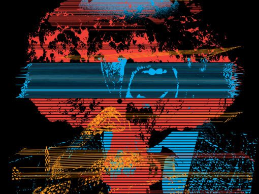
Wanting to include a quiet nod to Taylor Hawkins, I researched native bird species in the region. The broad-winged hawk is common in New Hampshire, so I illustrated one gliding across the sunset sky. It became a small tribute to Taylor—noticed and appreciated by fans who recognized the symbolism in the first show poster of this new chapter.
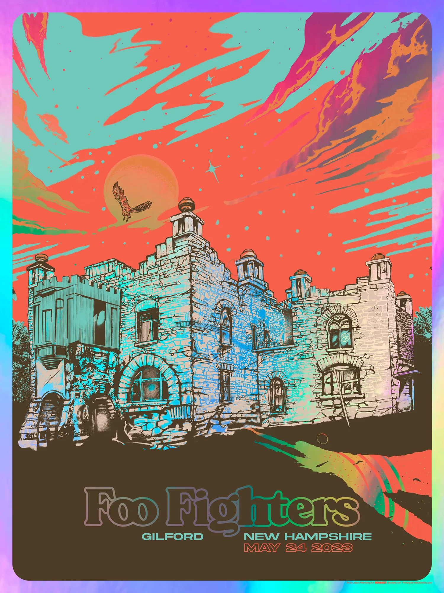
Variants
The poster was produced as a five-color screen print on Mohawk Natural Paper, along with an even more limited variant on rainbow foil.
Both editions sold out quickly—first at the show, and then online within two hours on my Big Cartel shop on May 26, 2023.
To announce the release, I created a short motion graphic and shared it across social media to show off the new design.
Foo Fighters Poster Gilford 2023 Specs
• 18” X 24” FIve Color Screeprint
• PRINTED ON ARCHIVAL QUALITY HEAVY PAPER
Recent Work















LET'S MAKE SOMETHING RAD TOGETHER!
I’ve designed posters and artwork for artists from “Weird Al” Yankovic to Foo Fighters, Metallica to Kings of Leon, Foals to Cut Copy, and many more — from small local shows to major international festivals.
Use the form below to get in touch and I’ll get back to you (usually within 24 hours) to talk about what brilliant things we might conjure into being.
Blather
Periodic dispatches of note, brimming with relatable brio.
Our Band Could Be Your Typography Lesson
13. BROKE. CURIOUS. BORED. The moment is burnt indelibly into my memory. Every Sunday morning, I’d pick through the day’s edition of the Omaha World Herald (I\'m originally a Nebraska boy. Or at least was for my first 25 years), and I was leafing through inky inserts and box store…
Ranking R.E.M.’s Album Covers Aesthetically 1982-2011
I was inspired by a friend’s Facebook thread about underrated late-period R.E.M. albums to create a ranking of the band’s album covers. Aesthetically. A ranking covering all their studio recordings from 1982 to their breakup in 2011. The ranking doesn’t include compilations or live albums, although I am including Dead Letter Office…

