Friendly Fires Poster Dallas 2011
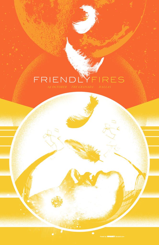
FRIENDLY FIRES POSTER DALLAS 2011
CONCEPT AND PROCESS
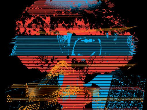
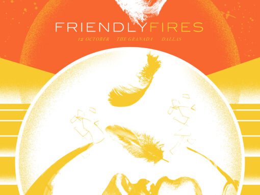
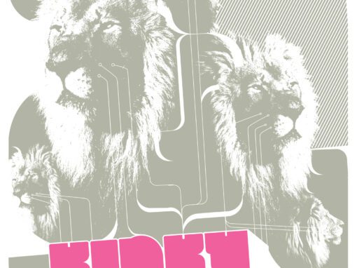
A Friendly Fires poster for the English band’s show at the Granada Theater in Dallas, October 2011. First and foremost, I wanted to start and stay with a bright color palette to mirror the light, almost tropical sounds of their (at-the-time) most recent album Pala (NOTE: An underrated record that I think is due a reappraisal) This is also how I ended up incorporating feathers into the final piece ala the album’s cover. Very 70’s sci-fi and weightless and perhaps even breathless. Personally, it makes me think of sleep paralysis, which I’ve been one to experience from time to time, often when falling asleep to weird 70s sci-fi flicks like Saul Bass’ directorial feature Phase IV from 1979. To that end, the tone and the stippled airbrush/colored pencil textures I used are a reference to Rene Laloux’s ultra-bizarro 1973 sci-fi flick Fantastic Planet which, if you have not yet seen, I suggest you remedy. Sadly, this poster ended up only getting partially used as band members became sick the day of the show and the show itself was canceled as a result.
Friendly Fires Poster 2011 Dallas
• 11″ X 17″ MATTE OFFSET PRINT
• PRINTED ON ARCHIVAL QUALITY HEAVY PAPER
• EDITION LIMITED TO 50
Recent Work
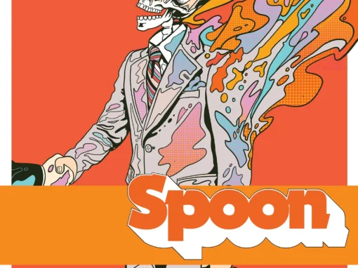
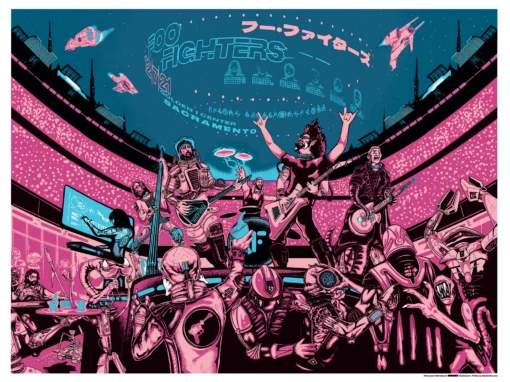
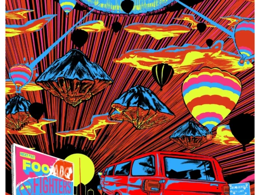
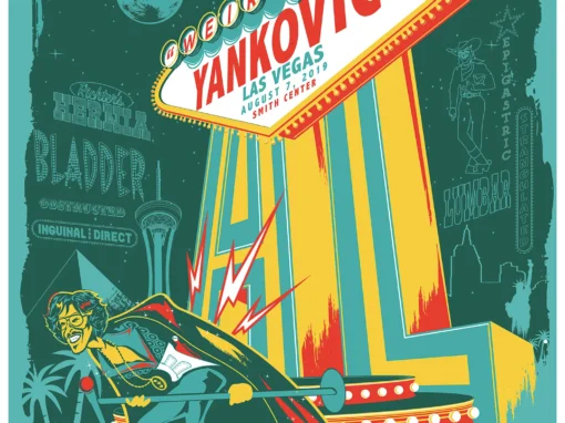










Let’s Work Together
I’ve done work for everyone from “Weird Al” to Foo Fighters, Foals to Cut Copy, and bands and festivals ranging in scale from local to international.
Contact me using the form below and I’ll be back to you (usually within 24 hours) to talk about what brilliant things we might conjure into being.
Blather
Periodic dispatches of note, brimming with relatable brio.
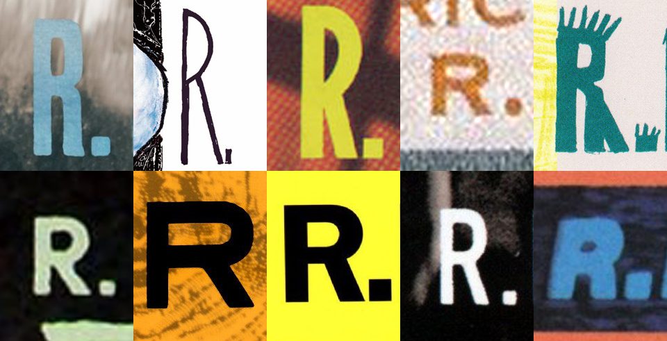
Our Band Could Be Your Typography Lesson
13. BROKE. CURIOUS. BORED. The moment is burnt indelibly into my memory. Every Sunday morning, I’d pick through the day’s edition of the Omaha World Herald (I\'m originally a Nebraska boy. Or at least was for my first 25 years), and I was leafing through inky inserts and box store…
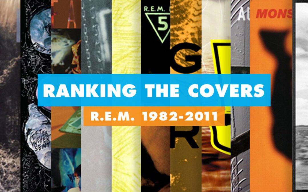
Ranking R.E.M.’s Album Covers Aesthetically 1982-2011
I was inspired by a friend’s Facebook thread about underrated late-period R.E.M. albums to create a ranking of the band’s album covers. Aesthetically. A ranking covering all their studio recordings from 1982 to their breakup in 2011. The ranking doesn’t include compilations or live albums, although I am including Dead Letter Office…

