Kinky with Money Mark Poster Sacramento 2008
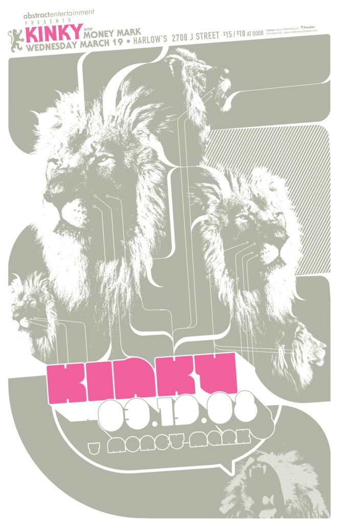
KINKY WITH MONEY MARK POSTER SACRAMENTO 2008
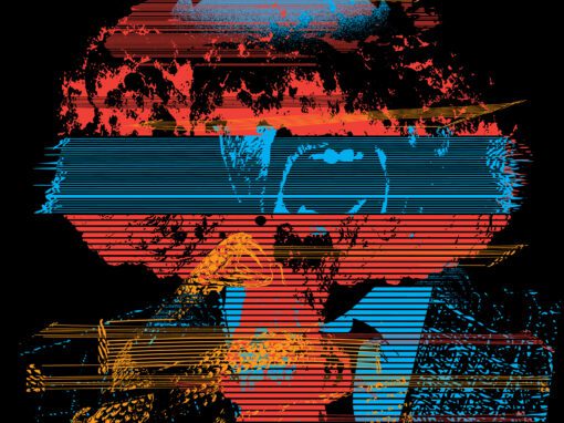
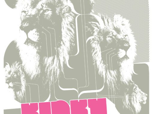
Approaching this Kinky and Money Mark poster, something in my head said “lions” so I started messing around with the idea while listening to their 2006 record Reina. I tend to force myself to design from concept first and foremost, so the idea of just straight-up making something cool looking with lions sounded fun and easy because (obviously) lions just look really cool. But as I often remind myself, the difference between a designer and a mere stylist is Ideas. Ideas have to come first and if ideas are to come first then visuals need more of a reason to exist than “that would look rad.” Would it be too self-indulgent to go this route?
Just then Track 4: “Leon” started up, with it’s bed of growling lion sounds. I had my way in now and I could take it without feeling like I copped out to Pointless Cool.
Using lions as a jumping off point, I aimed to make something fluid and techno but still organic. In a perfect world I would have just let the rounded logotype in the middle do the talking, but you still gotta sell tickets, so I added the info strip along the top (a technique I would use again as a kind of visual callback in my poster for The Naked and Famous in 2011. At the end of the day I think it actually ended up enhancing the finished piece.
Kinky & Money Mark Poster Sacramento 2008 Specs
• 11″ X 17″ MATTE OFFSET PRINT
• PRINTED ON ARCHIVAL QUALITY HEAVY PAPER
• EDITION LIMITED TO 50
Recent Work









LET'S MAKE SOMETHING RAD TOGETHER!
I’ve designed posters and artwork for artists from “Weird Al” Yankovic to Foo Fighters, Metallica to Kings of Leon, Foals to Cut Copy, and many more — from small local shows to major international festivals.
Use the form below to get in touch and I’ll get back to you (usually within 24 hours) to talk about what brilliant things we might conjure into being.
Blather
Periodic dispatches of note, brimming with relatable brio.
Our Band Could Be Your Typography Lesson
13. BROKE. CURIOUS. BORED. The moment is burnt indelibly into my memory. Every Sunday morning, I’d pick through the day’s edition of the Omaha World Herald (I\'m originally a Nebraska boy. Or at least was for my first 25 years), and I was leafing through inky inserts and box store…
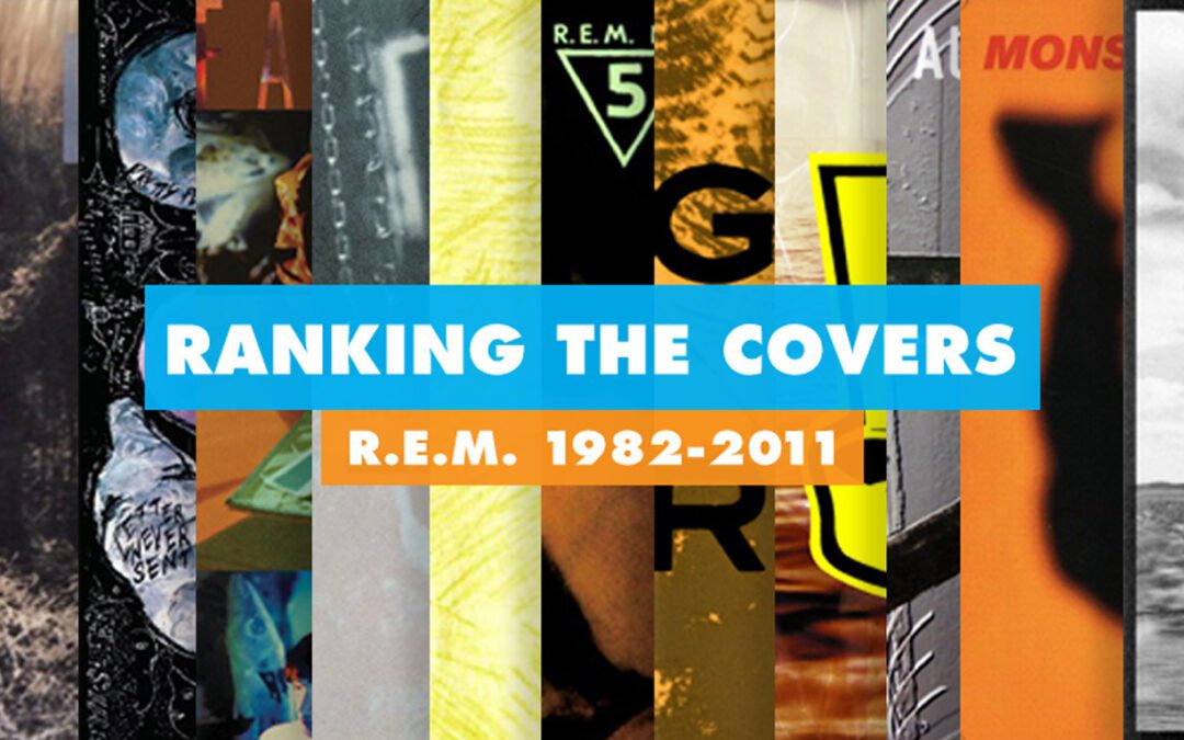
Ranking R.E.M.’s Album Covers Aesthetically 1982-2011
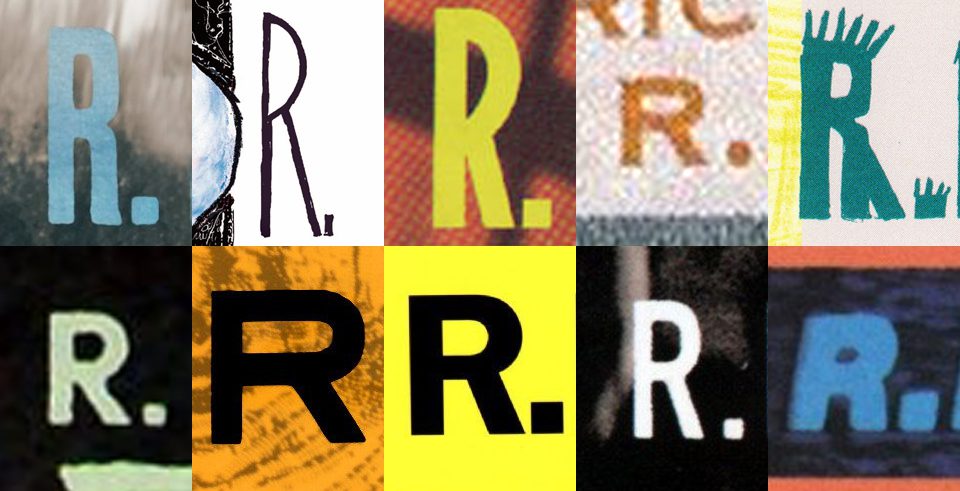
I was inspired by a friend’s Facebook thread about underrated late-period R.E.M. albums to create a ranking of the band’s album covers. Aesthetically. A ranking covering all their studio recordings from 1982 to their breakup in 2011. The ranking doesn’t include compilations or live albums, although I am including Dead Letter Office…

