Launch Music Festival Poster 2013 Sacramento
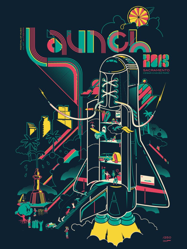
LAUNCH MUSIC FESTIVAL POSTER 2013 SACRAMENTO
A LINEUP TOLD THROUGH PICTOGRAMS
For 2013’s Launch Music Festival in Sacramento, California, I approached the promoter’s about a two-fold idea: first I wanted to curate a poster series representing each band in the line-up worked into individual gig posters designed by local Sacramento artists (of I which I myself created one, for Australia’s Van She). Secondly, I wanted to create a screen printed poster for the event itself. A souvenir item to be used as merch at the festival itself. Since, the poster was for people who were already at the festival, I felt we could dispense with the usual wall of text and band names and try something a bit more clever. I decided to represent each band on the lineup as a simple pictogram representing their name. At first I was only going to do the main headliners, but as inspiration struck I started adding more and more acts to the list and since you can’t do one from the undercard without doing the others before long I had thrown my hat over the fence and committed to doing them all. Some are simple, some are far more oblique, but they are all get-able and the fun is in figuring out who is who.
The performers:
Girl Talk
Rocket from the Crypt
Van She
Grieves
Family of the Year
Dredg
Gold Fields
Dessa
Turquoise Jeep
Lemuria
Frank Jordan
Doombird
Paper Pistols
Imagine Dragons
Minus The Bear
Blonde Redhead
Washed Out
Cults
St. Lucia
Doomtree
Surfer Blood
P.O.S.
Geographer
DLRN
No
Exquisite Corps
Life in 24 Frames
The Bell Boys
Launch Music Festival Poster 2013 Sacramento Specs
• 18” X 24” FOUR COLOR SCREENPRINT
• PRINTED ON ARCHIVAL HEAVY FRENCH CONSTRUCTION PAPER
• EACH PIECE INDIVIDUALLY SIGNED AND NUMBERED
Recent Work











LET'S MAKE SOMETHING RAD TOGETHER!
I’ve designed posters and artwork for artists from “Weird Al” Yankovic to Foo Fighters, Metallica to Kings of Leon, Foals to Cut Copy, and many more — from small local shows to major international festivals.
Use the form below to get in touch and I’ll get back to you (usually within 24 hours) to talk about what brilliant things we might conjure into being.
Blather
Periodic dispatches of note, brimming with relatable brio.
Our Band Could Be Your Typography Lesson
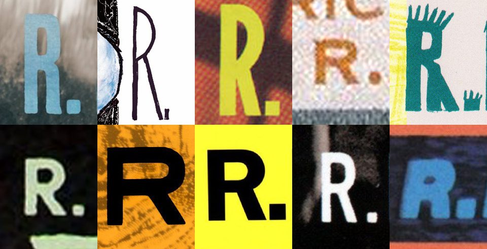
13. BROKE. CURIOUS. BORED. The moment is burnt indelibly into my memory. Every Sunday morning, I’d pick through the day’s edition of the Omaha World Herald (I\'m originally a Nebraska boy. Or at least was for my first 25 years), and I was leafing through inky inserts and box store…
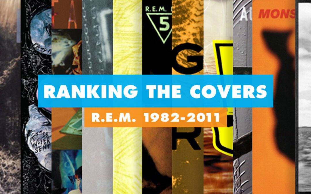
Ranking R.E.M.’s Album Covers Aesthetically 1982-2011
I was inspired by a friend’s Facebook thread about underrated late-period R.E.M. albums to create a ranking of the band’s album covers. Aesthetically. A ranking covering all their studio recordings from 1982 to their breakup in 2011. The ranking doesn’t include compilations or live albums, although I am including Dead Letter Office…

