Life in 24 Frames CTRL+Z Album Cover

LIFE IN 24 FRAMES – CTRL+Z
GATEFOLD VINYL ALBUM COVER
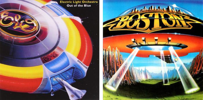
I was contacted in late 2015 by Sacramento band Life in 24 Frames about doing some poster art for an upcoming show and maybe working on a cover for an album they had finished demos for. At the time I was hard at work illustrating Northern Nights Music Festival‘s 2016 poster and just couldn’t fit it in. We tabled the idea temporarily and circled back around to it again in the spring. They had given me links to the tracks to listen to in the meantime to let my brain marinate on things in the interim. When we reconvened in spring 2016 we talked about concept, album theme, title, etc. What really excited me about working on this is that we were all on the same page about the visual ballpark we wanted the art to land in. We had all been fans of sci-fi art in general, and 70s sci-fi paperback art in particular. Add to the mix classic airbrushed album covers with spacey themes and imagery, like the iconic cover of Boston‘s 1977 self-titled and ELO‘s Out of the Blue from that same year. Mix in themes of 70s envirodisaster flicks like Silent Running and Phase IVand songs like Neil Young‘s “After the Gold Rush” and we had our concept. It was important however that this not become winking pastiche. This needed to be a 2017 version of an 1977 album cover, not only in execution but style as well. This was not a throwback band nor was this a throwback album. I wanted a modern analogue of the great lush gatefold airbrush art of the 70s.
THE LOGO
While the band had versions of logos emphasizing the 24 in use before, I wanted to start this entire project fresh. Since we were aiming at a visual concept referencing space travel, I wanted a clean minimalist mark that could look futuristic while also reading as clean and timeless.
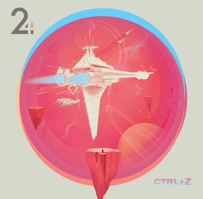
THE ILLUSTRATIONS
Confession: I’m not much of an illustrator. For the first 15 years of my career as a designer I generally avoided illustrating. It just didn’t seem like a skillset I possessed or could do anything worthwhile with. As I progressed as a gigposter artist I started working illustrative elements into my stuff. My poster for 2013’s Launch Music Festival was really the first time I tried to illustrate an entire poster but it really wasn’t until 2014 when I took on my second Drive-By Truckers screenprint that I’d really go all-in on fully illustrating something. In the years since I’ve worked at it and have become more comfortable with my illo skills but nothing I had worked on before now compared to the challenge of creating the illustrations for CTRL+Z: I needed to dig as deep as I could and come up with some techniques I’d never used before to make the ideas I had in my head hit the page the right way.
I was fortunate in that the band was giving me an open-ended deadline to work the cover out. They wanted to aim for a Thanksgiving release and were putting the finishing touches on the tracks anyway, so I had about 6 months to create the four pieces that populate the panels of the gatefold, a challenge where I had to learn how to create them while creating them. This ended up being much bigger challenge than I’d initially anticipated. In fact, while working on the starship that graces the front cover, I had actually hit so many dead ends with it that I had a text to the band written in my phone telling them that “I’m sorry but I just don’t think I have the skills to do this thing.” I was frustrated, it was a late Wednesday night, I sat there looking at my phone, my thumb hovering over the Send button. I decided to keep going. I’d just brute force the process and keep going and it would have to work by force or will and elbow grease alone. This was huge. By the weekend, I had the basic cover art done and with it the styles, textures, colors and framing for the rest of the art. I finally had traction and I had proven to myself that this was something I could actually do.


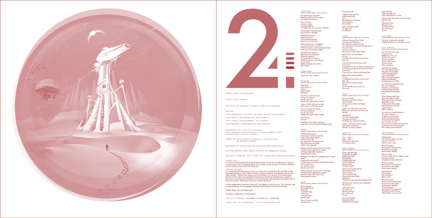
THE OVERALL DESIGN
Since one of my stated aims with this was to create a modern version of a 70s album cover, one of the ways I thought to do that was in how the illustrations were presented graphically. The circular rounded framing of the art felt like a no brainer to me. It felt modern, it felt futuristic, it felt a bit like a porthole in space, and it afforded me the opportunity to added some splashes of complimentary colors in the outer rings to give a sense of kinetic motion to it all. A swirling whirl of color as if maybe you’re seeing an spaceship’s display screen ripple to life. Plus creating these hard frame boundaries gave me frames for elements to violate and borders to reach out past. The stranded astronaut on the front cover could stand inside and outside the composition, as could the crew of the ship on the bridge in the gatefold art, hovering in a suggested foreground while working on suspended touch-displays.


This would carry over to the inner-sleeve and lyric sheet. I also created an alternate version of the back cover illustration for one of the sleeve panels to further flesh out the storyline and its theme of time, change, distance, isolation, yearning and discovery.
ALBUM RELEASE ART
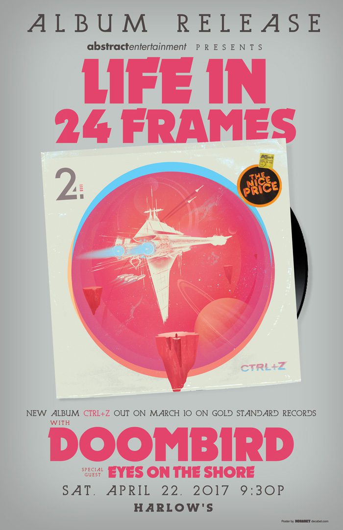
The band held two shows to debut the material: the first in November 2016 to promote the finished album’s digital release and a second show in April 2017 to tout the vinyl release. The latter I took a more formal approach where the latter gave me the opportunity to have a little fun with the design.
CONCLUSION
In the end this was a massive undertaking that was also a hugely rewarding one. I pushed myself well beyond my usual techniques and comfort zones and it ended up redefining for me what it is I was capable of. I am extremely proud and pleased of how this all turned out and the countless hours (easily in the low hundreds) of work I put in over the course of those 6 months really helped to broaden my compositional skills as well as my ability to plot out perspective, lighting, shading, and more. I joke that this project was “the most I’ve ever made designing a record cover and the least per hour” which is absolutely true, but it was worth every minute spent working it out.
Recent Work








LET'S MAKE SOMETHING RAD TOGETHER!
I’ve designed posters and artwork for artists from “Weird Al” Yankovic to Foo Fighters, Metallica to Kings of Leon, Foals to Cut Copy, and many more — from small local shows to major international festivals.
Use the form below to get in touch and I’ll get back to you (usually within 24 hours) to talk about what brilliant things we might conjure into being.
Blather
Periodic dispatches of note, brimming with relatable brio.
Our Band Could Be Your Typography Lesson
13. BROKE. CURIOUS. BORED. The moment is burnt indelibly into my memory. Every Sunday morning, I’d pick through the day’s edition of the Omaha World Herald (I\'m originally a Nebraska boy. Or at least was for my first 25 years), and I was leafing through inky inserts and box store…
Ranking R.E.M.’s Album Covers Aesthetically 1982-2011
I was inspired by a friend’s Facebook thread about underrated late-period R.E.M. albums to create a ranking of the band’s album covers. Aesthetically. A ranking covering all their studio recordings from 1982 to their breakup in 2011. The ranking doesn’t include compilations or live albums, although I am including Dead Letter Office…

