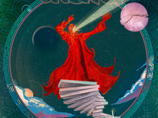
Metallica Poster Philadelphia 2017

METALLICA POSTER 2017 PHILADELPHIA
SPEAKING TO A TUMULTUOUS MOMENT
I still cannot believe I had the chance to create a poster for Metallica. When I was seventeen, I spent nearly a week painting an enormous Metallica banner using materials I “borrowed” from my high school art room. I entered it into a local radio station contest for backstage passes to their Omaha stop on the tour for the Black Album. Shockingly, I won. In retrospect, that banner was the first gig poster I ever made. All these years later, I was asked by Nakatomi Inc. to design a date for Metallica’s 2017 tour. It felt like a full-circle moment.
Finding the Right Direction
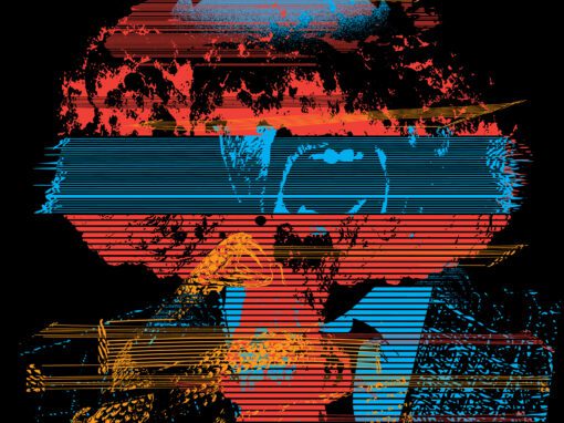
My first instinct was to create a classic, straight-up metal poster full of skulls and fire, something in the spirit of Heavy Metal magazine. But other artists on the tour were likely to head in that direction, so the suggestion was to find a different angle. Around that time Metallica had released Hardwired…To Self-Destruct, an album built around themes of volatility, fractured identity, and our strange cultural attraction to chaos. That became my starting point.
The World in 2017
I wanted the artwork to feel connected to the moment that America was living through in 2017. Not partisan. Not preachy. But observant. Reflective of how it felt to be immersed in an environment where anger, fear, and conflict were turned into content and entertainment. I leaned into the imagery of CRT television screens, distorted talking-head broadcasts, rolling scanlines, and the constant hum of media theatrics.
Distortion, Chaos, and the Birth of a Concept
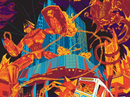
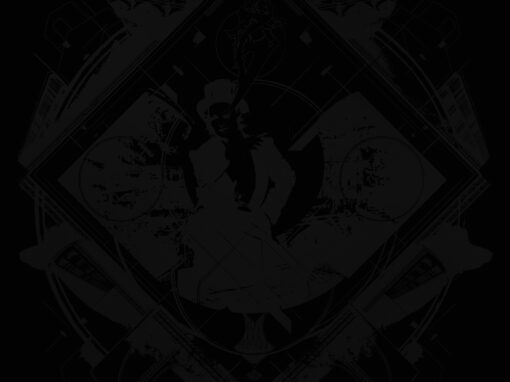
The poster merges multiple symbolic elements: the snarling face of a suited talking head, a rising mushroom cloud, a coiled serpent, and fractured bursts of color. All of it is unified by horizontal CRT scanlines that glitch, smear, and pull the imagery apart. The poster itself becomes a piece of broken broadcast signal, warped by the static and noise of a culture that cannot stop watching itself unravel.
The Metallica logo, which we had surprising freedom to reinterpret, floats above the imagery like a broadcast banner. Even it is fractured with neon color facets, signaling that it sits beyond the chaos but is also shaped by the same cultural forces swirling beneath it. The date and location take on the same distortion, rolling like a flickering on-screen channel guide.
Print and Production
This is an 18 by 24 inch offset print produced in a limited edition run through Nakatomi Inc.. Both the band and the Nakatomi team were incredible to work with and the experience meant a great deal to me. It felt like contributing one more small piece to the ongoing visual legacy of one of the world’s most influential rock bands.
Metallica Poster Philadelphia 2017 Specs
• 18” X 24” MATTE OFFSET PRINT
• PRINTED ON ARCHIVAL QUALITY HEAVY PAPER
• EDITION LIMITED TO 50
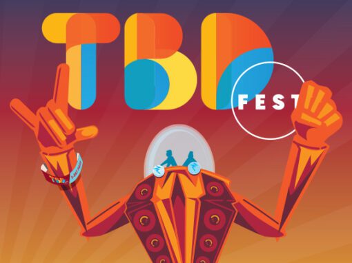
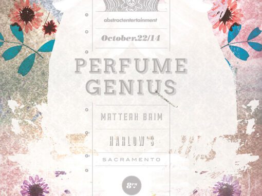
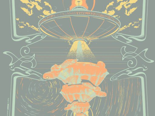
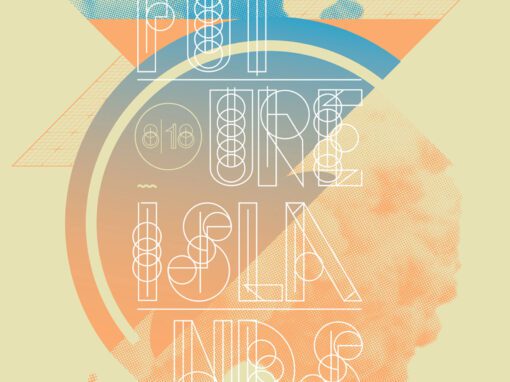
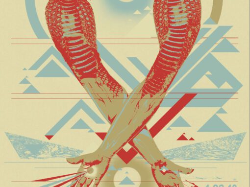
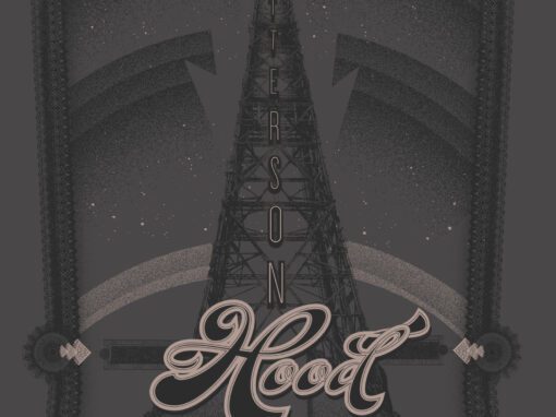
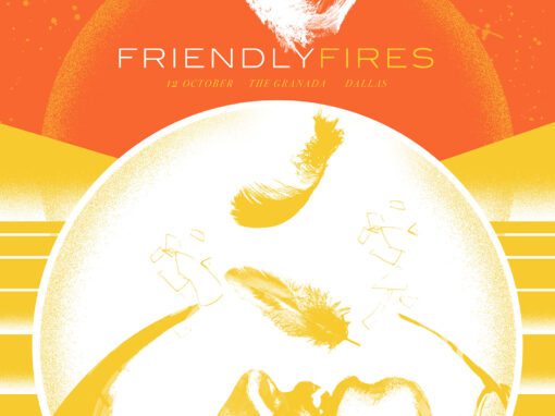
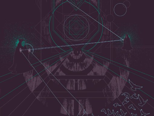
Recent Work


LET'S MAKE SOMETHING RAD TOGETHER!
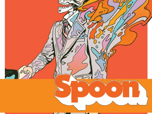
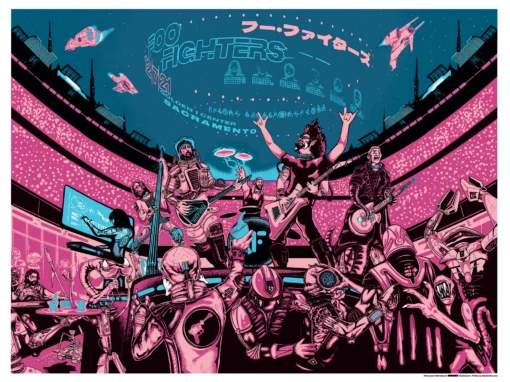
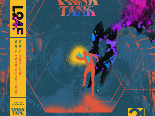
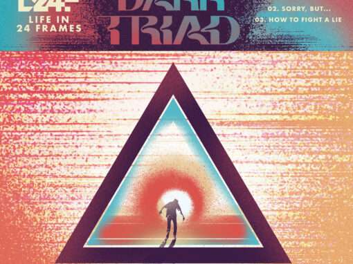
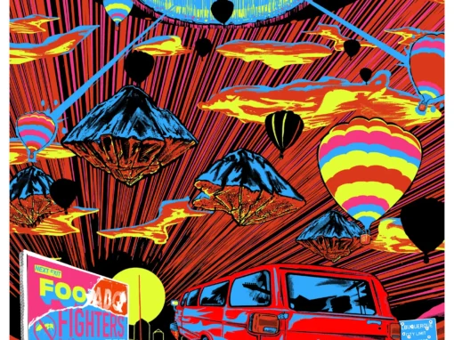
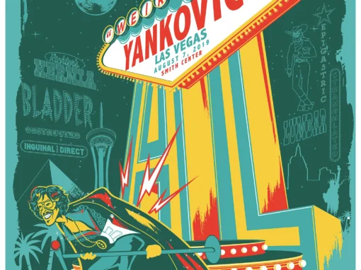
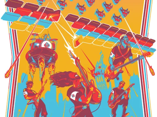
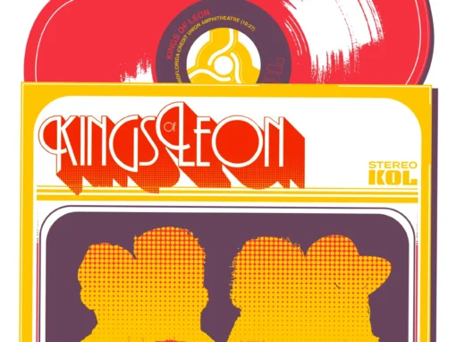
I’ve designed posters and artwork for artists from “Weird Al” Yankovic to Foo Fighters, Metallica to Kings of Leon, Foals to Cut Copy, and many more — from small local shows to major international festivals.
Use the form below to get in touch and I’ll get back to you (usually within 24 hours) to talk about what brilliant things we might conjure into being.