My Morning Jacket Residency | The Fillmore San Francisco

My Morning Jacket | 4 Nights at The Fillmore
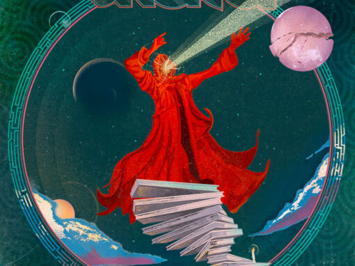
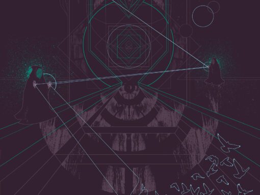
Visualizing the Ascension
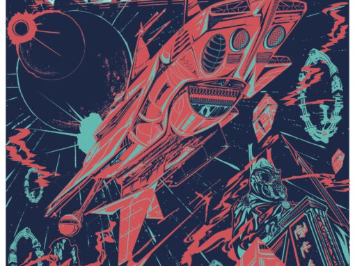
For My Morning Jacket’s special four-night residency at the legendary Fillmore in San Francisco, the goal was to create a singular, defining admat that captured the gravity of a “no repeats” run at one of the world’s most iconic musical landmarks. Unlike a standard gig poster, an admat serves as the primary visual hook for the entire event promotion, requiring a composition that remains impactful across multiple digital and print formats while anchoring the residency’s brand identity.
The Concept: The Spiral Staircase
The focal point of this illustration is a red-hooded figure perched atop a monumental spiral staircase that transcends the earthly plane. While the structure is often misinterpreted as a stack of books, it is intended as a literal representation of ascension—a staircase stretching toward the heavens to meet a celestial alignment.
This imagery was designed to mirror the transformative, “cosmic” experience of an MMJ live set, where the boundaries between the stage and the celestial often blur. The use of deep teals, lavender moons, and 1970s pulp paperback-inspired typography creates a visual narrative that feels both vintage and futuristic, much like the band’s sonic evolution.
A Study in Synchronicity
The professional backstory of this project is a testament to the power of a strong portfolio and a bit of cosmic timing. I had originally reached out to the My Morning Jacket camp via cold email to express interest in a collaboration. Every single one of those emails resulted in a bounce-back; I assumed the connection was a dead end and moved on.
Remarkably, the MMJ team reached out to me directly just a few weeks later. They hadn’t seen my attempted outreach—they had discovered my work independently and felt my surrealist aesthetic was the perfect match for the Fillmore residency. They sought me out to define the visual identity of these shows, a professional milestone that underscores the importance of letting the work speak for itself. When the aesthetic alignment is there, the work finds its way to the right people.
My Morning Jacket Admat Specs
Client: My Morning Jacket
Project Type: Concert Admat / Residency Branding
Venue: The Fillmore, San Francisco, CA
Recent Work


LET'S MAKE SOMETHING RAD TOGETHER!
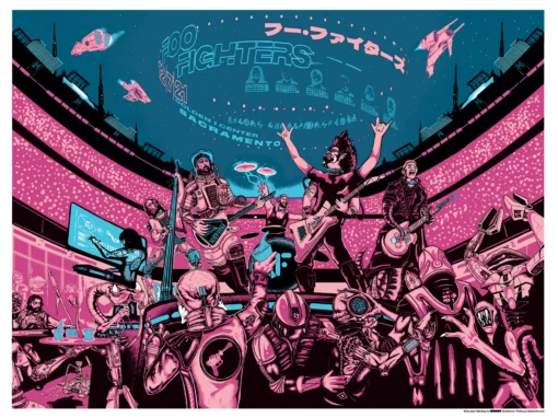
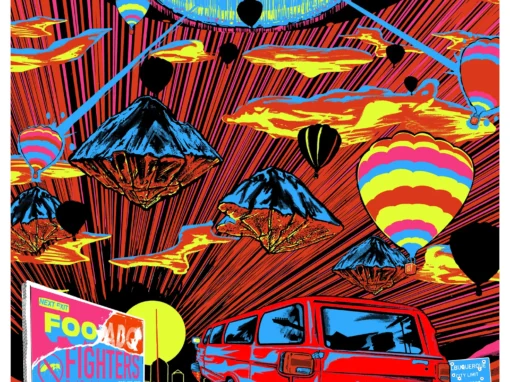
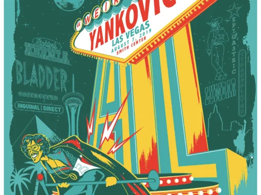
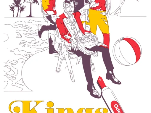
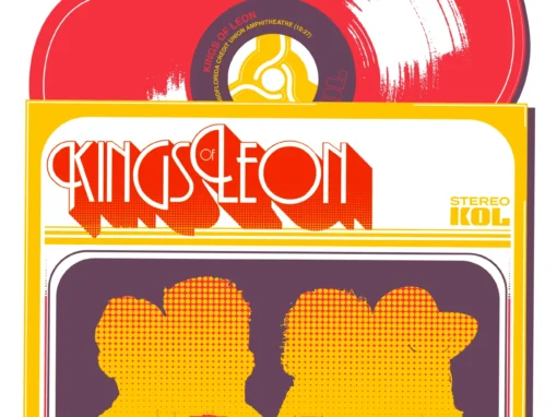
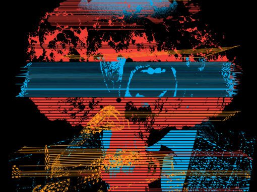
I’ve designed posters and artwork for artists from “Weird Al” Yankovic to Foo Fighters, Metallica to Kings of Leon, Foals to Cut Copy, and many more — from small local shows to major international festivals.
Use the form below to get in touch and I’ll get back to you (usually within 24 hours) to talk about what brilliant things we might conjure into being.
Blather
Periodic dispatches of note, brimming with relatable brio.
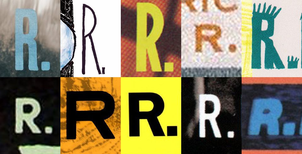
Our Band Could Be Your Typography Lesson
13. BROKE. CURIOUS. BORED. The moment is burnt indelibly into my memory. Every Sunday morning, I’d pick through the day’s edition of the Omaha World Herald (I\'m originally a Nebraska boy. Or at least was for my first 25 years), and I was leafing through inky inserts and box store…
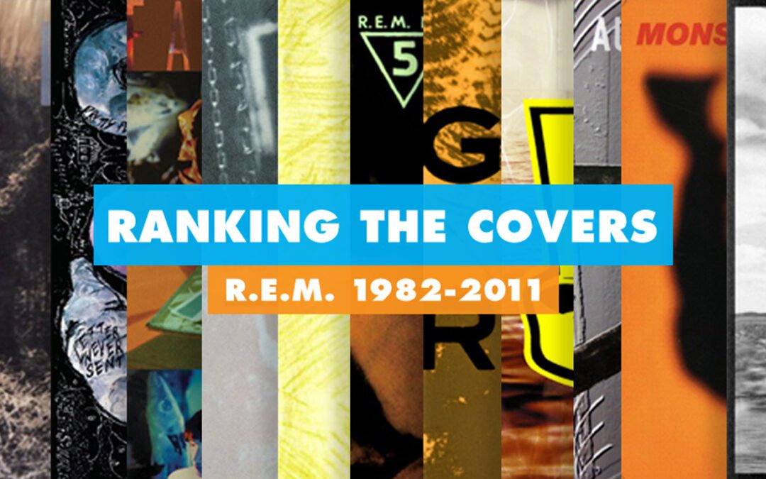
Ranking R.E.M.’s Album Covers Aesthetically 1982-2011
I was inspired by a friend’s Facebook thread about underrated late-period R.E.M. albums to create a ranking of the band’s album covers. Aesthetically. A ranking covering all their studio recordings from 1982 to their breakup in 2011. The ranking doesn’t include compilations or live albums, although I am including Dead Letter Office…