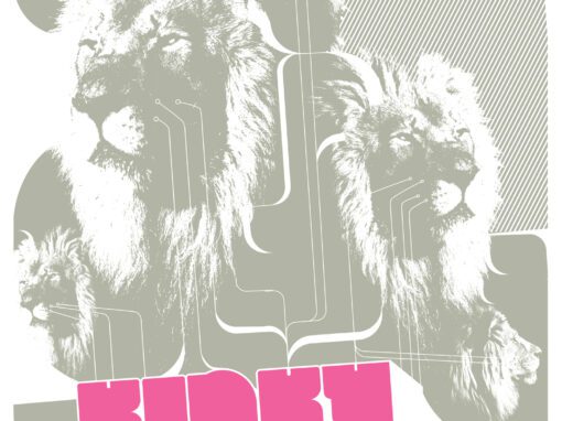
Sister Crayon Poster 2010
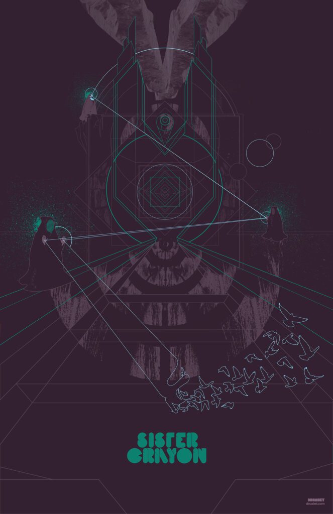
SISTER CRAYON POSTER 2010
A TOUR POSTER TO BUY A VAN TO TOUR IN
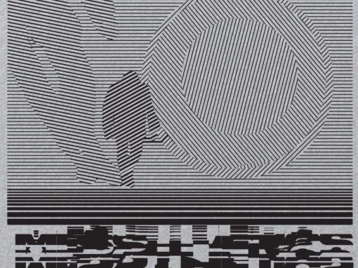
Sister Crayon (now Rituals of Mine) was an insanely talented band from Sacramento who hadbeen transfixing audiences all over the map with their ethereal and somewhat mystic songcraft. I designed this poster for them in 2010 as a way to help them pay for a new van (as I recall.) I’m very very glad I did as their sound helped to push my work into a new frontier I hadn’t been to yet. Part-Tron, part-Zardoz, part-Jodorowsky. On the short list of my favorite posters I’ve worked on over the years. And I really should have taken the time to make a full alphabet from the typeface I designed for the band’s name.
Sister Crayon Tour Poster 2010 Specs
• 11″ X 17″ MATTE OFFSET PRINT
• PRINTED ON ARCHIVAL QUALITY HEAVY PAPER
• EDITION LIMITED TO 50
Recent Work




















LET'S MAKE SOMETHING RAD TOGETHER!
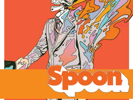
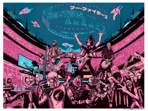
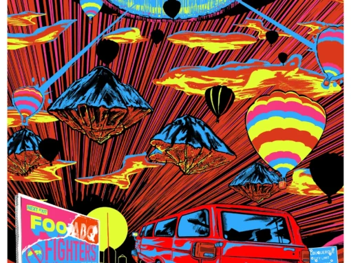
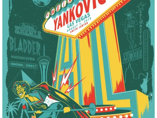
I’ve designed posters and artwork for artists from “Weird Al” Yankovic to Foo Fighters, Metallica to Kings of Leon, Foals to Cut Copy, and many more — from small local shows to major international festivals.
Use the form below to get in touch and I’ll get back to you (usually within 24 hours) to talk about what brilliant things we might conjure into being.
Blather
Periodic dispatches of note, brimming with relatable brio.
Our Band Could Be Your Typography Lesson
13. BROKE. CURIOUS. BORED. The moment is burnt indelibly into my memory. Every Sunday morning, I’d pick through the day’s edition of the Omaha World Herald (I\'m originally a Nebraska boy. Or at least was for my first 25 years), and I was leafing through inky inserts and box store…
Ranking R.E.M.’s Album Covers Aesthetically 1982-2011
I was inspired by a friend’s Facebook thread about underrated late-period R.E.M. albums to create a ranking of the band’s album covers. Aesthetically. A ranking covering all their studio recordings from 1982 to their breakup in 2011. The ranking doesn’t include compilations or live albums, although I am including Dead Letter Office…

