The Little Book of Rock and Roll Wisdom

The Little Book of Rock and Roll Wisdom
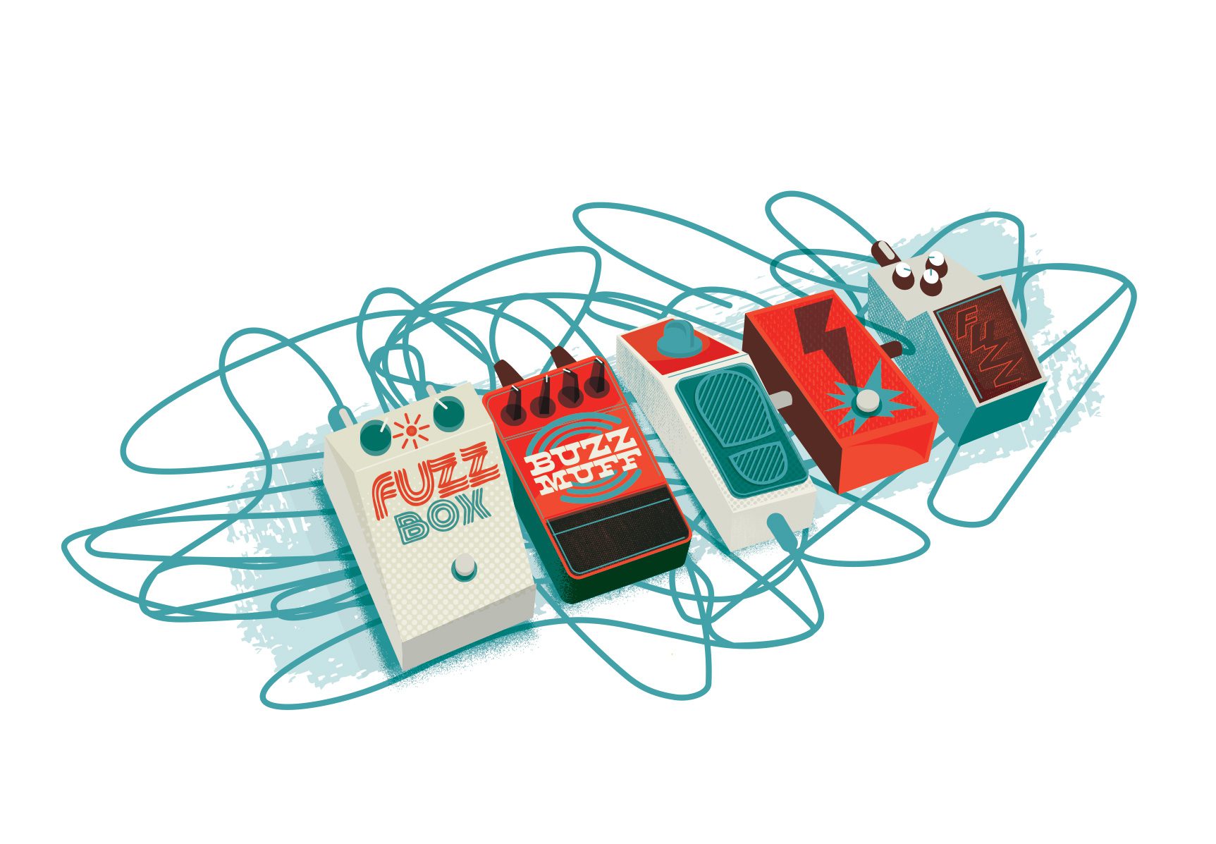
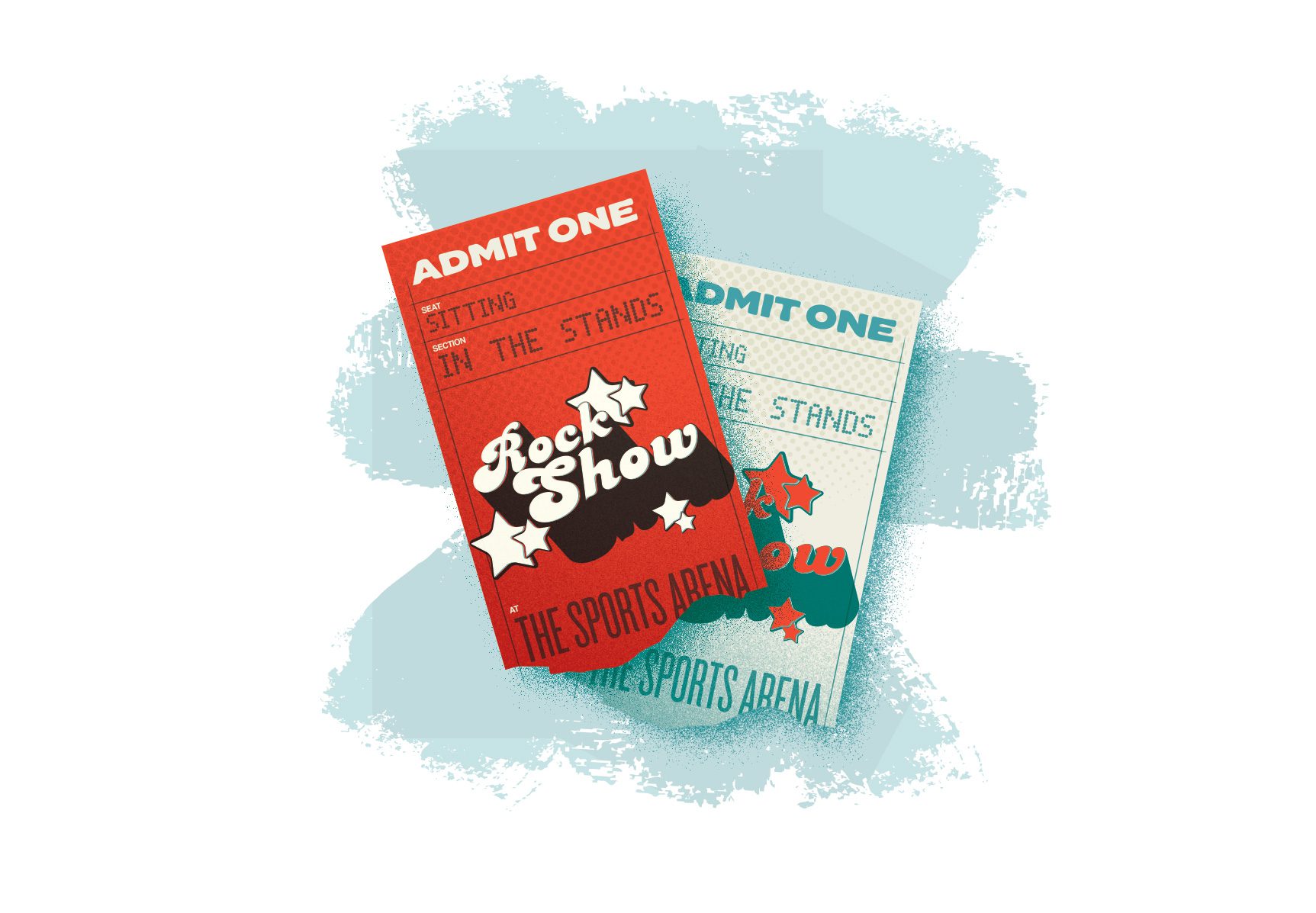
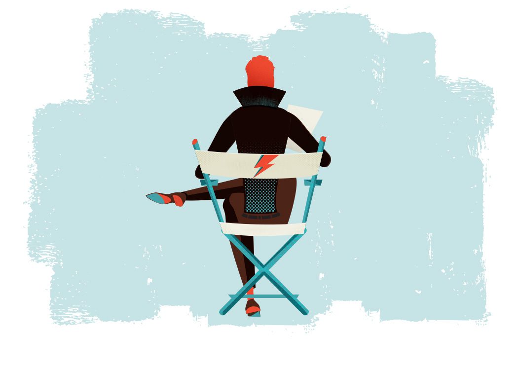
In which I illustrate an entire book on a crazy tight deadline
If I may name drop and schmooze Bobby Bittman-style for a moment, Crispin Kott is a close, personal friend of mine. Kindred spirit music dorks with a taste for BritPop and RiffTrax, it was all but predestined that we’d eventually work on something together. That opportunity came fall 2017 when he asked if I thought I could pull off editorial illustration. He and writing partner Mike Katz were prepping a volume of quotes, anecdotes, lists and other curiosa pulled from 50+ years of rock and roll history. The Little Book of Rock And Roll Wisdom was fast taking shape and it needed some artwork to give it all a look and feel to help tie together so many different vibes and voices. You had several hundred pages cataloguing everything from Mick Jagger’s thoughts on men’s footwear to Gene Simmons’ very canine estimation of his own libido, so naturally you’d want something to make it all feel of a piece. Of course I was in, but was this something I could do? Not just was I available, but was I capable? And to put things in reverse for a second, if I was capable was I even available?
Further Complications
2017 was a pretty crazily productive year, with marquee projects like the California State Fair anniversary poster, my first-ever piece for Metallica, several gigposters for Kings of Leon, a pretty demanding day job, a side gig designing a magazine every other month, and all the other short bursts of side work that kept me in bread and jam. After all that, I was coasting into November of that year on fumes. The parts of me that weren’t physically drained were mentally and creatively spent. And now I was going to take on 4 and a half dozen distinct illustrations in a style I’d have to come up with (I always design with an eye toward what the project needs rather than my own whim) for a form I’d never really worked in. Sure, I’d done some spot illos for magazines and newspapers here and there, and what are my gigposters if not illustrations but still, the thought of committing myself to something like this was daunting to say the least. Still, it was too plum a gig to not take on. I’d accept the gig and then figure out how to do it. Throw my hat over the fence, as it were. A philosophy that has guided more of my career than is probably safe to admit.
OK, So What The Hell Do I Do Now?
I needed to figure out a style for this thing. I pride myself in not having a set style to sell, preferring instead to work in whatever style feels like a good fit for whichever project I’m working on at the time. Sure, there’s commonalities in my work that come across to give my stuff a kind of look, but I’ve never been all that interested in being “The Guy That Does X Thing”. There’s just too many things I want to do in my work and, besides, they say dancing is just anything you can do twice, so if I am going to have a “style” let it come from there rather than working in a visual schtick.
I decided to start—quite literally—at the start. They never asked me to design the cover, I wasn’t contracted to design the cover, and in fact they already had someone in-house that does that. But for my won sake of finding the right way “in” to this project, I decided to design a cover.
The name drove a lot of where I’d go with it. “The Little Book of Rock And Roll Wisdom” conjured all kinds of stuff in my brain: first grade workbooks, PBS shows from when I was a kid, Golden Books…especially Golden Books. It might be a bit pat, but what about an owl? That’s pretty universal, ties into the concept of “wisdom”, and there are endless ways to work music ephemera into its design. So that’s what I did: a wise old owl, with cassette spool eyes, a guitar pick nose, unspooled tape and concert tickets for plumage, and 45 adapters for feet. Some of the tickets used even belonged to the authors, giving things a bit more soul and meaning than if I’d just pulled stock. I even shot a picture of my own vinyl collection’s spines to work into the background. The color palate a lively scholastic red and teal, recalling textbooks and standardized test forms from when I was a kid. I wasn’t hired to make a cover but I did and through that I had my look.

Onward, Into the Drink
As relieved as I was to have my aesthetic established, I was now equally stressed by the project now becoming real. Before this, coming up with fifty-some illustrations in the next five weeks (that’s 12 a week. Why on earth did I do the math? Oh boy, this is gonna be tough) was still somewhat theoretical. Now it was all underway and I had to push on and actually deliver. With the holidays coming up no less which meant the weekends I’d normally grind out work were going to be getting taken over by family, friends, and work engagements.

“And you have to remember, I was an ugly son of a bitch. At my best, I looked like a dog at birth. But, now that I was in this famous band, I was in a position where I could mount anybody’s girlfriend and mother, often at the same time. That’s the magic of Rock & Roll right there. It means that even Meat Loaf can get some puss.” – Gene Simmons, Kiss (Uncut, March 2006)
I Don’t Do Portraits. Or Wait… Do I?
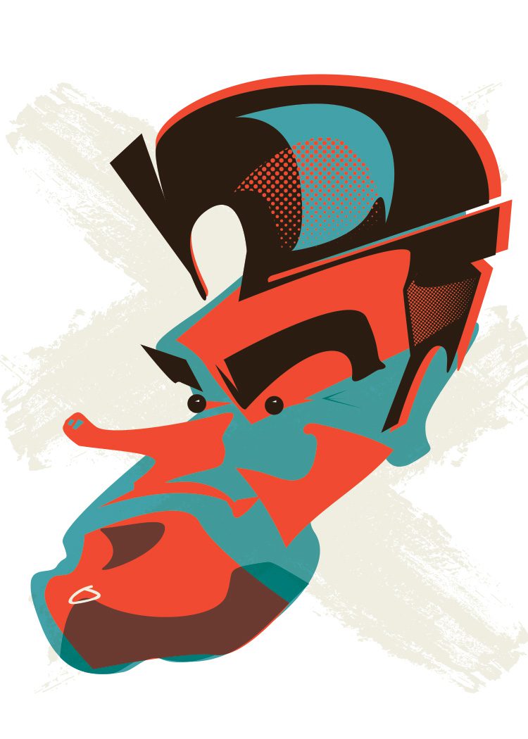
Having grown into illustration somewhat late in my career, I’ve had to build up my confidence project by project. I’d never really done much if any portraiture, but I wanted to mix up the illustrations a bit so there was a bit of variety to things. After all, this book was several hundred pages long and there was certainly variety in the content. So shouldn’t the illustrations reflect that variety? At any rate I was keen to give it a shot. One night I quickly dashed out an angular stab at Morrissey, full of all the sharp-chinned pomp you’d expect from Moz.
Coda
It was a beast of a project to take on but I managed to pull it off in the end. Some projects take a lot out of you but the best ones will make you feel like you “leveled up” while working on them and this was definitely one of those. Finishing this book made me feel like my still-young career as an illustrator might hold some viability after all.
I’m extremely grateful to Crispin Kott and Mike Katz for letting me take this ride with them. It was a deeply fulfilling project to get to be a part of and while there were plenty of nights working on it that I couldn’t see over the stack to the end of it, I can’t imagine my body of work without The Little Book of Rock And Roll Wisdom in the stack.

The Little Book of Rock and Roll Wisdom
The Little Book of Rock And Roll Wisdom is available from Lyons Press everywhere books are sold.
Click below to order it from Amazon.
Recent Work





















LET'S MAKE SOMETHING RAD TOGETHER!
I’ve designed posters and artwork for artists from “Weird Al” Yankovic to Foo Fighters, Metallica to Kings of Leon, Foals to Cut Copy, and many more — from small local shows to major international festivals.
Use the form below to get in touch and I’ll get back to you (usually within 24 hours) to talk about what brilliant things we might conjure into being.
Blather
Periodic dispatches of note, brimming with relatable brio.
Our Band Could Be Your Typography Lesson
13. BROKE. CURIOUS. BORED. The moment is burnt indelibly into my memory. Every Sunday morning, I’d pick through the day’s edition of the Omaha World Herald (I\'m originally a Nebraska boy. Or at least was for my first 25 years), and I was leafing through inky inserts and box store…
Ranking R.E.M.’s Album Covers Aesthetically 1982-2011
I was inspired by a friend’s Facebook thread about underrated late-period R.E.M. albums to create a ranking of the band’s album covers. Aesthetically. A ranking covering all their studio recordings from 1982 to their breakup in 2011. The ranking doesn’t include compilations or live albums, although I am including Dead Letter Office…

