Walk the Moon Poster 2015 New York City

WALK THE MOON POSTER NEW YORK CITY 2015
RETRO FUTURISM
“OK
In spring 2015, I was emailed out of the blue by Walk The Moon’s art director. Some bands have art directors now. Crazy. I assume this is due to the shifting nature of music business revenue streams: merch and posters now make up a bit more of a band’s bread and butter than they once did. I was thrilled to be tapped to come up with a design for the band’s sold out shows in New York. All I had to do was avoid using a number of cliches the band had encountered over the years (no moons, etc).
With that I set about trying to encompass Walk the Moon’s feel. I felt it called for something retro without being obvious or pandering, something bright and colorful without being gaudy, and something that gave a sense of bounding motion. A dance poster without any dancing.
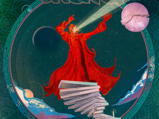
Conceptually this one is pretty clear: a jump man leaping from suspended galactic cliffs over a computerized plain of equalizer response. The band loved it and it remains one of my favorite pieces I’ve done. And that French bright yellow paper demands attention. Plus that sci-fi typeface (Alex Trochut’s Neo Deco) is just unstoppable if you set it in the right treatment.
Walk the Moon Poster New York City 2015 Specs
• 18” X 24” THREE COLOR SCREENPRINT
• PRINTED ON ARCHIVAL QUALITY HEAVY PAPER
• EDITION LIMITED TO 50
Recent Work























LET'S MAKE SOMETHING RAD TOGETHER!
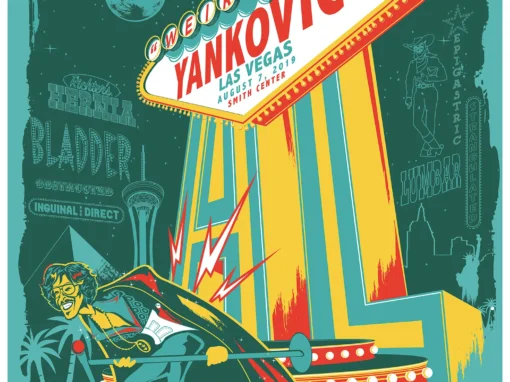
I’ve designed posters and artwork for artists from “Weird Al” Yankovic to Foo Fighters, Metallica to Kings of Leon, Foals to Cut Copy, and many more — from small local shows to major international festivals.
Use the form below to get in touch and I’ll get back to you (usually within 24 hours) to talk about what brilliant things we might conjure into being.
Blather
Periodic dispatches of note, brimming with relatable brio.
Our Band Could Be Your Typography Lesson
13. BROKE. CURIOUS. BORED. The moment is burnt indelibly into my memory. Every Sunday morning, I’d pick through the day’s edition of the Omaha World Herald (I\'m originally a Nebraska boy. Or at least was for my first 25 years), and I was leafing through inky inserts and box store…
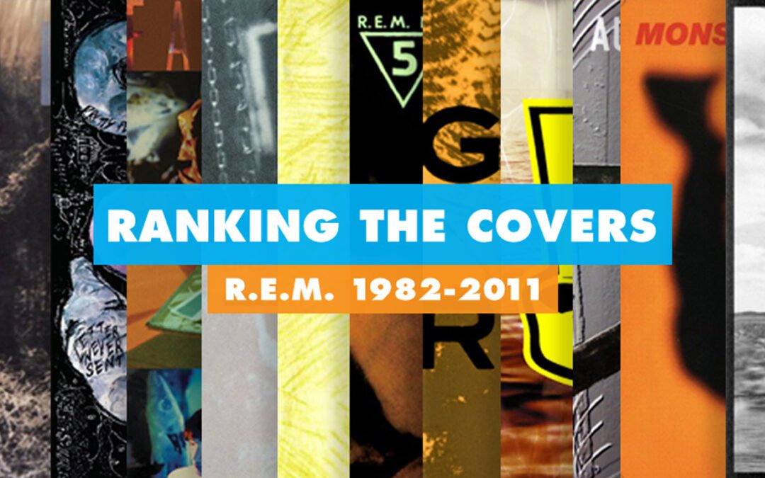
Ranking R.E.M.’s Album Covers Aesthetically 1982-2011
I was inspired by a friend’s Facebook thread about underrated late-period R.E.M. albums to create a ranking of the band’s album covers. Aesthetically. A ranking covering all their studio recordings from 1982 to their breakup in 2011. The ranking doesn’t include compilations or live albums, although I am including Dead Letter Office…

