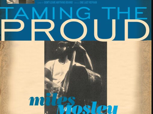
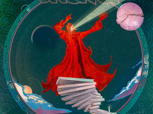
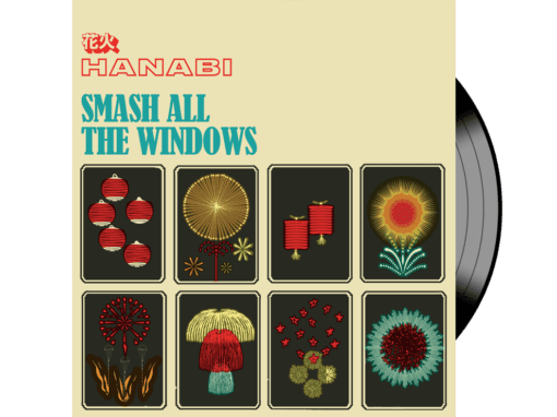
Like in 24 Frames – Redivider

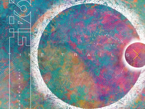
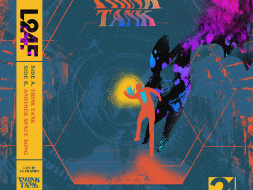
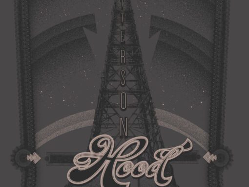
Redivider is the fourth full-length album from Sacramento indie/alternative rock band Life in 24 Frames, released independently on March 24, 2023. The album is built around a cyclical concept: song titles are palindromes, the album title itself reads the same forward and backward, and the record is split into mirrored A and B sides that pit an internal critic against an optimist.
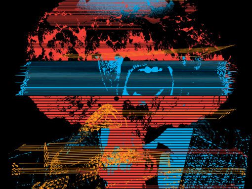
Band founder Kris Adams brought that framework to the conversation early, and the design challenge was finding a visual equivalent for it. The solution centers on a geometric tunnel structure that radiates outward in repeating, nested forms, pulling the eye inward toward a lone figure rendered deliberately out of focus, small and distant, as if observed from the far end of a corridor of thought. The figure is surrounded by roiling nebula photography, textured and atmospheric, suggesting the noise of internal conflict. Against that chaos, the geometric forms impose a kind of visual order, the cyclical structure made literal and spatial.
The logotype was designed specifically for this release. The word Redivider is itself a palindrome, and the lettering reflects that: end characters are mirrored and reversed, making the word perform its own concept at a glance. The custom letterforms sit low on the cover, wide and grounded, anchoring the composition beneath the tunnel and giving the design a clean entry point after the density of everything above.
Life in 24 Frames / Redivider
Recent Work


LET'S MAKE SOMETHING RAD TOGETHER!
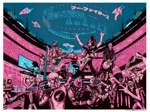
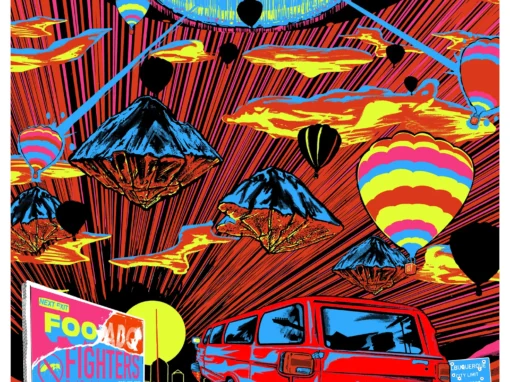
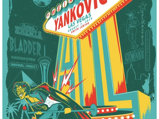
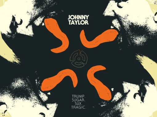
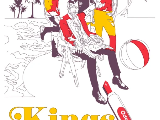
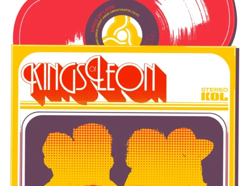
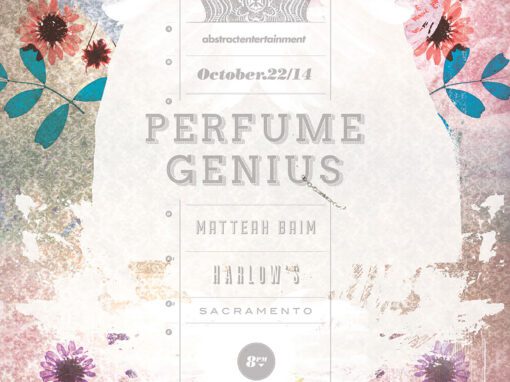
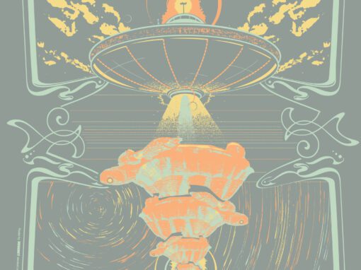
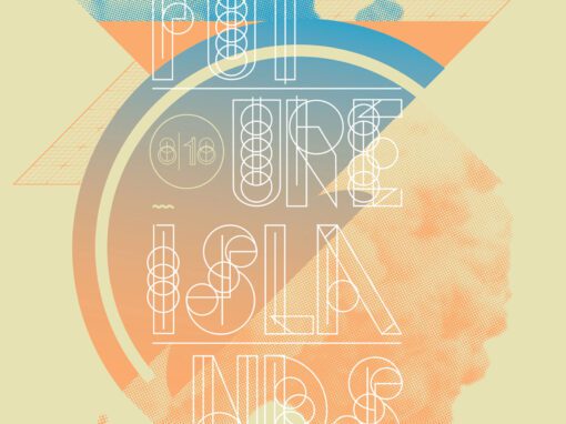
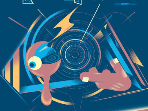
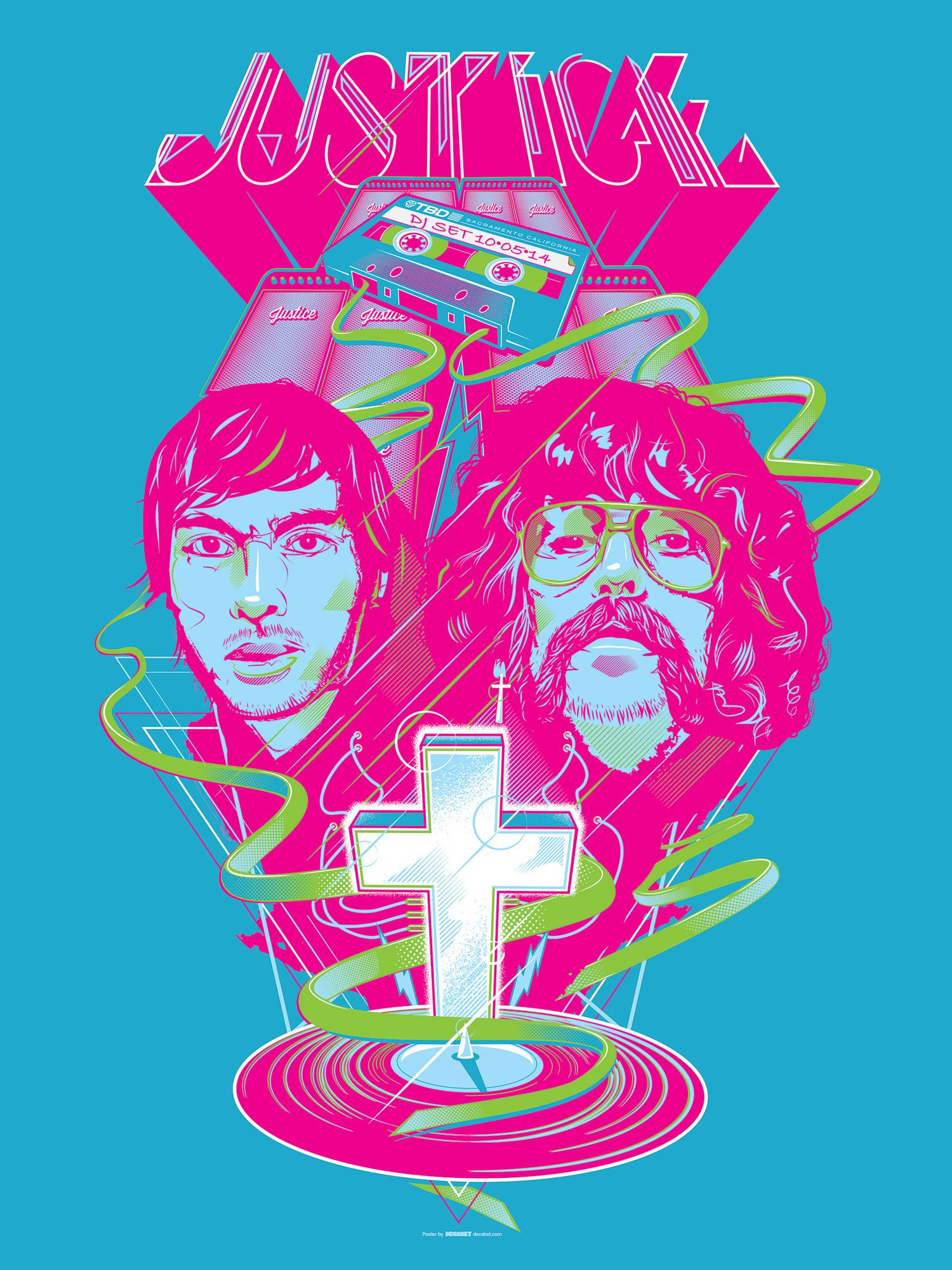
I’ve designed posters and artwork for artists from “Weird Al” Yankovic to Foo Fighters, Metallica to Kings of Leon, Foals to Cut Copy, and many more — from small local shows to major international festivals.
Use the form below to get in touch and I’ll get back to you (usually within 24 hours) to talk about what brilliant things we might conjure into being.
Blather
Periodic dispatches of note, brimming with relatable brio.
Our Band Could Be Your Typography Lesson
13. BROKE. CURIOUS. BORED. The moment is burnt indelibly into my memory. Every Sunday morning, I’d pick through the day’s edition of the Omaha World Herald (I\'m originally a Nebraska boy. Or at least was for my first 25 years), and I was leafing through inky inserts and box store…
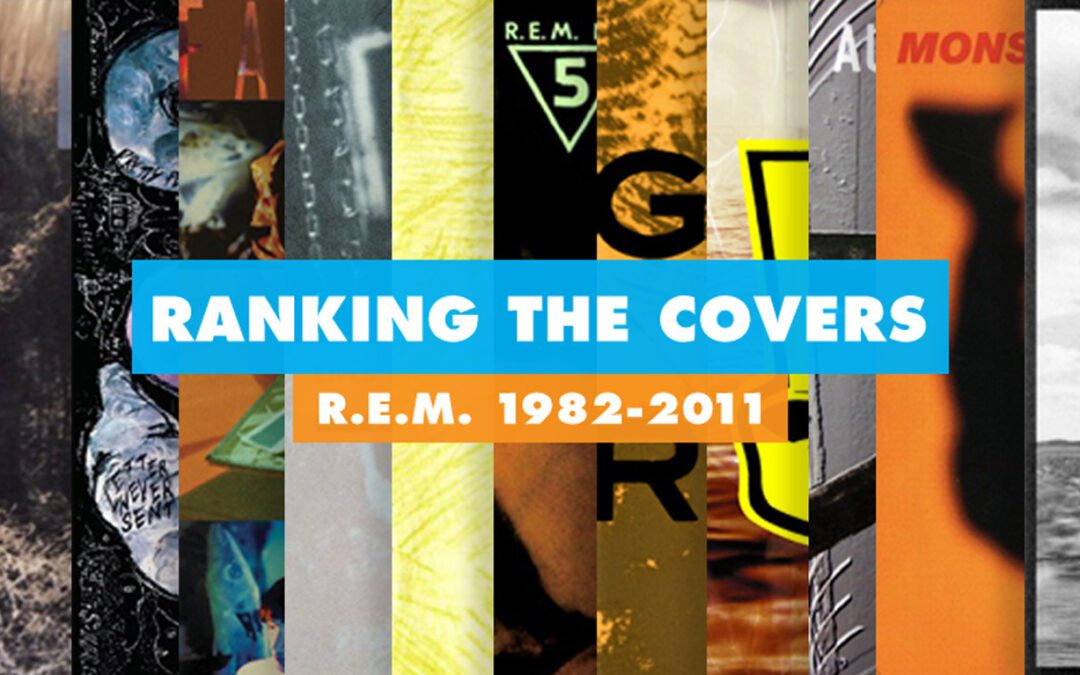
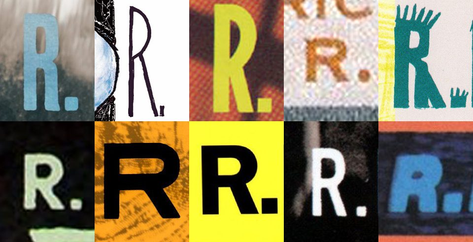
Ranking R.E.M.’s Album Covers Aesthetically 1982-2011
I was inspired by a friend’s Facebook thread about underrated late-period R.E.M. albums to create a ranking of the band’s album covers. Aesthetically. A ranking covering all their studio recordings from 1982 to their breakup in 2011. The ranking doesn’t include compilations or live albums, although I am including Dead Letter Office…