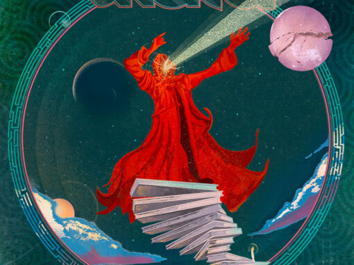
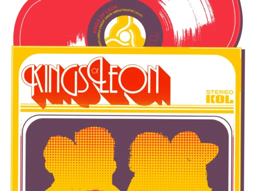
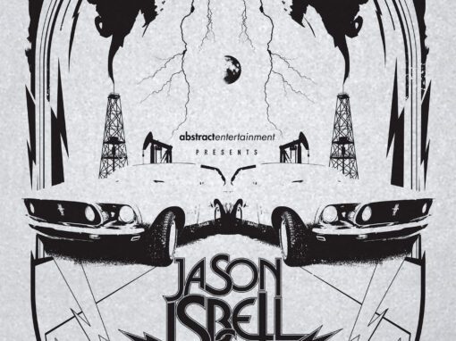
Kings of Leon Poster New Jersey 2017

KINGS OF LEON POSTER 2017 HOLMDEL, NEW JERSEY
JUST SOME GOOD OLD BOYS…
This poster for Kings of Leon was one of the first pieces I created for their 2017 summer tour in collaboration with Nakatomi Inc.. The print is a 12 by 18 inch, three color screenprint inspired by the wild, rubber-burning energy of 1970s good-old-boy car flicks. I was deep into a run of classic Burt Reynolds films like Hooper, Smokey and the Bandit, Convoy, and Grand Theft Auto. I was also revisiting drive-in exploitation movies like The Van, which helped shape the tone, palette, and overall attitude of the artwork.

A Van, a Chase, and a Whole Lot of Chaos
I wanted the piece to feel like a lost one-sheet from a regional New Jersey drive-in. Police cruisers skid across the highway. A helicopter swings overhead. A bridge goes up in flames. At the center of it all, a custom muscle van barrels through frame with smoke coming off the tires. Every element is exaggerated just enough to capture the mix of action and playful chaos that defined the era.
The Cherry Motif and the Cherry 4 Ever Van
Throughout the 2017 tour the band asked artists to incorporate cherries into their artwork wherever possible. Instead of placing cherries into the composition as decoration, I embedded the motif into the core idea. The van itself is marked Cherry 4 Ever, a nod to the high-school-roadtrip humor of Porky’s and a partial homage to the Straight Arrow van from The Van. It became the perfect vehicle for the poster in more ways than one.
Kings of Leon Poster 2017 Holmdel, New Jersey Specs
• 12″ x 18” THREE COLOR SCREENPRINT
• PRINTED ON ARCHIVAL QUALITY HEAVY PAPER
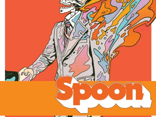
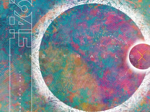
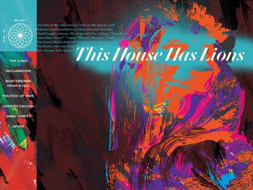
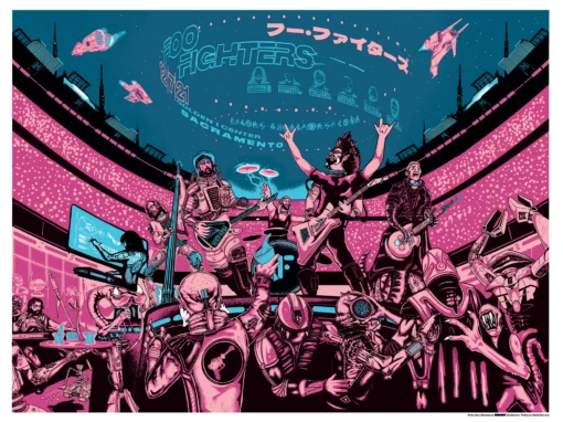
Recent Work
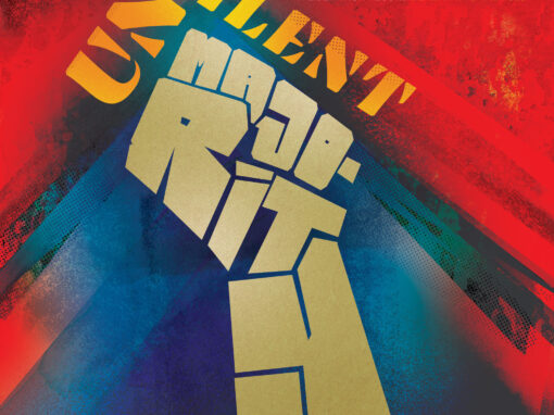
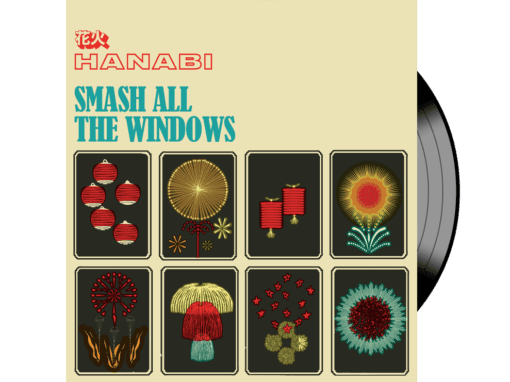
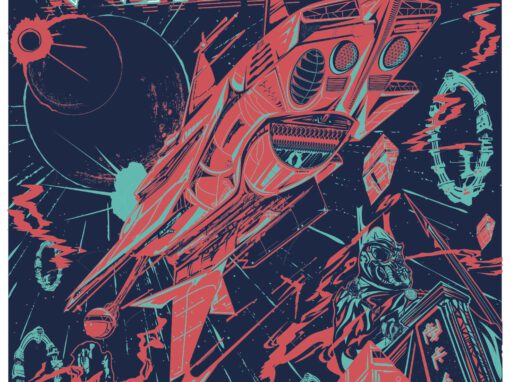
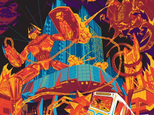

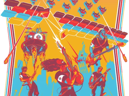
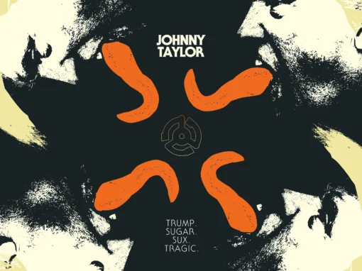
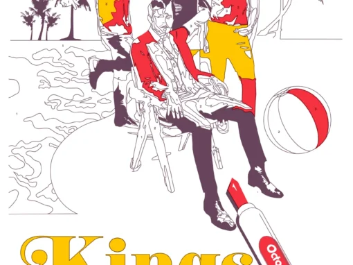
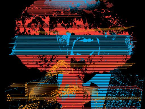

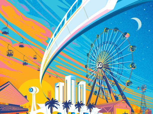


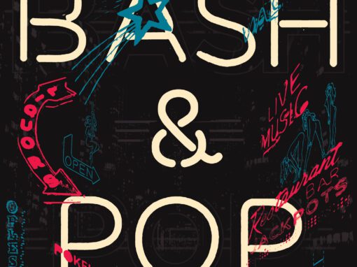

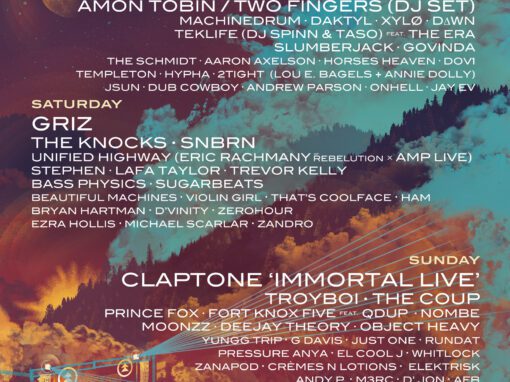
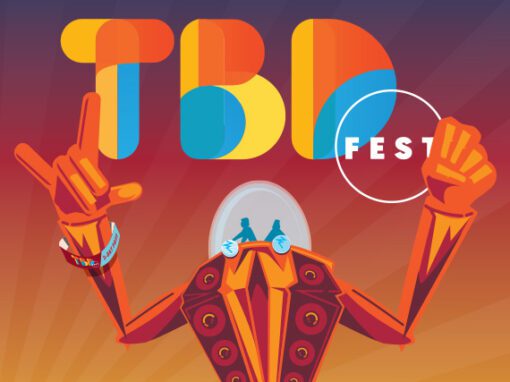


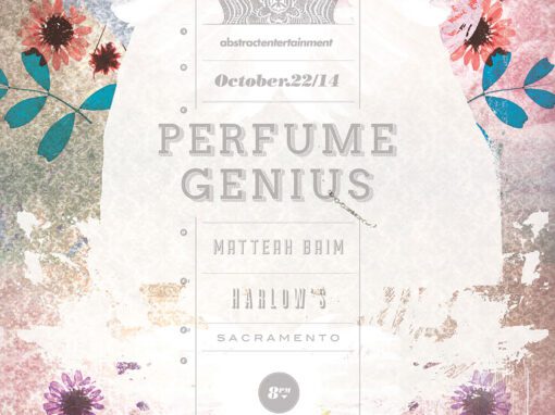
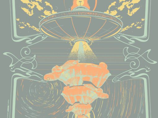
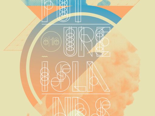
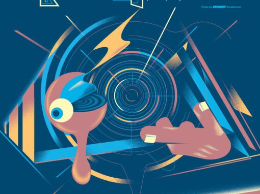
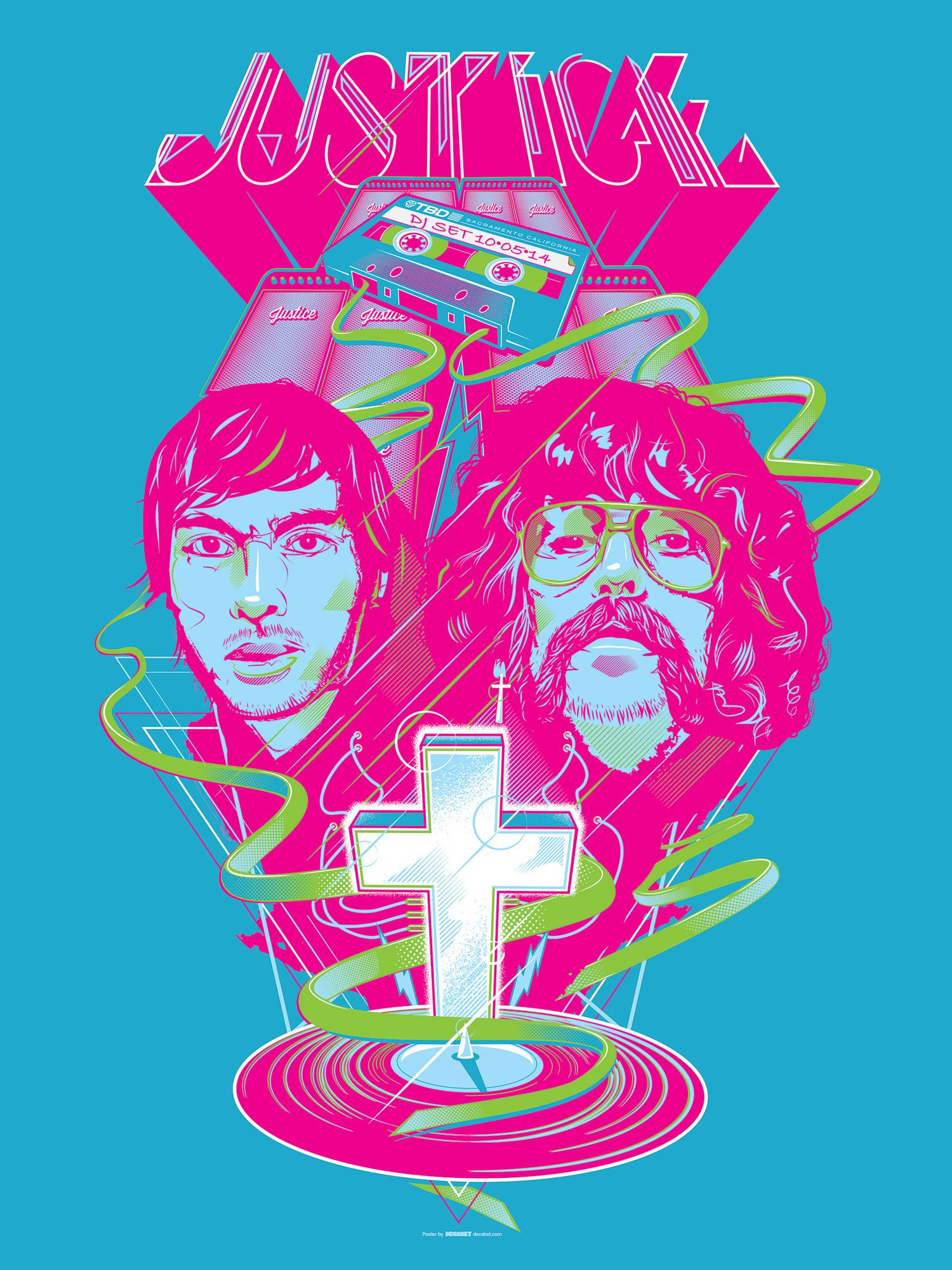
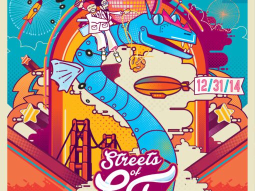
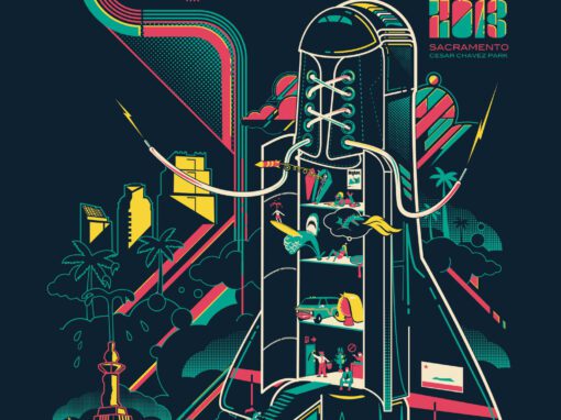
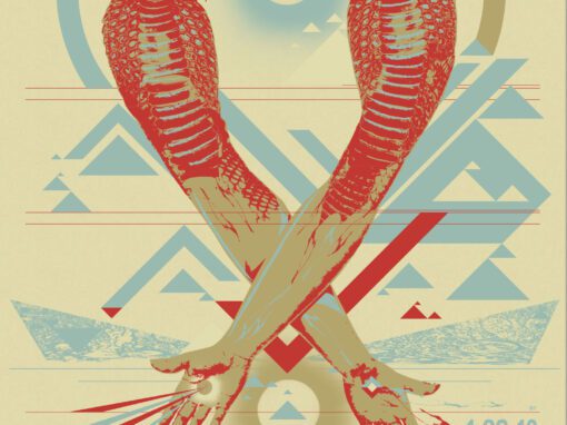
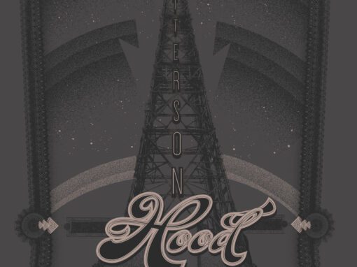
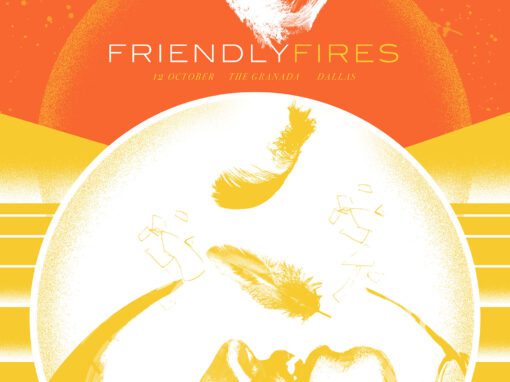

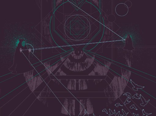

 GIGPOSTERS, FESTIVAL BRANDING, RECORD COVERS, EPHEMERA, JUVENILIA. SACRAMENTO. REPUBLIC OF CALIFORNIA.
LET'S MAKE SOMETHING RAD TOGETHER!
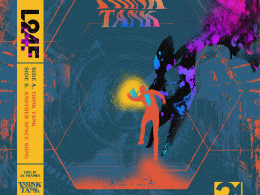
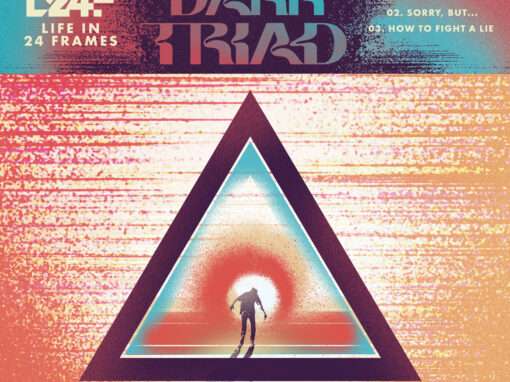
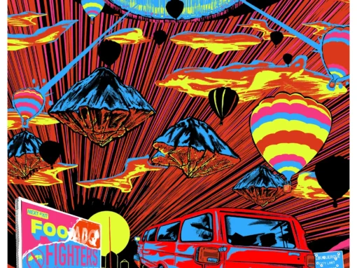
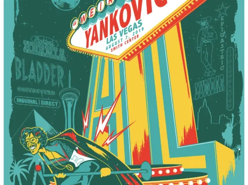
I’ve designed posters and artwork for artists from “Weird Al” Yankovic to Foo Fighters, Metallica to Kings of Leon, Foals to Cut Copy, and many more — from small local shows to major international festivals.
Use the form below to get in touch and I’ll get back to you (usually within 24 hours) to talk about what brilliant things we might conjure into being.